Bright Spring color palette (Clear Spring): vivid, warm colors
Usually also called Clear Spring. Clarity comes before warmth: this is the season that can stand next to near-neon, and that dusty colors let down.
very vivid
on average
The Bright Spring palette
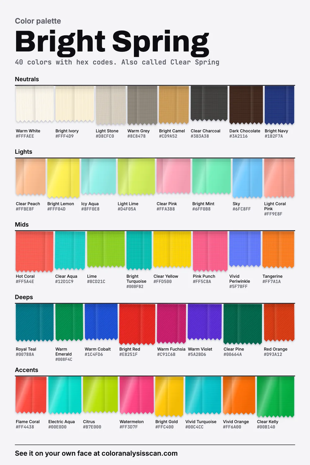
40 colors with hex codes. Also called Clear Spring. Tap any color to copy its hex code.
Neutrals
Lights
Mids
Deeps
Accents
Clarity first, warmth second
Most people find their season by asking about warm and cool. Bright Spring is one of the two seasons where that isn’t the first question. Its defining trait is clarity: how clean a color is, how little grey it carries. The dial above puts our palette near the top of the twelve, with 52.5% of the board counting as vivid. Only Bright Winter keeps it company.
The warmth comes after that, and there’s less of it than you might assume. On average it’s warm, but well short of Warm Spring. Only 55% of the colors measure warm, against 82.5% for Warm Spring, and 27.5% measure cool. So this is a season with hot coral and tangerine on the same board as Warm Cobalt and Warm Violet. It leans warm, the way a person can lean on a railing without quite resting on it. Those figures describe our palette, and color measurement isn’t perfectly even, particularly for blues and violets, so please read them as rough measures.
Strength, lightness and hue are separate properties, which is the insight Munsell brought to color. You can’t reach this palette by making a warm color lighter or darker. You get there by keeping the grey out.
Is Clear Spring the same thing?
Nearly always. The names come from different schools and describe the same place: a spring whose main trait is clarity. A Clear Spring color palette and this one are after the same thing. Bright is the far more common name in English, so that’s what we use. In Agile Styling’s 16-season method, Bright Spring is one of the palettes it treats as fundamentally neutral, with a slight spring lean, which fits how modest the warmth is in our numbers.
Why dusty colors fail and pastels fall flat
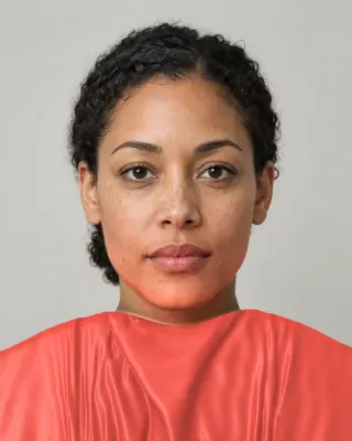
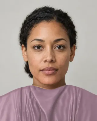
Here is the failure mode, as clearly as we can show it: the same colors with the clarity taken out.
Greyed colors do something specific to this coloring. The people who suit this palette tend to have some strong contrast or a clear, bright quality to their eyes, and a dusty color next to that looks like a mistake, as if the clothing has aged and the face hasn’t. Our avoid list is almost entirely these: Dusty Mauve, Olive Drab, Greige and Taupe. Each is far more muted than the board around it. Burgundy is the fifth, there for a different reason: too dark and too cool for the lean of the season. A clear red like Bright Red does that job better.
Pastels are a subtler problem. A true pastel is pale and low in saturation, and a Bright Spring does have pale colors. But they’re different pale colors. Our lights group is nearly three times as strong as Light Summer’s. Bright Lemon, Icy Aqua and Clear Pink are pale as a lit screen is pale: clean, with no chalk. If you’re wearing something pale and feeling invisible, trade it for one of these.
Why strong colors can look like they glow
There’s a real perceptual effect that helps here. Under the Helmholtz-Kohlrausch effect, saturated colors tend to look brighter than less saturated ones of the same luminance. So Hot Coral doesn’t only look more colorful than its dusty twin. It can look lighter too, even at the same measured lightness. This may be part of why these colors feel lit from within. It says nothing about which people suit them, of course. That part is style judgment, done by eye.
How close to neon can you go?
Closer than anyone else, with a caveat. Colors like Citrus, Electric Aqua and Watermelon are about as strong as a screen can show at their lightness. Real neon clothing is a different thing, though. Fluorescent dyes absorb light at one wavelength and re-emit it at another, so in daylight they can look brighter than ordinary surfaces. Day-Glo, the company that invented daylight fluorescent paint, built a business on that. No hex code can reproduce it, and fluorescence at the neckline is intense on anyone. As a rule, stop at the “almost neon” of a very clean dye. Treat true fluorescent as a sportswear or accessory option, and test it on your face before you commit.
Bright Spring or Bright Winter?
These twins are the closest pair in our data for strength. On average they’re equally vivid, with a difference far too small to see. So clarity, the one thing you came to this page about, tells you nothing here. The split is on the other two axes.
| Measure | Bright Spring | Bright Winter |
|---|---|---|
| Strength | very vivid | very vivid |
| Vivid share | 52.5% | 52.5% |
| Warmth | warm | close to neutral |
| Warm share | 55% | 32.5% |
| Cool share | 27.5% | 40% |
| Depth | light to medium | medium |
| Darkest color | Dark Chocolate | Jet Black |
| Dark share | 7.5% | 20% |
Bright Spring runs lighter, warmer and a little less extreme. Bright Winter keeps more darkness and has black and white on its board. The Bright Winter page has its side of this story. For a quick test, compare Hot Coral with a cherry red, and Warm White with a stark white. If coral and the softer white look cleaner on you, stay here. Then check both in the scan, which reads your own face and shows your season and colors beside your photo.
Other near neighbors
Warm Spring is golden where this one is clean, and if your face looks best in warm neutrals, try that one. Light Spring is clearly lighter and has no dark colors at all. If Dark Chocolate or Bright Navy swallows you, try there.
How to recognize it
Harder than most, and we won’t pretend otherwise. Soul of Color calls this perhaps the trickiest season to spot, says it can come with any hair, eye or skin color, and warns that people often get mistyped several times before landing here. Its advice is to watch how a person looks in bright, warm color and ignore the features. We’d agree. Clear contrast or very bright eyes can occur at any skin depth. The season test reads your own face and then has you compare actual colors.
Celebrities commonly typed as Bright Spring
Soul of Color’s list names Emma Stone, Emmy Rossum, Gina Rodriguez, Jennifer Hudson, Karen Fukuhara, Kerry Washington, Michelle Dockery, Olivia Munn, Rachel Weisz, Solange and Tessa Thompson. It says clearly that none of these are verified. This list is more varied than most, which fits the claim that this season can look like anyone. Elsewhere the same site marks Lily Collins as a Bright Winter who may be a Bright Spring, which shows how fuzzy that border is.
Neutrals: an unusual set
Because this palette has some real darkness, its neutrals look different from the other springs. There’s Dark Chocolate, close to black, Clear Charcoal and Bright Navy for your darks, and Warm White and Bright Ivory for your lights. Its range from light to dark is wider than any other spring’s by a long way. A dark neutral with a strong color works well here, so a Bright Navy jacket over a Clear Yellow top isn’t too much. In fact that step of contrast is often what makes the outfit look finished.
Bright Camel is the one warm mid-neutral to own, and it’s stronger than camels elsewhere. Avoid the greyer beiges and taupes that get recommended as “neutrals that go with everything”.
Quiet days, without going dusty
Nobody wants to be vivid every day, and it’s fair to ask how to dial this down. The mistake is reaching for grey-beige, because that’s the failure this page keeps warning about. Reduce the amount of color instead of the quality of it. Try Bright Navy and Warm White with just a thin Clear Aqua stripe, or Dark Chocolate trousers with a Bright Ivory shirt and small Bright Gold earrings. Light Stone is the softest neutral worth owning. You’ll still look calm, and you won’t look like you’re wearing someone else’s clothes.
Shine on the metal, color on the lips
High-shine yellow gold or mixed metals, in any finish that’s clean. Brushed and antiqued surfaces look dull on this coloring because they scatter light where a polished one throws it straight back. Our makeup directions are clear coral, watermelon and bright warm pink on the lips, clean coral pink on the cheeks in a small amount, and a crisp black-brown liner with bright teal or clean bronze on the lids. Smoky greys are the thing to skip. A bright lip with a clean, simple face is about as easy as a look gets for this season.
Shopping, and where to start
Fast fashion and sportswear do well for this palette, as do summer resort collections, and so do designers known for bold color. Fabric plays a role: a silk or a smooth cotton shows a color cleanly, and a heathered knit greys it down. Stay away from anything “vintage wash”. Compare what you’re holding with something white. A clean color looks cleaner next to it, and a dusty one looks dirtier.
A first six: a bright navy jacket, warm white jeans or a shirt, a hot coral top, a bright turquoise knit, a clear yellow accessory and bright camel shoes. The spring family is on the spring palette page, all twelve are on the hub, and the Full Color Report is where we describe the personal version.
Related guides and tools
Sources
Full Color Report
Dusty Mauve is on the Bright Spring avoid list. Here's why.
The answer is in the report.
$19one time. No subscription.
An in-person color analysis costs about $200 to $600. See a cost guide
Full Color Report
Bright Spring
Personal palette
Metals
Yellow gold and white gold
Makeup
Clear coral, watermelon and bright warm pink.
What's included
- Fifteen AI pictures of you: 3 best colors beside 3 worst, your lead color, 3 hair colors, day and evening makeup, 2 outfits, and glasses with jewelry
- What we measured on your face: undertone, depth, clarity and contrast, and how close your second season was
- Your full palette of about 40 named colors, with hex codes and how to use each group
- Your colors to avoid, why, and how to wear them away from your face
- Makeup from foundation to nails: lips, blush, eyeshadow, liner and brows, with a day and an evening look
- Hair colors to choose and to skip, and what to say to your colorist
- Metals, jewelry, glasses frames and leathers in your colors
- Your contrast level, your white and your black, suit and coat colors, prints, fabrics and denim
- A capsule wardrobe as outfit formulas, every piece in your colors
- A shopping guide: the color names to search for and the label words to skip
- The "Does this suit me?" checker for anything you might buy
- Your second season, and when to borrow from it
- A PDF of the whole report, a swatch card, a phone wallpaper and a share card, saved to your account
Common questions
- What is a Bright Spring?
- A coloring described as clear first and warm second, with vivid contrast between skin, hair and eyes. The palette has saturated, warm-leaning colors like hot coral, bright turquoise and lime, and it also holds real darks like navy and dark chocolate.
- Is Clear Spring the same as Bright Spring?
- Yes, in nearly every system. They are two names for a spring whose main trait is clarity. Bright is the more common name in English. Don't confuse it with Light Spring, which is the palest of the springs.
- Why do pastels look flat on a Bright Spring?
- Classic pastels are low in saturation, and this coloring wants the opposite. The pale colors on our board are clean and clear, not chalky. Try bright lemon, icy aqua or clear pink in place of a chalky baby pink.
- What is the difference between Bright Spring and Bright Winter?
- Not strength: on average the two are almost exactly as vivid. Bright Spring is warmer and lighter, leaning warm where Bright Winter sits close to neutral. Bright Winter holds true black and stark white. Compare hot coral with cherry red in daylight.
- Can a Bright Spring wear neon?
- More easily than most, though true fluorescent is intense on anyone. Very clean dyes like citrus and electric aqua get close. Keep real neon to sportswear or accessories unless you've tested it against your face.
- Can a Bright Spring wear black?
- It isn't on our board, though clear charcoal, dark chocolate and bright navy are, and they're all quite dark. If you wear black, pair it with a strong color near the face. A dark neutral plus a vivid top suits this palette.

See which colors are yours.
See your colors on your own face, compare seasons side by side, and get your season, your undertone and a starter palette.