True Autumn color palette (Warm Autumn): golden, earthy colors
Usually also called Warm Autumn. The warmest palette of our twelve: gold, earth and spice with nothing cool in the way, and hex codes for every color.
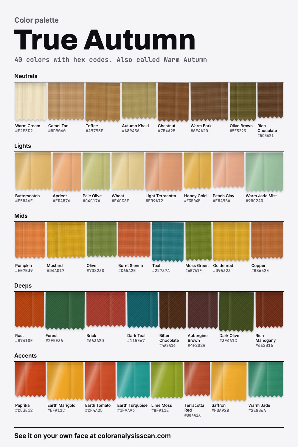
The True Autumn palette
40 colors with hex codes. Also called Warm Autumn. Tap any color to copy its hex code.
Neutrals
Lights
Mids
Deeps
Accents
Nearly everything points the same way
The compass at the top of this page plots all forty colors by hue. Most palettes look like a loose cloud on this kind of chart. This one looks like a compass needle: almost every dot crowds between red and yellow, with a few loners across the middle. 85% of the colors measure warm, the highest share we have, and its average warmth is the highest as well. If you want the shortest possible definition of True Autumn in autumn color analysis, that’s it. Warm above all, and earthy.
Lightness and strength are moderate by comparison. On average the colors are medium in depth and clear without being loud. So this isn’t a palette of pale gold, or of near-black browns. Colors like Pumpkin, Olive and Mustard are in the middle of the scale at real strength. These numbers come from our own hand-picked hexes, not from measuring any person. They’re a way of comparing palettes, and small differences between them mean little.
True Autumn or Warm Autumn?
Two names for one season, most of the time, so what you’ll find here is also a Warm Autumn color palette. We use True Autumn because more people search for it. One system separates them: Agile Styling’s 16 seasons keep True Autumn and add Warm Autumn as a separate flow toward True Spring, lighter and brighter. So if you got your result from an analyst using that method and your fan looks sunnier than this board, that’s why. For most people, the names are interchangeable.
Season names are labels in the end. The standard reference article on color analysis calls the seasons themselves, to some degree, arbitrary, and says someone can sit on the cusp of two. A number of those people will find this page by way of Warm Spring or Deep Autumn, both of which share a good part of this color territory.
Where these colors come from
True Autumn is the season closest to the oldest paint box there is. Ochre, sienna and umber are clays colored mostly by iron and manganese oxides, dug out of the ground and used for millennia. It may be part of why these colors feel familiar together: they share a chemistry.
Ochre
Clay colored by iron oxide, yellow to deep orange or brown.
Mustard, Goldenrod
Raw sienna
An iron-rich earth with some manganese, yellowish brown.
Toffee, Camel Tan
Burnt sienna
The same earth after heating, which turns it reddish brown.
Burnt Sienna, Rust
Umber
More manganese, so darker: greenish to very dark brown.
Olive Brown, Chestnut
That shared origin gives you a useful shopping idea. Anything that looks as if it could have come from clay, rust, dried leaves or spice is likely to belong. Burnt Sienna is even named for the Tuscan pigment, which got its “burnt” from being roasted. A color that looks as if it came from a chemistry set, such as an icy lilac or a fluorescent pink, almost certainly won’t.
Your best colors
The six signature colors give you the fastest test. Pumpkin, Mustard, Olive and Rust are the ones that most clearly show the season, and if those four all look alive on you, the rest of this page probably applies. Add Camel Tan as a neutral and Teal for contrast.
Beyond those: Butterscotch, Wheat and Peach Clay are the light end, good for shirts and for summer. Forest, Brick and Rich Mahogany give you depth. Saffron, Paprika and Earth Marigold are the strongest colors on the board, and they’re easy to wear because your coloring isn’t competing with them. Neutrals here are unusually colorful. Toffee, Autumn Khaki and Chestnut have real color in them, and they’ll bring warmth to whatever else you’re wearing.
The three cool colors allowed in
Look at the far side of the compass. Only 3 colors read cool: Teal, Dark Teal and Earth Turquoise. All are teals, sitting on the green side of blue. This is the color family that gives a warm palette some breathing room, and analysts have recommended deep teals to Autumns since the original books: Carole Jackson’s Autumn list included deep teal alongside brown, burnt orange, olive and maroon. Wearing Teal next to Rust also creates the strongest color contrast you can make with this palette, since those two sit nearly opposite each other.
Can a True Autumn wear black or silver?
Both are poor matches, and our board leaves both out. Black is first on our avoid list because it’s flat and colorless against coloring defined by warmth. Rich Chocolate and Olive Brown give you the same depth with a warmth black can’t offer. Keep black for shoes if you must.
Silver tells a similar story, and here chemistry lends a hand. Silver throws back most of the visible spectrum about evenly, which is why the metal reads white. Copper absorbs green and blue, so it looks orange-red. Gold absorbs at the blue end as well, so it looks reddish-yellow. A warm cloth and a warm metal look warm for the same basic reason: less blue comes back to your eye. Our picks are rich yellow gold, copper and bronze, ideally hammered or antiqued, and Soul of Color suggests trying gold and bronze as a way of spotting this season to begin with. Fourteen-karat gold-copper alloys can look close to certain bronzes, so a mixed stack of the two will read as one family. If you have a silver piece you love, wear it. It simply won’t do what gold does.
The rest of our avoid list is about cold pallor: Icy Blue, Cool Grey and Pastel Pink carry little color and lean cool, so they make warm coloring look yellow next to them. Fuchsia is the exception, strong and still wrong, because it’s a blue-red with nothing earthy in it.
True Autumn or Soft Autumn?
People often get stuck between these two, and the answer is mostly strength. The two palettes share a family and not much else. On average True Autumn is almost twice as vivid, and clearly warmer.
PumpkinMuted Pumpkin
MustardSoft Mustard
RustSoft Rust
OliveSoft Olive
TealMuted Teal
Camel TanSoft Camel
If you’re stuck, look for an Olive top and a dusty sage one. On a True Autumn, the sage tends to look like an apology. On a Soft Autumn, full-strength olive takes over. Soft Autumn vs True Autumn compares the deciding colors directly.
The other neighbors
Deep Autumn is noticeably darker on average. Warm Spring is the neighbor people don’t expect: almost the same warmth, and noticeably lighter. Soul of Color notes that natural redheads often fall into either True Autumn or True Spring, depending on depth and brightness. So if you have copper hair and everything here looks a little heavy, go there next.
What to look for in yourself
Warm undertones, usually with some visible gold, bronze or red: auburn or chestnut hair, warm brown or amber eyes. Soul of Color’s description has skin from deep to medium-light in warm beige, golden or deep olive tones. Golden warmth appears across every depth of skin, so fair examples in magazines shouldn’t put you off. The undertone test checks the warm or cool question on its own, and the season test goes on from there. People typed here are on the True Autumn celebrities page.
A word about the word warm
Your photos and your lamps can make this hard to judge, and the vocabulary doesn’t help. In lighting, a warm white has a low color temperature, around 2700 to 3000 kelvin, while a cool, bluish one is above 5000. In other words, “warm” here is an old artistic association, the exact reverse of the physics of hot objects. For you the practical upshot is this: warm room light flatters warm colors, so everything in your closet will look better at home in the evening than at noon by a window. Judge new things in the daylight, and if you run the scan more than once, use the same light each time.
When a dress code asks for navy or grey
Offices and formal events often assume cool neutrals, which leaves this season looking like it borrowed someone else’s clothes. There are straight swaps. For navy, wear Dark Teal or Forest: they sit at a similar depth, and most people won’t register anything unusual. For grey, wear Warm Bark, Olive Brown or Autumn Khaki. For a white shirt, wear Warm Cream. A Rich Chocolate suit with a cream shirt looks more formal on this coloring than a badly matched charcoal one, and men’s tailoring has offered brown for a very long time, whatever the current fashion.
Hair and makeup
Lips in brick, terracotta and warm cinnamon. Cheeks in warm apricot or soft terracotta. Copper, bronze, moss and warm brown on the eyes. A true red lipstick needs to lean orange to suit this palette. For hair, chestnut, auburn and caramel come out on top, and Soul of Color warns against very cool options like platinum blonde or an ash brown.
A first True Autumn capsule
Camel Tan
Warm Bark
Olive Brown
Rust
Warm Cream
Pumpkin
Teal
Mustard
Chestnut
Toffee
When you shop, ignore the season of the catalog. Autumn collections are where this palette lives, so it pays to stock up then, since spring racks tend to have little for you beyond some khaki. Natural fibers with visible texture, such as corduroy, tweed, suede and linen, help these colors along. Patterns like paisley or a warm tartan can tie several of them together in a single piece. The Full Color Report describes a personal version of this plan. The family page is here, and all twelve palettes are one click away.
Related guides and tools
Sources
Full Color Report
Black is on the True Autumn avoid list. Here's why.
The answer is in the report.
$19one time. No subscription.
An in-person color analysis costs about $200 to $600. See a cost guide
Full Color Report
True Autumn
Personal palette
Metals
Yellow gold, copper and bronze
Makeup
Brick, terracotta and warm cinnamon.
What's included
- Fifteen AI pictures of you: 3 best colors beside 3 worst, your lead color, 3 hair colors, day and evening makeup, 2 outfits, and glasses with jewelry
- What we measured on your face: undertone, depth, clarity and contrast, and how close your second season was
- Your full palette of about 40 named colors, with hex codes and how to use each group
- Your colors to avoid, why, and how to wear them away from your face
- Makeup from foundation to nails: lips, blush, eyeshadow, liner and brows, with a day and an evening look
- Hair colors to choose and to skip, and what to say to your colorist
- Metals, jewelry, glasses frames and leathers in your colors
- Your contrast level, your white and your black, suit and coat colors, prints, fabrics and denim
- A capsule wardrobe as outfit formulas, every piece in your colors
- A shopping guide: the color names to search for and the label words to skip
- The "Does this suit me?" checker for anything you might buy
- Your second season, and when to borrow from it
- A PDF of the whole report, a swatch card, a phone wallpaper and a share card, saved to your account
Common questions
- What is a True Autumn?
- A coloring described as warm above all, with an earthy, golden or bronze quality. The palette holds spice, moss, rust and gold, and by our numbers it is the warmest of the twelve we publish.
- Is Warm Autumn the same as True Autumn?
- Generally, yes: 12-season charts pick one name or the other. Agile Styling's 16-season method keeps both, with Warm Autumn as a lighter, brighter flow toward True Spring, so check your chart if your fan looks different from this board.
- What are the best colors for a True Autumn?
- Pumpkin, mustard, olive, rust, teal and camel tan are the six to start with. For depth, try forest, brick and rich mahogany. For light colors, try butterscotch, wheat and warm cream.
- Can a True Autumn wear black?
- It's on our avoid list, mainly because it's flat and colorless next to golden coloring. Rich chocolate or olive brown gives you the same depth. Black shoes or a black skirt, away from the face, are a much smaller issue.
- Can a True Autumn wear silver?
- It works better for other seasons. Yellow gold, copper and bronze echo the warmth in your skin and hair, and hammered or antiqued finishes suit them. A favorite silver piece won't hurt, but it won't do what gold does for you.
- What's the difference between True Autumn and Warm Spring?
- Not temperature: the two palettes are almost level. Warm Spring is noticeably lighter on average, and fresher. If rust and bark feel heavy on you and coral and marigold feel right, look at Warm Spring.

See which colors are yours.
See your colors on your own face, compare seasons side by side, and get your season, your undertone and a starter palette.