Warm Spring color palette (True Spring): golden, fresh colors
Usually also called True Spring. Golden, fresh and strong, with the fewest muted colors of the twelve: this is the palette for people who look alive in yellow.
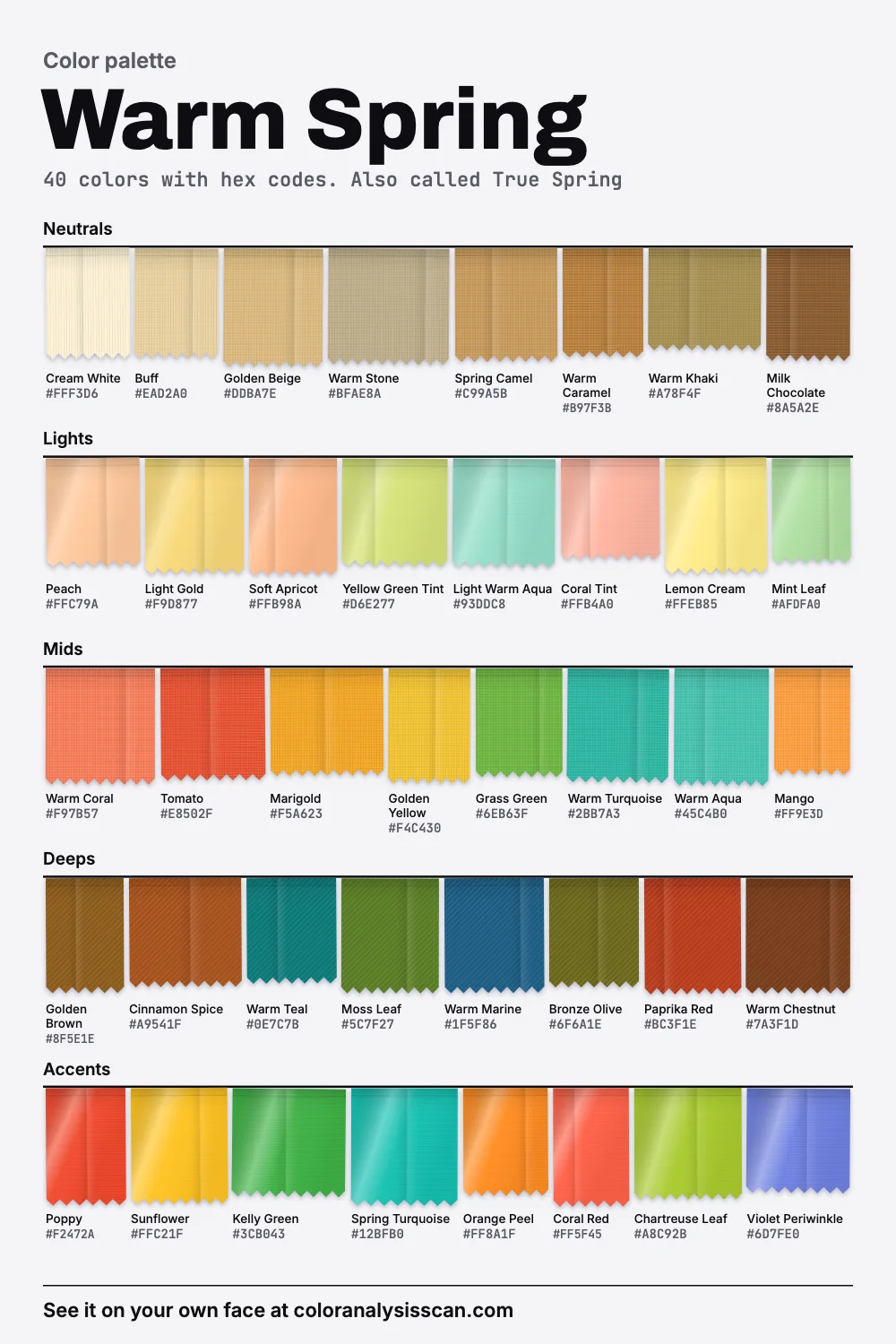
The Warm Spring palette
40 colors with hex codes. Also called True Spring. Tap any color to copy its hex code.
Neutrals
Lights
Mids
Deeps
Accents
Warm and clean, at the same time
Warm colors usually come with some earth in them. Think of camel, rust, moss. What sets Warm Spring apart is warmth without the earth. The plot at the top of this page shows it: a tight spread of forty dots in the warm, strong corner, with the grey ghost of Soft Summer low down for comparison. Only 5% of the palette counts as muted, the lowest share of the twelve, meaning just two colors out of forty: Cream White and Warm Stone. Everything else carries real color.
Warmth is also near the top, second only to True Autumn. 45% of the colors are vivid, and on average it’s the third most vivid palette of the twelve. In lightness it sits above the middle but isn’t pale. These come from our own board, computed from the hexes, so they describe a set of colors and leave your face out of it. When two values are close, treat them as level.
Warm Spring or True Spring?
In most charts they mean the same thing, the spring whose defining trait is warmth, so a True Spring color palette and a Warm Spring one should overlap heavily. We lead with Warm Spring because that’s the name most people use. One notable exception is Agile Styling’s 16-season method. There, True Spring stays lighter and clearer, and a separate Warm Spring leans toward autumn, a little darker and softer, with room for brown eyes and brown hair. If your analyst used that method, check your fan against this board.
Your neutrals are colors
This is the most useful thing we found in the numbers. Neutrals in our Warm Spring palette carry more color than any other neutral group of the twelve. They’re colorful enough to count as colors in another palette, and it makes dressing this season very different from what most wardrobe advice assumes.
Most capsule wardrobes are built on navy, grey and black, on the assumption that a neutral should disappear. Here, that advice backfires. Golden Beige, Spring Camel, Warm Caramel and Milk Chocolate are doing something: they’re carrying warmth to your face. Buff and Cream White do it at the light end. If you put a Warm Coral top with Spring Camel trousers, you’ve got two colors speaking to each other. With black or cool grey, you’d have one color and a void, and both of those are on our avoid list. Black has no warmth to answer your skin, and Cool Grey cancels the glow. Our replacement for the dark end is Milk Chocolate or Warm Chestnut.
The yellow test
Yellow may be the most divisive color in a wardrobe, and plenty of people struggle with strong yellow near the face. Soul of Color suggests using this as a test for True Spring: many other seasons don’t get along with yellow, while on this one it can make you come alive. So grab anything close to Golden Yellow or Sunflower and hold it under your chin by a window. If your skin looks clear and your eyes look brighter, you have a strong clue. If you look jaundiced, try another season. The scan reads your own face and shows your season and colors beside your photo. It’s a guide, not a substitute for real cloth in real daylight.
Warm Spring or True Autumn?
These are the two warmest palettes we have, and they’re nearly tied. Their warmth is almost the same, so temperature can’t separate you. Depth can, along with a little strength: Warm Spring is noticeably lighter, and a little more vivid. And the muted shares are almost the same, 5% and 7.5%. So both can wear warm colors at real strength. The difference is whether your colors are lit by morning or evening.
To check, try a color from each end of a line. If Marigold looks right and Goldenrod goes heavy, you’re here. If the reverse, you belong with the True Autumn palette. Soul of Color observes that natural redheads usually land on one side or the other of this line, according to depth and brightness.
Your other neighbors
Light Spring is a good deal paler and softer in strength. If everything here feels a bit loud, try that. Bright Spring is stronger and much less warm, with real darks and some cold accents. If you have strong contrast between your hair, eyes and skin, and you like Violet Periwinkle more than Warm Khaki, try that one.
Who wears it
The description Soul of Color gives is a warm glow in skin, hair and eyes. Darker blonde, light brown and red hair are all common, with eyes in green, hazel, light brown or blue. It adds that skin can be fair or tan, as long as it’s warm with a slight brightness. We would add that golden warmth occurs on medium and deep skin as well, and a warm glow doesn’t require a tan. Check it with the season test, which reads your skin, hair and eyes and then has you compare colors yourself.
Sunset selfies will lie to you
One practical warning for anyone self-typing as a warm season. The golden hours near sunrise and sunset have a low color temperature, because the atmosphere scatters blue out of the direct light. A phone will partly correct for that, through its white balance, and partly not. Photos in that light add warmth to everyone, and in lamplight even more so. It’s easy to type yourself Warm Spring from a picture taken in lovely light. To check, look at the white of your eyes or a sheet of plain paper in the frame. If they’re yellow, so is everything else.
Wearing the rest of the board
Try the signature six first: Warm Coral, Golden Yellow, Grass Green, Warm Turquoise, Spring Camel and Mango. Turquoise is the one that tends to surprise people, as it’s the only real cool note you need. 17.5% of the board measures cool, nearly all of it teals and turquoises plus the odd Violet Periwinkle. They’re there because a warm palette looks warmer with a little of its opposite beside it. Lights such as Peach, Light Gold and Mint Leaf are for shirts and summer dresses. Deeps such as Cinnamon Spice, Warm Teal and Paprika Red replace your evening colors.
On the avoid list, Magenta is the strongest, and it’s a hard blue-red. Dusty Rose fails by being grey and cool at once. Icy Blue is so pale and cold that warm skin can read sallow beside it.
Wearing this to work
This is the real challenge. Office clothes are built around exactly the colors on your avoid list, and a tomato red suit isn’t an answer. The trick is to treat Spring Camel and Milk Chocolate the way everyone else treats grey and navy. A Warm Khaki blazer, Milk Chocolate trousers and a Cream White shirt pass anywhere, and you can add one strong note at the collar: a Warm Turquoise silk scarf, or a Warm Coral shell under the jacket. Warm Marine is your closest thing to navy, a blue with enough green in it to sit with the rest of the board. If your workplace does insist on black or grey, wear your own colors at the neckline.
Bright gold, coral lips
Bright yellow gold comes first, then polished copper. Silver tends to look thin here. Our makeup starting points are warm coral, tomato red and golden peach on the lips, peach or warm apricot blush, and golden brown, bronze and warm olive around the eyes. Teal eyeliner makes a nice color note: it’s one of the few places a cool tone goes straight next to the iris, and warm brown and hazel eyes tend to take it well.
Celebrities commonly typed as Warm Spring or True Spring
Soul of Color files this season under True Spring, so that’s the name to look for on its page. The list includes Amy Adams, Blake Lively, Isla Fisher, Jennifer Lawrence, Kylie Minogue, Léa Seydoux, Lily Cole, Maya Hawke and Sadie Sink, along with Brad Pitt, Ed Sheeran, Owen Wilson and Prince Harry. The source says plainly that none of these are verified and that photos alone make it hard to tell.
A small example of how shaky this is: Matt Damon appears on that site’s True Spring list and also on its Soft Summer list. Those two palettes could hardly be further apart on strength: in our numbers Warm Spring is about three times as vivid as Soft Summer. Hair color changes for film roles and fades with age, so a typing that holds for one photo may not hold for the next. Use names to get a rough feel for the look, and nothing more.
Shopping, and a starter wardrobe
Search terms help: “marigold”, “coral”, “turquoise” and “kelly” tend to land closer than “mustard” and “rust”. Avoid anything labeled vintage, washed or dusty. Cotton, linen and shiny silks suit this palette better than heavy matte wool. Resort and beachwear collections often have the clean warm colors you need. Compare a beige with Cream White: if it looks grey or pink next to it, leave it.
Start with seven: a spring camel coat, milk chocolate trousers, a cream white shirt, a warm coral knit, a warm turquoise top, a golden yellow scarf and warm caramel shoes. The other springs live on the spring palette page, the palettes hub has all twelve, and the Full Color Report explains what a personal version would include.
Related guides and tools
Sources
Full Color Report
Black is on the Warm Spring avoid list. Here's why.
The answer is in the report.
$19one time. No subscription.
An in-person color analysis costs about $200 to $600. See a cost guide
Full Color Report
Warm Spring

Personal palette
Metals
Yellow gold and copper
Makeup
Warm coral, tomato red and golden peach.
What's included
- Fifteen AI pictures of you: 3 best colors beside 3 worst, your lead color, 3 hair colors, day and evening makeup, 2 outfits, and glasses with jewelry
- What we measured on your face: undertone, depth, clarity and contrast, and how close your second season was
- Your full palette of about 40 named colors, with hex codes and how to use each group
- Your colors to avoid, why, and how to wear them away from your face
- Makeup from foundation to nails: lips, blush, eyeshadow, liner and brows, with a day and an evening look
- Hair colors to choose and to skip, and what to say to your colorist
- Metals, jewelry, glasses frames and leathers in your colors
- Your contrast level, your white and your black, suit and coat colors, prints, fabrics and denim
- A capsule wardrobe as outfit formulas, every piece in your colors
- A shopping guide: the color names to search for and the label words to skip
- The "Does this suit me?" checker for anything you might buy
- Your second season, and when to borrow from it
- A PDF of the whole report, a swatch card, a phone wallpaper and a share card, saved to your account
Common questions
- What is a Warm Spring?
- Warm first and clear second, with a golden glow to skin, hair and eyes. Warm Spring colors are sunny and fresh: coral, marigold, grass green and turquoise, with camel and milk chocolate standing in for grey and black.
- Is True Spring the same as Warm Spring?
- In most 12-season charts, yes. Agile Styling's 16-season method treats them as two seasons: True Spring lighter and clearer, Warm Spring slightly darker and softer with an autumn influence. Check which system gave you your result.
- What are the best neutrals for a Warm Spring?
- Golden beige, spring camel, warm caramel and milk chocolate, plus cream white in place of white. They have more color in them than neutrals in any of our other palettes, so they bring warmth to the face where grey or navy wouldn't.
- Can a Warm Spring wear black?
- It's on our avoid list because it has no warmth to answer golden skin, which can look tired beside it. Milk chocolate or warm chestnut gives you a dark anchor. If you wear black, keep it away from the face.
- What is the difference between Warm Spring and True Autumn?
- Their warmth is nearly level in our palettes. Warm Spring is noticeably lighter and somewhat stronger, while True Autumn is deeper and earthier. Compare marigold with goldenrod under your chin to see which one lifts you.
- Why do I look good in yellow?
- Strong yellow is rare on most palettes and common on spring ones. If yellow makes your skin look clear and your eyes bright in daylight, that suggests a warm, clear coloring. Warm Spring is a good first candidate, but test Bright Spring and Light Spring too.

See which colors are yours.
See your colors on your own face, compare seasons side by side, and get your season, your undertone and a starter palette.