Is color analysis real? What the evidence actually shows
Is color analysis real? Partly. Color near your face really does change how your skin looks. The four seasons are a convention, and we found no study showing that a season assigned to you beats any other palette. Here's what each claim rests on, ours included.
Supported
Measured, and repeatable by others
Plausible
Some evidence, none of it settling
Untested
We found no test at all
The honest split
Most pages on this question are written by someone selling a session, or by someone who has already decided it’s nonsense. We sell a report too, so weigh what follows with that in mind. The board above sorts each claim by how much stands behind it. It’s our own sorting, from the sources at the end, and a claim can move as studies appear. “Untested” means we found no test, not that the claim is false.
What’s real: color changes how skin looks
Two separate things happen when you hold fabric under your chin, and both are well established.
Your eye compares neighbors
In the 1820s Michel Eugène Chevreul ran the dye works at the Gobelins tapestry factory in Paris. He was brought in over complaints about the dyes. He found some of them deficient, but the often-criticized black was first-rate. What people objected to was partly optical: a color appears to shift toward the opposite of its neighbor. He called this simultaneous contrast and published it in 1839. It isn’t obscure, and you can test it on the screen in front of you.
Chevreul went further than most people know, in a passage almost nobody quotes. He applied it to complexions, and his 1839 book has a section on “the colours of the complexion and the contiguous drapery”. Rose-red, he wrote, can’t sit next to even the rosiest complexion without costing it some freshness, because it pushes the skin toward green. Delicate green does the reverse for fair skin lacking in rose. He gives readers a test with sheets of colored paper. That’s 141 years before Color Me Beautiful, and it’s closer to a real mechanism than most of what came later.
Light bounces off cloth onto skin
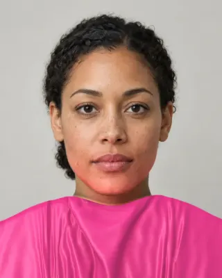
Chevreul separated this out too: the “coloured rays” from a headdress, “reflected on the skin”, tinge it with their own color. Vision science now calls it mutual illumination. In 1999, Bloj, Kersten and Hurlbert folded a card with magenta on one side and white on the other, so the magenta side lit the white one. The white side looked pale pink when people saw the fold as concave, and deep magenta when the same card appeared convex. Their conclusion is that the visual system already takes this bounced light into account, early on.
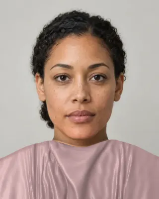
Teal: #B5906C at the edge, almost identical from the skin above
Mustard: #CA9469 at the edge, close from the skin above
Fuchsia: #C88B6D at the edge, close from the skin above
So when an analyst flips a drape and your skin seems to change, it isn’t a trick of suggestion alone. Stephen and colleagues also showed in 2009 that observers adjust the redness of a face to make it look healthier, so people do notice skin color at this scale. None of that study involved fabric, and it shouldn’t be stretched to cover it.
What’s tradition: the seasons
The step from “color changes skin” to “you are a Soft Autumn” is much longer, and it wasn’t taken in a laboratory. Here is the lineage as far as we could check it.
- Robert Dorr (1905 to 1979), an American artist and later a consultant to cosmetics firms, is credited with noticing in 1928 that paints with a shared undertone looked harmonious. His Color Key System split complexions into Key I, cool and blue, and Key II, warm and yellow. Copies of the same encyclopedia text disagree on whether the 1928 paints were green or blue against yellow, so treat that detail loosely.
- Johannes Itten (1888 to 1967), who taught at the Bauhaus from 1919, linked “subjective” color preferences to four seasonal types of people in The Art of Color (1961). He rated subjective color lower than objective color, and the idea grew out of his teaching.
- Suzanne Caygill (1911 to 1994) turned to color in 1945. A 1980 newspaper article says she had worked mainly in California for over 30 years, assigning seasons with subtypes inside each. Her book Color: The Essence of You tied color to personality.
- Bernice Kentner published Color Me a Season in 1978, arguing that skin rather than hair or eyes sets the season.
- Carole Jackson published Color Me Beautiful in 1980. It reached a 31st printing by 1983, and it’s the version most people mean. Jackson herself called the seasons a convenient artifice, and said “Type A” and “Type B” would have done, only less poetically.
Encyclopedia editors reach the same place: the seasons are “to some degree, arbitrary”, and the field stays contested because anyone can call themselves an analyst without standard training. The full timeline is on the seasonal color analysis page.
What we searched, and what we found
We found no peer-reviewed study that assigns people to seasons and then tests whether their assigned palette beats another one. That is a statement about our search. It doesn’t mean no such study exists. Here is the search, run on November 4, 2026, so you can repeat it.
| Where | Terms | Records | What turned up |
|---|---|---|---|
| PubMed, title or abstract | seasonal color or colour analysis; personal color or colour; color or colour draping | 0 | Nothing |
| PubMed, title or abstract | clothing color or colour, with skin or face | 5 | Three on clothing with attractiveness or skin tone, none testing seasons |
| OpenAlex, title | “personal color” | 146 | Korean and Japanese beauty journals, some engineering. Mostly applications and classifiers |
| OpenAlex, title | “personal colour” | 8 | Including one lipstick study, one on fashion forecasting and an app paper |
| OpenAlex, title | “seasonal color” | 48 | Mostly leaves, frogs and Mars, with a handful on people |
We read abstracts for the papers on people, plus two full texts. We couldn’t search Google Scholar, Web of Science or Scopus, and much of the Korean and Japanese work is available only as an abstract to us. So someone with better access may do better. We’re not alone in noticing the gap, though. Perrett and Sprengelmeyer wrote in 2021 that stylists’ categories “are not defined scientifically”, that advised colors are inconsistent, and that this may explain “the lack of formal tests”.
The closest tests we could find
None of these validates seasonal typing. Each one touches a piece of it, and they don’t all point the same way.
- For it. Nonaka and colleagues (2023) photographed six people in colors one professional called their best and worst, and asked 30 university students to rate the pictures. They picked the pro’s best colors as attractive, and the worst as unattractive, more often than chance. Even with the clothing cropped out, the face in the best color did better. The students’ own favorite colors didn’t explain it. This is the most interesting result we found, and it’s small: a conference abstract, one professional, six sitters. The authors wonder whether wearers in their best color simply look happier, which is its own kind of answer.
- Against skin as the key. Perrett (2023) altered faces digitally to tease apart skin, hair and eyes. Iris color dominated people’s clothing choices and skin had little influence, even when they were told to match the skin. He concludes that the emphasis on skin “may be misplaced”.
- For warm and cool, in part. The 2021 experiments found observers matched cool blues to fair faces and warm oranges and reds to tanned ones, on 12 White women’s faces.
- Clothing does shift skin. Zhang and colleagues (2025) tried 22 plain sweatshirts in a real viewing setup. Lower-lightness clothing made faces look fairer, in work aimed at young Chinese consumers. We’ve read the abstract only, and it measures fairness, which is not the same as flattering.
- Warm and cool hold up better than seasons. Kawase and colleagues (2025) trained a classifier on how five Japanese influencers sorted lipsticks. It could recover yellow-base against blue-base at .82 accuracy, and the four seasons at only .65, with the seasons overlapping heavily. They call the seasons looser, culturally elaborated categories. Note that it tests lipstick labels, not people.
- Systems versus their own claims. Cassidy (2012) found that personal color systems all claimed to rest on hue, saturation and value, yet those were rarely applied to the individual palettes.
- No effect on self-concept. A 1985 thesis by Little compared 186 female students with and without color analysis instruction, on ten measures of self-concept. None of its tests reached significance. It’s one old thesis, and it speaks only to the instruction it gave.
Why do analysts disagree?
Because they’re using different systems, in different light, with different fabrics. That part has numbers. Cha, Bang and Kim put women through the UK, Japanese, Korean and German drape systems in 2012 and compared the diagnoses. Agreement ran from 64.5% between the Korean and Japanese systems to 83% between the UK and German ones. In a companion paper, 200 Korean women in their 20s were typed in all four and measured with a spectrophotometer. The systems separated people on different measurements, and the Korean system’s Winters had the highest yellowness of all, which the authors point out contradicts the theory.
Even the basics aren’t settled. House of Colour says natural daylight gives the most accurate results. A 12-tone analyst in Kentucky says natural daylight is “disturbingly variable” and uses full-spectrum lamps with a grey cape. Both are reasonable, and both are selling a session. A 2018 Korean paper says it plainly: the field’s measuring system is “a sensory test with no industry standard”. So two honest analysts can reach two answers, and neither has a reference to check against.
The fair criticism: early systems failed darker skin
This is real, and it goes back to the beginning. Chevreul’s 1839 chapter opens with two types of “skins more or less white and rosy”, and gives other women a few lines at the end in language we won’t repeat. In 1980, the same assumption was still there. Later critics say Color Me Beautiful focused mostly on white readers and put all people of color into Winter. The Good Trade says Jackson analyzes white women “almost exclusively”. We haven’t read a first edition against these claims, and they come from later commentary, so we’re reporting them as criticism. They are consistent with each other. A 2017 analyst’s post also complains that some systems still automatically place dark skin in Dark Winter.
The problem has been noticed for a long time. Women of Color by Darlene Mathis, with a foreword by Jackson, appeared in 1994. Korean practice rests on eight types built from Fujii and von Alten (1992), on the argument that hair and eye color vary less among its clients. Those fixes point to the same flaw: a chart built around one kind of face reads everyone else as an exception.
There’s a technical side too, and we’ve run into it. A rule such as “low contrast between hair and skin means Soft” makes nearly every deep complexion Soft. A rule that treats dark skin as Deep makes nearly every deep complexion Deep. So our engine measures temperature against what’s typical at your own skin depth, and it adds the contrast of the white of the eye against the iris. It also leans on color rounds where the camera can’t tell. That design is an attempt to fix the old flaw, and it hasn’t been proven to work.
Our own limits
You should hear this from us, in plain words:
- Nobody has tested our scan on real people in varied light. The numbers we quote elsewhere come from simulated light on fictional portraits.
- Deep skin is our weakest area. No test portrait is deeper than about Monk tone 6, so scan readings at the deep end are least proven, and the color rounds carry more of the decision there.
- Our 12 palettes were hand-built, about 480 colors, and checked against each season’s traditional traits by the numbers. No color consultant has reviewed them. They are a styling convention with arithmetic on top, like every other chart.
- Our scan shows colors beside your photo and draws nothing on your face, so it can’t reproduce the light real fabric throws in a room.
- We can’t tell you that you “are” a season. Nobody can. We can tell you which colors won when you compared them.
Why do apps give different results?
Mostly because a photo isn’t a measurement. One App Store reviewer described getting Cool Summer, Light Spring, Warm Spring and Soft Autumn from Dressika. The developer’s reply is worth reading, since it’s honest: different results from different photos are normal, because you can take a photo in warm or cool tones by adjusting the camera or the light. That’s the core problem with any selfie reading, and the AI color analysis page goes through it with numbers.
So is it worth doing?
We think so, if you treat it as a structured way of looking rather than a fact about you. Comparing warm against cool and soft against bright under your own chin teaches you something, and a wardrobe with fewer colors that work together is useful even if the season name is a story. It stops being worth it when a label costs you a color you love or a few hundred dollars you needed. An in-person session has real value as an experience and as a trained opinion. What it costs is on its own page.
You can run a fair test of your own for free. It works for any tool, including ours:
- Pick the two seasons you’re deciding between, and three tops from each, without telling anyone which is which.
- Take a plain photo in each, in the same indirect daylight, cropped to your face and neckline.
- Send the photos, shuffled, to three people who haven’t heard your result. Ask which photos make you look most awake.
- See whether the winners cluster in one season. If they don’t, the label isn’t doing much for you, and you can keep whichever colors won.
For a quicker version, the undertone test takes on the one axis with the best support. The scan reads your skin, eyes and hair from your camera, corrects the light with white paper, shows your season, palette and colors beside your photo, and tells you how sure it is. Our methods are on the methodology page.
Related guides and tools
Sources
- Color analysis
- Carole Jackson
- Bernice Kentner
- Johannes Itten
- Michel Eugène Chevreul
- The laws of contrast of colour and their application to the arts, paragraphs 498 to 544. Trans. John Spanton (1861), from the 1839 French
- Consultants help decide which color are best for you. Evelyn Radcliffe
- Color: The Essence of You. Suzanne Caygill (Celestial Arts, 1980), digitized record
- Perception of three-dimensional shape influences colour perception through mutual illumination. Bloj MG, Kersten D, Hurlbert AC
- Contrast effect
- Skin blood perfusion and oxygenation colour affect perceived human health. Stephen ID et al.
- Eye color is more important than skin color for clothing color aesthetics. Perrett DI
- Clothing aesthetics: consistent colour choices to match fair and tanned skin tones. Perrett DI, Sprengelmeyer R
- Effects of personal color on attractiveness ratings. Nonaka Y, Ogino M, Kondo A, Watanabe K
- The impact of clothing colour on skin tone perception and consumer preference. Zhang Q, Chen Z, Tian B, Guan Y, Liu Q
- Personal colour between perceptual space and social practice. Kawase A, Adachi J, Nagashima K
- Personal colour analysis, consumer colour preferences and colour forecasting for the fashion and textile industries. Cassidy TD
- An exploratory study of the effects of color analysis in clothing selection on the self-concept of individuals. Little S
- Comparative analysis of diagnostic results of domestic and foreign personal color systems: UK, Japanese, Korean, German. Cha HY, Bang HJ, Kim JH
- A comparative analysis of the skin color according to seasonal types in personal color systems. Cha HY, Kim JH
- Research of quantitative modeling that classify personal color skin tone. Kim YH, Oh YS, Lee JH
- How to use seasonal color analysis in your wardrobe. Natalie Gale
- Color analysis for people of color
- Women of color: the multicultural guide to fashion and beauty. Darlene Mathis, foreword by Carole Jackson (catalog record, read through a search excerpt)
- Color analysis service
- Personal color analysis
- Color Analysis: Dressika
The Full Color Report: $19one time
You in your best and worst colors, about 40 colors with hex codes, makeup, hair and a capsule wardrobe plan.
See a sample reportCommon questions
- Is color analysis a scam?
- We wouldn't use that word. The optical effects are real and most analysts believe in their work. The weak part is the claim that you have one fixed season that science can identify. Pay for it if you value a trained opinion and a good afternoon, not because a lab proved it.
- Is there any science behind seasonal color analysis?
- There's science behind the ingredients: simultaneous contrast, reflected light and color measurement. We found none behind the final step of sorting people into seasons and testing that the sorted palette works better. A few small studies come close.
- Was color analysis racist?
- Early systems were built around white readers, and later critics say Color Me Beautiful put people of color into Winter. Whatever the intent, the outcome failed many people. Deep skin occurs in every season on any fair reading, and a tool that treats depth as a season is repeating the old mistake.
- Why did two analysts give me different seasons?
- They may use different systems, light and fabric, and there's no shared standard. Measured agreement between four national drape systems ran from 64.5% to 83% in one Korean study. Different answers don't prove that either analyst was careless.
- Does color analysis work on men?
- The optics apply to any face. House of Colour stylists do sell men's sessions, and our tools don't ask your gender. The studies we found mostly used women's faces, so there's even less evidence for men.
- Is your own tool scientifically validated?
- No. Our scan uses real measurement and published skin data, and it hasn't been tested on real people yet. We describe it as a structured comparison ending in your own judgment, and the page you are reading lists what we haven't proven.

See which colors are yours.
See your colors on your own face, compare seasons side by side, and get your season, your undertone and a starter palette.