Exactly what is free, and where it stops
People searching for a free color analysis have usually met the other kind: a long quiz, then an email box, then a trial. So here is the whole offer in one table. Nothing in the left column asks for an email, an account or a card, and you can run it as many times as you want.
| Free, on this page | Full Color Report, $19 one time |
|---|---|
|
|
The other tools on the site are free too: the quiz, the undertone test, and every season palette with its hex codes.
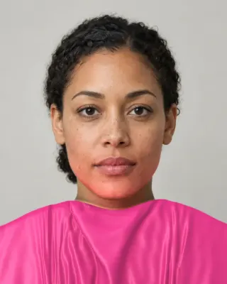
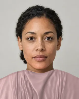
The catch is simple, so we’ll say it: we hope some of you buy the report. That’s why it appears right under your season, with your own picture tinted in its preview. Scroll past it and the rest of your result is there.
What “free” means elsewhere
A free tool that leads to a paid plan is a normal business, and some of these plans may suit you better than ours. You just want to know the terms before you answer thirty questions. These are the published ones we could check:
- color-analysis.app. Its terms, as we read them on 4 November 2026, describe a 7-day trial for $1.00 that converts to the selected plan. Their worked example: $1.00 for days 1 to 7, then $14.99 a month. They also list weekly plans from $9.99 to $14.99.
- Three apps, as FaceRater lists them. FaceRater’s comparison, dated 17 October 2026, has Dressika as a free download with plans from $4.49 to $40, Palette Hunt at $19, $29 or $59 on the web and $12.99 a week or $69.99 a year in the app, and My Best Colors as free with ads and $14.99 for lifetime premium. FaceRater runs its own tool, and prices move, so check each listing yourself.
- A person. One published cost guide puts an in-person session with a trained analyst at USD 200 to 600 and a virtual one at USD 100 to 300. Sterling Style Academy, which sells training and sessions, gives its own New York range as $200 to $600. More in how much a color analysis costs.
Before you start any free tool, these four questions save time:
- Does it show the season itself before it asks for an email?
- Does the result need a trial or a card?
- If there’s a trial, what does it renew at, and when?
- Does it tell you what came second? A single confident name tells you less than two close ones.
How to take a photo that reads well
The tool only needs one picture, and it’s forgiving about framing. Light is what it can’t fix afterwards. A camera decides for itself what white looks like in every shot, a process called white balance, and a wrong guess shifts every color in the picture, your skin included.
Facing a window
Good
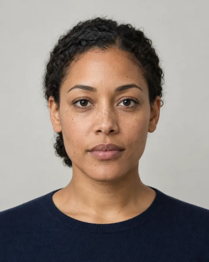
Even daylight on your face and a plain wall. The one to aim for.
With something white in view
Good
A pale wall or white shirt gives the tool a possible white to correct from.
Under a warm bulb
Read, but misleading
It gets read, and reads warmer than you are. The light estimate only pulls it part of the way back.
Through a filter
Read, but misleading
It gets read, and nothing can tell the filter from your skin. Use the original.
Flash or hard sun
Asks for another
Your skin is washed out by the light
A dim room
Asks for another
This photo is too dark to read
Too far away
Asks for another
Your face is quite small here
Two people
Asks for another
There's more than one person here
- Face a window, in daylight. It’s the broadest light most people have at home. Stand so that it falls on your whole face, not one side.
- Keep a plain, pale background. With no paper in the picture, the tool estimates the light from what surrounds your face. A green or orange wall drags that estimate with it, and white or pale grey helps it. A white shirt or wall in the frame may even be picked up as a reference.
- Turn off filters and beauty modes. This is the one problem the tool can’t detect. A filter looks exactly like different skin. If your phone smooths faces by default, look for the original.
- Wear little or no makeup. Foundation is a color laid over the skin being read, and lipstick changes how fabric looks next to you.
- Show some hair. Hair helps set your depth. If the read can’t place it, the result leaves it out and says so.
- Use a recent photo of you alone. A tan from two summers ago or a friend in the frame won’t help.
If the picture can’t be read, you get a plain message and a way forward, either another photo or our example person. The checks are for no face, more than one face, a face under about an eighth of the picture’s width, too little light, and light so strong that your skin has lost its detail. We don’t reject a picture for anything else. So a photo under a warm bulb goes straight through, and it’s up to you to avoid it.
What the tool does with your picture
- It places a face model on your photo to find where your eyes, cheeks, forehead, jaw and hairline are.
- It looks for something white outside your face. If there’s a bright, even, neutral patch, it corrects from that. If there isn’t, it estimates the light from the rest of the picture and your eye whites, and pulls that correction back by half because the estimate is rough.
- It samples your iris, eye white and skin, and your hair just above the hairline, trimming highlights and shadows, and shows you each one as it goes.
- It places those colors on three scales: temperature, value and clarity. Because no sheet of paper was involved, it trusts its own temperature reading less.
- That’s why your choices matter here. It shows pairs of colors beside your photo, chosen to separate your closest seasons, for five to eight rounds. Nothing is drawn on your face. A few consistent picks can overturn the first reading.
- You get the result, with the offer straight after it.
For where pictures go and what we keep, read the privacy page. The method itself is explained on the methodology page, and our AI color analysis guide covers how tools like this differ.
Photo or live camera: which should you use?
Use whichever you’ll actually do. The differences are real, though, and it’s worth knowing them.
| Photo | Live camera | |
|---|---|---|
| White reference | Only if the picture happens to contain one. Otherwise an estimate. | A sheet of paper you hold up, with a before and after. Skippable. |
| Brightness correction | Usually none | From the paper, when you use it |
| Frames read | One | Several, so one blink can’t decide |
| Help with framing | A message afterwards | Guidance as you move |
| Color rounds | Drawn on your still picture | Drawn on you, following your head |
| Works when | You have a good picture, or no camera | You’re somewhere with decent light |
We tested how much the white reference matters, and the honest version of that test is narrow. We took six fictional portraits, simulated different light on them in code, and checked whether each kept the season it read in neutral light. It measures steadiness, not whether anyone was typed correctly. Nothing here has been run on real people yet.
White paper in the picture
the live scan's paper step
69% same, 94% same or neighboring
No paper, plain grey wall
a photo in a friendly room
52% same, 77% same or neighboring
No paper, orange-beige wall
a photo in a difficult room
31% same, 61% same or neighboring
No correction at all
what the camera handed over
28% same, 76% same or neighboring
With paper, a portrait kept its season in 69% of runs. A photo on a plain grey wall managed 52%, and an orange-beige wall dropped it to 31%. So a good photo works, the room behind you matters more than people expect, and the paper does something a photo can’t. If your first result feels wrong, try again on your camera with a sheet of printer paper before you doubt yourself.
What a free result can’t give you
Nobody is looking at you. An analyst brings real fabric, a mirror and a trained eye, and can argue with you about a close call. House of Colour, for one, only works in person, in natural daylight, and that has a real advantage: fabric throws real light on your face, and ours only shows colors beside your photo. Your screen also has its own opinion about color. And the seasons themselves are a styling convention, so no tool of any price can measure your “true” one.
What you can do for free is run it twice, in different light, and see what holds. Two results that agree are worth more than one confident one. If they land on neighbors, hold a color from each palette under your chin in daylight. Once you trust the answer, the sample report shows what the paid version adds, and the pricing page has the full list. Prefer an app? We compare those separately.