Cool Winter color palette (True Winter): icy, blue-based colors
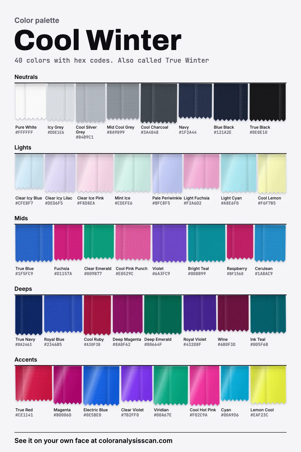
Usually also known as True Winter. Icy and saturated at once, full of blue, with the whole range from pure white to black. Every color here has a hex code to copy.
The Cool Winter palette
40 colors with hex codes. Also called True Winter. Tap any color to copy its hex code.
Neutrals
Lights
Mids
Deeps
Accents
Three measures that define it
Plenty of seasons get described in moods. This one lends itself to measurement, so here it is in the three dimensions Munsell set out over a century ago. Hue is the basic color family, value is how light or dark, and strength is how far from grey.
- Temperature
- 50%
- measure cool, against 27.5% warm. 9 of the 40 are clearly blue to violet.
- Value
- Full range
- From pure white down to true black, end to end.
- Strength
- Clear
- on average, with vivid accents and neutrals that carry almost no color.
Read together, those say something specific. The palette is cool in hue, enormous in value and strong in color, and it gets those at the same time. Half the colors read as measurably cool. Its span from light to dark is the second widest of the twelve, just behind Bright Winter’s. The Concept Wardrobe’s guide to True Winter describes the same three dimensions in words: very cool, ranging from true white to true black, fairly high in color.
A caveat, because this palette leans so heavily on blue. Color measurement is at its least reliable on blues, so a blue’s measured strength and lightness won’t match your eye as closely as a yellow’s. Also, 32.5% of these colors count as muted, though nothing here looks dusty. That share is the whites, greys, blacks and the palest ices, which are almost colorless. All of this describes our own board and can’t be read back onto a person’s skin.
True Winter and Cool Winter: same season?
Usually, yes. Most 12-season charts use one name or the other, so this doubles as a True Winter color palette, and we went with Cool Winter because it’s the more common search. There’s an exception worth knowing, though. Agile Styling’s 16-season method keeps True Winter and makes Cool Winter a separate flow toward True Summer, slightly lighter and softer. If that’s the system behind your result, your palette may be a notch gentler than this one. You can also think of the names as markers along a continuous spread, since no border line exists in nature.
Icy and saturated, with little between
The picture above sets ice beside strong color along a hard edge, and that’s the natural way to wear this palette. It has two characteristic groups. The lights are very pale and only faintly tinted, and they look like color seen through frost: Clear Icy Blue, Clear Ice Pink, Mint Ice. The accents are vivid: True Red, Electric Blue, Magenta. Many of the most flattering combinations pair the two, with an icy shirt under a saturated jacket, or a sharp Fuchsia top beside a pale grey skirt.
What’s largely missing is the soft middle: dusty pinks, faded denim, warm stone. The neutrals barely have any color, so they stay out of the way. Cool Charcoal, Navy and True Black give you depth, and Icy Grey and Pure White give you light. Dressing this way can look graphic, and that’s fine: strong edges suit a face that has them.
Which whites work?
This is one of the few places where the honest answer is “the whitest one you can find”. Most seasons need a softened white. A Cool Winter generally doesn’t, and our board includes Pure White, which is just about as cold and as bright as a surface can get on screen.
Crisp White
Deep Winter
Stark White
Bright Winter
Pure White
Cool Winter
Rose White
Cool Summer
Soft White
Light Summer
Oyster
Soft Summer
Warm White
Bright Spring
Warm Ivory
Light Spring
Soft Cream
Soft Autumn
Aged Ivory
Deep Autumn
Cream White
Warm Spring
Warm Cream
True Autumn
There’s some interesting chemistry behind buying this color for real. Plain cotton, even freshly washed, tends toward yellow, and consumers dislike that, so fabrics and detergents often contain optical brighteners. These compounds absorb ultraviolet light and re-emit it as blue, which cancels the yellow and can make a shirt look brighter than the light hitting it. So what shops call “optic white” is a blue-leaning white by design. That’s what makes it a problem on the soft and warm seasons, and exactly what you want here. To test it, hold the garment against a sheet of printer paper by a window. A warm white shows up as cream.
If you prefer something quieter, Icy Grey and Clear Icy Blue give a similar crisp effect. Off-whites called ivory, ecru, oat or vanilla are the ones to leave behind, since Warm Beige sits on your avoid list for good reason.
Why not orange or camel?
Three of the five colors we warn about are the same idea: strong warmth. Orange, Rust and Golden Brown all measure very warm, about as far from this palette’s cool average as colors get. Orange is the extreme case, nearly the opposite of blue on the color wheel. Analysts say it makes blue-based skin look yellow and tired. That’s a judgment by eye and not a lab result, so hold one up and decide for yourself.
Camel is a different kind of failure. It isn’t strong, but it’s the classic neutral that shops sell as going with everything. Against crisp coloring it takes the sharpness out. Choose Mid Cool Grey for a mid-tone neutral, or Navy when you’d have used a tan coat. If you already own a camel coat you love, wear it open over a white or navy top, so that it isn’t sitting at your collar.
Yes, there is a yellow
Winters get told yellow is off the table, and warm yellow mostly is. Our board does hold two, Cool Lemon and Lemon Cool, both leaning toward green. Compare them with the Camel and Golden Brown on your avoid list, which lean toward orange. It’s the same word for a very different color, and The Concept Wardrobe makes the same point: even the yellows on this palette are cool ones. Try it as an accent first. A pale lemon shirt under a navy coat is a look few other seasons can pull off.
Silver only?
Our recommendation leads with bright silver, platinum and white gold, and yellow gold often looks brassy here. But “only” is too strong. Some of those are hard to tell apart in the real world, so it helps to know what you’re buying. White gold is gold alloyed with a white metal, usually nickel, silver, platinum or palladium. Its color can lean pale yellow or slightly brown, so jewelers often electroplate it with rhodium for a bright white surface at the time of sale. That layer is thin and wears away, so if a white gold piece has gone slightly warm over the years, replating can bring it back.
If you have a gold heirloom you care about, wear it. A single warm piece beside a pure white shirt doesn’t undo anything, and season rules aren’t laws of nature. Carole Jackson’s own framing of seasons was as a poetic label.
Is it you, or one of the other winters?
Deep Winter has less light in it and a higher dark share, at 40% against your 25%. It’s also clearly darker on average. If jewel tones and near-blacks do more for you than icy colors do, look there. Bright Winter is the stronger, more electric one, and a touch closer to neutral. If Lemon Cool is a highlight on you and not a shock, try that.
Cool Summer is the softer relative on the other side. The two are close in average lightness and share a blue base, so people land between them often. The difference is strength: Cool Winter is clear, Cool Summer soft. Put Fuchsia under your chin. If it brightens your whole face you lean Winter. If it arrives before you do, you lean Summer.
Published descriptions of True Winter often mention dark ash or black hair, cool eyes and a strong contrast between features, including the contrast between the iris and the white of the eye. The Concept Wardrobe makes a helpful point about that last detail: even where skin is deep, contrast from the eyes and teeth remains. Cool undertones and strong contrast occur on every skin depth, so don’t read the common fair examples as a rule. The season test starts from your own face and shows your colors beside your photo.
Makeup and hair, in short
True blue-red, fuchsia and cool berry on the lips, clear cool pink on the cheeks, and black, charcoal and icy silver on the eyes. A crisp black liner suits this contrast. True Red is the one to try first if you want a signature lipstick. For hair, ash and blue-black tend to sit best. Warm highlights are a common mistake and can drag the whole palette off course. Typings of public figures are on the Cool Winter celebrities page.
Shopping and a starting wardrobe
You’ll have an easier time than most, because black, navy, white and grey are in every store all year. Your real challenge is color, since shops often stock warm and muted tones in larger quantities than clean, blue-based brights. Sportswear, evening wear and swimwear are good hunting grounds for saturated cool colors. Be strict about grey: pick up a charcoal and look for a brown cast in the folds. Hold navy next to true black, and pass on it if it turns green.
Seven pieces to begin with: a navy coat, true black trousers, a pure white shirt, a clear icy blue knit, a true red top, a royal blue dress and a cool charcoal blazer. Copy any hex from the board above to take shopping. There’s more on the other winters on the winter palette page, on all twelve at the palettes hub, and on the personal version at the Full Color Report.
Related guides and tools
Sources
Full Color Report
Orange is on the Cool Winter avoid list. Here's why.
The answer is in the report.
$19one time. No subscription.
An in-person color analysis costs about $200 to $600. See a cost guide
Full Color Report
Cool Winter


Personal palette
Metals
Silver, platinum and white gold
Makeup
True blue-red, fuchsia and cool berry.
What's included
- Fifteen AI pictures of you: 3 best colors beside 3 worst, your lead color, 3 hair colors, day and evening makeup, 2 outfits, and glasses with jewelry
- What we measured on your face: undertone, depth, clarity and contrast, and how close your second season was
- Your full palette of about 40 named colors, with hex codes and how to use each group
- Your colors to avoid, why, and how to wear them away from your face
- Makeup from foundation to nails: lips, blush, eyeshadow, liner and brows, with a day and an evening look
- Hair colors to choose and to skip, and what to say to your colorist
- Metals, jewelry, glasses frames and leathers in your colors
- Your contrast level, your white and your black, suit and coat colors, prints, fabrics and denim
- A capsule wardrobe as outfit formulas, every piece in your colors
- A shopping guide: the color names to search for and the label words to skip
- The "Does this suit me?" checker for anything you might buy
- Your second season, and when to borrow from it
- A PDF of the whole report, a swatch card, a phone wallpaper and a share card, saved to your account
Common questions
- What is a Cool Winter?
- A coloring described as cool above all and clear second, with crisp contrast between features. Most charts also call it True Winter. The palette runs from pure white to true black, with saturated blue-based colors and icy tints.
- Is Cool Winter the same as True Winter?
- Nearly always. The exception is Agile Styling's 16-season method, where Cool Winter is a separate flow from True Winter, slightly lighter and softer. If the board here looks too strong for your fan, check which chart your result came from.
- Which white is best for a Cool Winter?
- The crisp, blue-leaning white sold as optic or pure white. Optical brighteners give it that cast, and it suits this coloring. Ivory, ecru and oat are the ones that tend to look yellow on a Cool Winter.
- Can a Cool Winter wear gold?
- Silver, platinum and white gold are our first picks, because yellow gold often reads brassy against this coloring. A single gold piece won't undo an outfit, though. If yours matters to you, wear it with a crisp white or navy.
- Why does orange look bad on a Cool Winter?
- It is about as far from this palette as a color gets: very warm, where the palette leans cool. Next to blue-based skin it tends to bring out any yellow, which can read as tired.
- Is black good for a Cool Winter?
- Yes. True black is on the board, along with blue black and navy. If black starts to look severe, add a clear icy color or a saturated accent near the face. That keeps it graphic instead of heavy.

See which colors are yours.
See your colors on your own face, compare seasons side by side, and get your season, your undertone and a starter palette.