Personal color analysis: hue, value and chroma explained
Personal color analysis asks three questions about your coloring: is it warm or cool, how light or deep is it, and how soft or clear? Those three are hue, value and chroma, and they make a space you can turn with a finger. In the view below, each season is a cloud of its own palette.
Is it the same as seasonal color analysis?
Mostly, yes. The practice is close to the same, and the words come from different places. English writers started with seasons, so they usually say seasonal. In Korea and Japan the common term is personal color, often with a tone added, as in Spring Light or Autumn Mute. In English, people searching for the term often have Korean studios in mind.
This page leaves the season names aside for a moment and looks at the machinery underneath, because that’s the part that carries from one system to another. If the seasonal guide tells you where the labels came from, this one tells you what they’re labels of.
What are hue, value and chroma?
Albert Munsell described color in these three dimensions in the early 1900s, and analysts have borrowed them. Here is one earthy color, moved along each axis in turn with the other two held still.
warm to cool, same lightness and strength
light to deep, same hue and strength
soft to bright, same hue and lightness
- Hue is which color family it is, and in this field it mostly matters as warm against cool. Is the red a tomato or a raspberry?
- Value is how light or dark it is, from cream to espresso. Analysts sometimes say depth.
- Chroma is how pure or greyed it is, from dusty to vivid. Analysts say soft against bright or clear. People often mix it up with value, because a pale color and a dusty color can both look gentle, though they aren’t the same thing.
On a garment, these are measurable properties. On a person, they’re a judgment call, and that’s where it gets harder.
How is each one judged on a person?
You can’t read a face the way you read a swatch, because a face has skin, hair and eyes in three different places. So each axis has its own way in, and its own way to go wrong.
| Axis | What an analyst watches | What throws it off |
|---|---|---|
| Warm or cool | Whether warm or cool fabric makes skin look even or sallow, and whether redness or shadows appear | The room’s light, a flush, a tan, foundation, a camera’s white balance |
| Light or deep | Overall depth of hair and eyes against skin, and which fabrics overwhelm the face | Dyed hair, and rules that treat dark skin as an automatic answer |
| Soft or clear | Whether bright colors take over the face, and how crisp the eyes look | Heavy makeup, tiredness, a blurry or compressed photo |
Contrast sits across these. It’s how far apart your own features are in lightness, and the low contrast page treats it separately. One 2023 experiment also found that people matching clothes to a face went by iris color far more than skin, even when told to use the skin. Advice that reduces this to skin alone may well be incomplete.
Try the axes on any color
Pick something from your closet or paste a hex code. You’ll see where that color sits on our three axes, and which of our twelve palettes hold something close to it. Each season shows up once, at its closest color. A color fits several seasons more often than you might expect, which is a useful thing to know before you throw away a sweater.
Closest in our palettes
A caution on these readings: color measurement is a useful map, but it isn’t perfectly even to the eye, especially for blues. The same measured gap can look larger or smaller depending on where it falls, so we say “about the same” when two colors are close.
Where do I fall?
Here is exactly what our scan does to place you, so you can decide how much to trust it. It finds your face with an on-device model, then samples cheeks, jaw, forehead, iris, the white of the eye and hair. Those samples are corrected for the light, using white paper if you hold some up, and they become three numbers, one per axis, each from -1 to 1:
- Temperature is your skin’s hue against what’s typical at your own lightness, from published skin measurements, and it counts for less where your skin has little color to read.
- Value mixes skin, hair and eyes, with the deep end of skin compressed so that deep skin doesn’t automatically read as Deep.
- Clarity comes from your color strength and your contrast, measured against what’s typical at your depth, and it includes the white of the eye against the iris.
Each axis also carries a confidence. Color rounds then ask which of two colors looks better on you, and a few consistent answers can overturn the camera. The 3D view shows where that puts you. The position comes from a fitted estimate, and it can land nearer a different season’s cloud than your result. We don’t hide that when it happens. None of this has been tested on real people yet, and we go into that on the evidence page.
What researchers have found about these axes
The academic work is thin and mostly recent, but it’s more interesting than what you usually hear.
- Kim, Oh and Lee (2018) measured the faces of 993 Korean women and built a model on three axes, value, saturation and yellowness, read from the cheek. They describe the field’s usual method as qualitative, with no industry standard. The authors work for a Korean company, iFamilySC, rather than a university.
- Kawase, Adachi and Nagashima (2025) found that yellow-base against blue-base was fairly recoverable from lipstick colors, at .82, while the four seasons reached .65, with lightness doing most of the work and heavy overlap. That hints the warm and cool axis is sturdier than the season names.
- Cassidy (2012) looked at the systems themselves. They all claimed to rest on hue, saturation and value, yet those were rarely applied to their palette types. A fourth system built to apply all three proved more useful for the study’s purpose.
- A 2022 thesis at Chulalongkorn University paired 15 skin tones with 128 colors on a screen and asked observers to rate harmony. Skin lightness mattered as well as undertone, and general color harmony models predicted only 53% of the results. That’s a reason to be careful with neat rules.
A 2026 review of 25 Korean papers notes that AI diagnosis is still a small area, and its own teaching model hasn’t been tested in classrooms. So if a source tells you the science here is settled, it’s getting ahead of the papers.
What to do with your three answers
Your answers matter more than the name. If you know you’re cool, medium and soft, you can shop on that without learning any season at all. Soft and cool colors, in mid depths, are what you look for. When you want a list, the palettes turn those traits into colors you can copy, and the scan shows which of them fit your own face, beside your photo. The quiz is the quick version if you’d rather not use a camera.
Related guides and tools
Sources
- Munsell color system
- Research of quantitative modeling that classify personal color skin tone. Kim YH, Oh YS, Lee JH
- Personal colour between perceptual space and social practice. Kawase A, Adachi J, Nagashima K
- Personal colour analysis, consumer colour preferences and colour forecasting for the fashion and textile industries. Cassidy TD
- Personal color analysis based on color harmony for skin tone. Sirisayan P, Sueeprasan S
- Review of research trends in personal color diagnosis and nail art color education. Kim SY
- Eye color is more important than skin color for clothing color aesthetics. Perrett DI
- Seoul personal color analysis studios
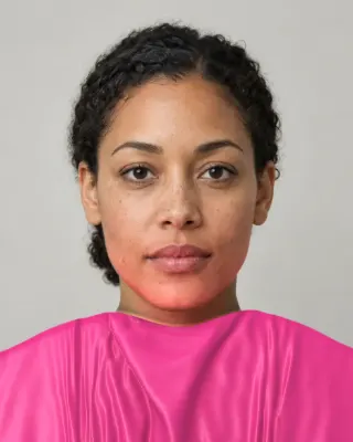

The Full Color Report: $19one time
You in your best and worst colors, about 40 colors with hex codes, makeup, hair and a capsule wardrobe plan.
See a sample reportCommon questions
- What is personal color analysis?
- A way of finding the colors that suit your natural coloring, by judging whether it's warm or cool, light or deep, and soft or clear. It's done by draping fabric in person, or by software reading a photo. Results are usually given as a season or a tone.
- What's the difference between value and chroma?
- Value is how light or dark a color is. Chroma is how pure or greyed it is. A pale pink and a dusty rose may both feel gentle, but pale pink is high in value while dusty rose is low in chroma.
- Is undertone the same as hue?
- Not exactly. Hue describes any color. Undertone is the cosmetics word for the warm or cool lean of skin, and it's a convention more than a measurement. Your skin's hue can be measured, and it changes with light, tan and flushing.
- Why does a hue on a garment look different on me?
- Partly simultaneous contrast, where neighboring colors shift each other, and partly because cloth reflects some colored light onto your skin. The room's light changes both. That's why a color is best judged next to your face in daylight.
- Do I need all three axes, or is warm and cool enough?
- Warm and cool is a good start, and it has the most support. But many people's strongest trait is depth or softness instead, and those are often what make a color wrong. Twelve seasons exist because temperature alone leaves many people between two answers.
- Can my personal color be measured with a device?
- Your skin's color can. Some Seoul studios use a spectrophotometer. But no device reads a season, since there's no agreed rule from numbers to seasons, and the Korean papers that try are building their own models.

See which colors are yours.
See your colors on your own face, compare seasons side by side, and get your season, your undertone and a starter palette.