Light Spring color palette: pale, warm colors to try on live
The palest palette of the twelve and the shortest range. Light first, warm second: dark colors do the overpowering here, so this page is mostly about what to wear instead.
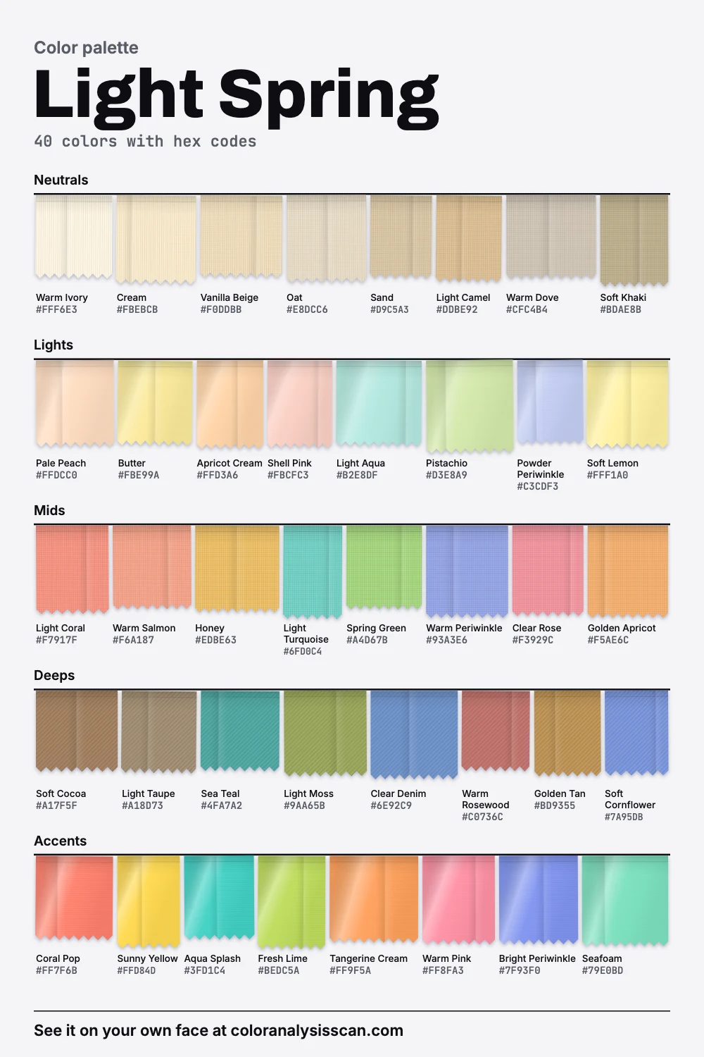
The Light Spring palette
40 colors with hex codes. Tap any color to copy its hex code.
Neutrals
Lights
Mids
Deeps
Accents
Why dark colors take over
Every season has a problem color. For a Light Spring the problem is a whole region: most of the bottom half of the lightness scale. Delicate coloring, with light hair and eyes and a golden warmth in the skin, doesn’t have much weight of its own. Stand it next to something very dark and the dark thing becomes the only thing anyone sees.
The picture above shows how we built for that. Our palette is the lightest of the twelve on average. It also has the shortest range from light to dark, from Warm Ivory down to Soft Cocoa. 72.5% of the colors count as light, and 0% are dark. The floor is so high that the single darkest thing on the board, Soft Cocoa, sits above the average color in four other palettes. That’s what “light first” means once you put it in numbers.
Light Spring
medium
Light Summer
deep
Warm Spring
deep
Soft Autumn
deep
Soft Summer
deep
Cool Summer
deep
True Autumn
deep
Bright Spring
deep
Deep Autumn
deep
Deep Winter
deep
Cool Winter
deep
Bright Winter
deep
Light Spring color analysis turns on this axis more than any other: how light a color looks, which Munsell called value. The eye doesn’t read light in a straight line, so double the light doesn’t look twice as bright, which is why we measure lightness the way the eye sees it. These are readings of our own hand-built palette and can’t measure your face. Think of them as a map of the colors, not a verdict on you.
Light doesn’t mean washed out
The word sends people straight to baby pastels, and that’s a mistake to correct early. On average these colors are exactly as strong as Deep Winter’s. A palette of pale colors can hold as much color strength as a palette of jewel tones. 17.5% of the board counts as vivid, including Sunny Yellow and Fresh Lime.
So the risk runs in two directions. Too dark and you disappear behind the clothes. Too grey and you look unwell, because the softness in something like Dusty Mauve takes away the freshness that makes this coloring look awake. A true pastel in the textbook sense has high value and low saturation, and those can work: Pale Peach and Light Aqua are close to that. But try Light Coral, Light Turquoise and Honey before you settle for sugar-pale everything.
What to wear where black would go
Nearly every wardrobe assumes one dark piece: trousers, a coat, a bag, something for evening. Here is what fills each job from our palette.
| The job | Your color | Why it holds up |
|---|---|---|
| Everyday trousers | Light Taupe, Soft Khaki | Dark enough to ground a light top, and they keep the warmth |
| Jeans | Clear Denim | A clean mid-wash, nowhere near indigo |
| Coat | Light Camel, Sand | The warm neutrals that make the rest of the palette look intentional |
| Bag and shoes | Soft Cocoa, Golden Tan | The darkest you need, and softer than any black leather |
| Evening | Sea Teal, Warm Rosewood | Rich for this palette without ever getting heavy |
| White shirt | Warm Ivory, Cream | White without the blue cast |
If you already own black, there are two easy rescues. Move it away from your face, to shoes or a skirt. Or break it at the neck with Butter or Pale Peach. Black and Charcoal lead our avoid list for exactly this reason, and Burgundy and Deep Plum share the issue, adding a cold base to the depth. Dusty Mauve is on the list for the opposite failure, the grey that takes your freshness away.
Is it you, or are you Light Summer?
This is the pair people most need to separate. Light Summer is the same idea with the temperature flipped. On average it’s only a little darker than yours. The real gap is warmth: yours leans warm and theirs leans cool. And a Light Summer has more dark room, going down to soft navy where yours stops at Soft Cocoa. A quick test is Soft Cornflower against Warm Salmon: a Light Spring usually looks livelier in the salmon, and it’s the one to try first.
Warm Spring shares the warmth at a stronger level: more vivid, and deeper. If this palette looks nice on you but slightly sheer, try that. Bright Spring has real darks and a much bigger range from light to dark, so if you have dark hair with light eyes, that may be the one.
Soul of Color describes Light Springs with natural blonde to light brown hair, often strawberry or light copper, and light eyes. It also says the skin can be pale or tan, and that what matters is being light for the person. That’s the right way to think about it. A person with deep skin can still have a lighter overall value than others of a similar background, and can carry these colors well. The label isn’t a shade card for skin.
A warning about your photos
Light Spring and Light Summer are the pair most easily flipped by a photo. Cameras apply white balance, a global correction of the colors in the frame, and a warm room or a sunset will push pale skin toward gold. A selfie in evening light can make a Light Summer read as a Light Spring and the other way around. That’s why our scan asks you to hold up white paper first, so it has a real reference, and why it’s worth running it again in steady daylight before you trust a result.
Where to start on the board
Six signature colors are the fastest way in: Light Coral, Butter, Light Aqua, Spring Green, Warm Periwinkle and Warm Ivory. Between them you get a warm pink, a yellow, a cool accent, a green, a blue-violet and a white. People are often surprised to find that yellow suits them, since yellow has a bad reputation in general. On this coloring Soft Lemon and Butter can look better than any pink.
You also get more blues than you might expect. Warm Periwinkle, Soft Cornflower and Clear Denim all sit on the board, because the warm lean of the season is an average, and 25% of our colors measure cool. Even a warm palette needs a few cool notes to make the warmth readable.
Getting through the dark months
Autumn and winter are when this palette gets hard to shop, and when you’re most tempted to give in and buy a black coat. There are other ways through. A long Light Camel or Sand coat stands out on a grey street and looks far more expensive than its dark equivalent. If you need something practical that won’t show dirt, Soft Cocoa and Golden Tan are forgiving, and Clear Denim handles rain. Winter whites, sold in wool and heavy cotton, tend to be warm ivory and come close to what you want. For knitwear, look for Apricot Cream and Shell Pink, which feel right against a dull sky. And a bright scarf in Coral Pop or Aqua Splash lets you keep a darker jacket you already own.
Boots and bags are the two places where dark things creep in. A mid-brown leather in the range of Soft Cocoa is the most useful thing you can buy, and it goes with the whole board. Black leather boots are fine with trousers in a dark wash, but they look heavy under a pale dress.
Light metals, sheer makeup
Light, polished yellow gold and rose gold are our recommendations, and heavy dark metal is the thing to skip: a chunky gunmetal chain makes the same mistake as a black top. On the face, start with peach pink, warm coral and clear apricot gloss on the lips. Soft peach or warm pink for a sheer blush. Warm taupe and light bronze on the eyes, with a touch of soft aqua when you feel like color, and brown liner in place of black. A black mascara and a brown one can look quite different on this coloring, so try both.
Celebrities commonly typed as Light Spring
Treat this as a sketch of the look, nothing firmer. Soul of Color, the source we checked, says plainly that none of its celebrity typings are verified, and that it’s hard to determine a season from photos. Its Light Spring list includes Amanda Seyfried, Elle Fanning, Jessica Chastain, Kate Hudson, Nicole Kidman, Saoirse Ronan, Sabrina Carpenter, Sydney Sweeney, Taylor Swift and Ewan McGregor.
Those lists show how fragile the exercise is. The same site puts Dakota Fanning, Elle’s sister, under Light Summer, with a note that she’s sometimes analyzed as Light Spring, and it adds the same note for Billie Eilish and Yvonne Strahovski. Hair dye makes it harder still, because you rarely know what a public figure’s natural color is. Your own face is a far better guide.
Shopping, and a first capsule
Spring and summer collections are your friend, and it pays to buy then, because autumn racks are heavy with exactly what you don’t want. Look for colors that seem lit from within: a clean coral, not a dusty one. Light fabrics help, since sheer cotton and linen let a little light pass through. Compare anything beige with Warm Ivory: if it turns pinkish or grey next to that, it’s a cool beige, and the warm one will do better.
Seven pieces: a light camel coat, clear denim jeans, light taupe trousers, a warm ivory shirt, a light coral top, a light aqua knit and a butter scarf. If you’d like a personal cut of the palette, it’s in the Full Color Report. For the other spring seasons, go to the spring palette page, or browse all twelve palettes.
Related guides and tools
Sources
Full Color Report
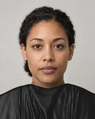
Black is on the Light Spring avoid list. Here's why.
The answer is in the report.
$19one time. No subscription.
An in-person color analysis costs about $200 to $600. See a cost guide
Full Color Report
Light Spring
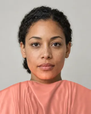
Personal palette
Metals
Yellow gold and rose gold
Makeup
Peach pink, warm coral and clear apricot glosses.
What's included
- Fifteen AI pictures of you: 3 best colors beside 3 worst, your lead color, 3 hair colors, day and evening makeup, 2 outfits, and glasses with jewelry
- What we measured on your face: undertone, depth, clarity and contrast, and how close your second season was
- Your full palette of about 40 named colors, with hex codes and how to use each group
- Your colors to avoid, why, and how to wear them away from your face
- Makeup from foundation to nails: lips, blush, eyeshadow, liner and brows, with a day and an evening look
- Hair colors to choose and to skip, and what to say to your colorist
- Metals, jewelry, glasses frames and leathers in your colors
- Your contrast level, your white and your black, suit and coat colors, prints, fabrics and denim
- A capsule wardrobe as outfit formulas, every piece in your colors
- A shopping guide: the color names to search for and the label words to skip
- The "Does this suit me?" checker for anything you might buy
- Your second season, and when to borrow from it
- A PDF of the whole report, a swatch card, a phone wallpaper and a share card, saved to your account
Common questions
- What is a Light Spring?
- A coloring described as light first and warm second, usually with fair to light features and a golden warmth. The palette is the palest of our twelve and leans on peach, butter, coral, aqua and warm ivory, with nothing truly dark.
- Why does black overpower a Light Spring?
- Black is far outside the range of this coloring. Our darkest color is a soft cocoa, far lighter than black, so it creates the sharpest edge in the picture and pulls attention from your face. Soft cocoa or light taupe gives the outfit an anchor without that drop.
- What neutrals replace black for a Light Spring?
- Light taupe, soft khaki and soft cocoa for the darker jobs, light camel and sand for coats, and warm ivory or cream in place of white. A mid-wash denim does more for you than dark indigo.
- What is the difference between Light Spring and Light Summer?
- Temperature. They are close in lightness on average in our palettes, but Light Spring leans warm and Light Summer leans cool. Light Summer can also hold a darker navy. Compare a warm salmon and a soft cornflower under your chin in daylight.
- Can a Light Spring wear pastels?
- Yes, but they aren't the whole palette. Warm pastels like pale peach and light aqua suit this season, and so do cleaner mid-tones like light coral and light turquoise. Dusty or greyed pastels are the ones that look tired.
- Can someone with dark skin be a Light Spring?
- Seasons describe how a person's coloring relates to itself, so skin depth alone doesn't rule a season in or out. Published descriptions lean toward fair examples, so you'll rarely see this one shown on deep skin. The only real check is how these colors behave on your face.

See which colors are yours.
See your colors on your own face, compare seasons side by side, and get your season, your undertone and a starter palette.