Deep Autumn color palette (Dark Autumn): rich, warm dark colors
The darkest palette of the twelve, and warmer than people expect: rich earth, spice and near-black browns, with hex codes to copy and a free scan to check them on you.
The Deep Autumn palette
40 colors with hex codes. Also called Dark Autumn. Tap any color to copy its hex code.
Neutrals
Lights
Mids
Deeps
Accents
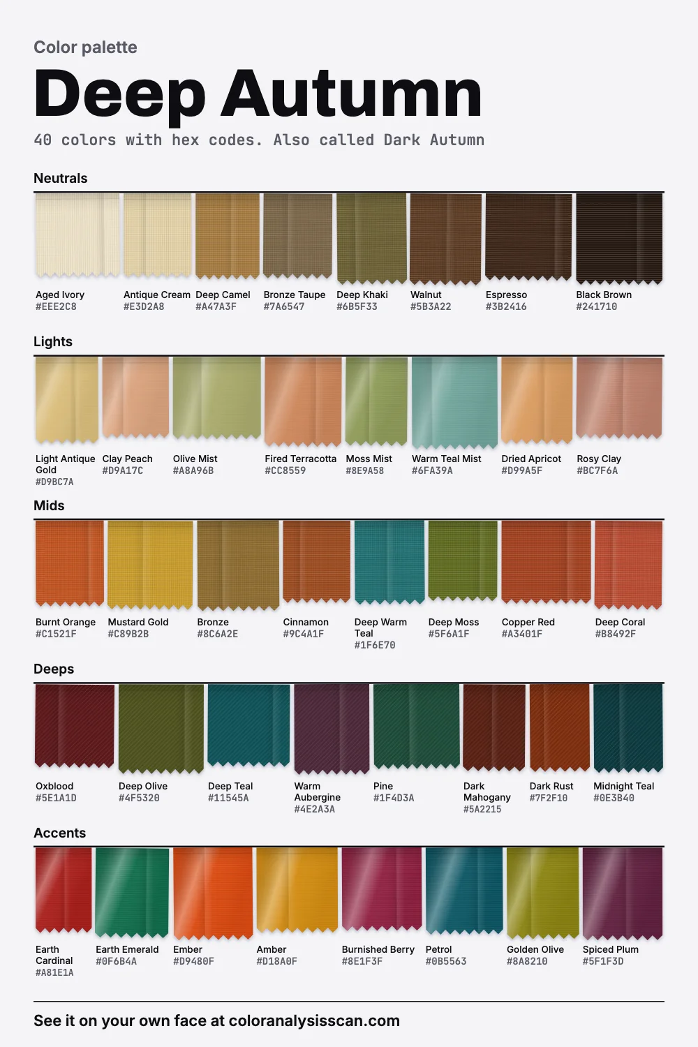
Dark, and still warm
Darkness and warmth rarely travel together in clothing. The default dark things in a shop, such as black, navy and charcoal, are all neutral or cool, so a warm person who wants depth ends up wearing the wrong kind. Deep Autumn is the answer to that. It’s defined as deep first and warm second, for coloring with rich dark hair and eyes and warmth in the skin. Our palette is the darkest of the twelve on average, while staying very warm. Compare Deep Winter, level in lightness and close to neutral in warmth. Those two facts together are the season.
Warm share is 80%, and only 12.5% of the colors read cool. Those cool notes are nearly all deep teals, such as Petrol and Deep Warm Teal, which behave almost like neutrals here. Strength is moderate on average. Published lists can’t agree whether this season is saturated or muted, so here’s the reading from our own hexes: 22.5% vivid and 22.5% muted, in nearly equal measure. It holds both. Ember and Earth Cardinal really do burn, and Bronze Taupe and Walnut really don’t. All these figures belong to the palette we drew up, so nobody’s skin has a warmth score, and small differences mean little.
Soil, and a real color system
The picture at the top is the palette as layers of earth, and that’s more than decoration. When the United States Department of Agriculture needed a way to describe soil in the 1930s, it adopted the Munsell system, with its three dimensions of hue, value and strength, the same ones color analysts use today. Soil is a fair way into this palette, too. Umber, one of the oldest pigments, is a clay holding iron and manganese, and it’s the manganese that takes it toward the deep browns. Heat it and it goes darker still. Walnut and Espresso live in that same territory.
One detail worth noticing in that chart: Deep Winter has a larger dark share than Deep Autumn. Its mean stays up because it also has so much ice at the top end. Deep Autumn has few lights to balance its darks, at 10%. That’s the lowest light share of the twelve, and you’ll feel it when you dress.
Is Dark Autumn the same thing?
Usually. Dark Autumn and Deep Autumn are two names for the same place in most 12-season charts, so a Dark Autumn color palette should land close to this board, and Soul of Color uses both names together. In the 16-season method from Agile Styling, 12-season Dark Autumn maps to a Deep Autumn that holds a similar position with a palette that may not match exactly. If you were typed by an analyst using a printed fan, go by the fan and use this page for the reasoning.
Should a Deep Autumn wear black?
People ask this a lot, and answers online tend to be absolute. Black isn’t on our avoid list, and it isn’t on our board. What’s on the board is its warm neighbor.
Black
black
Black Brown
close
Espresso
far off
Walnut
far off
Black Brown is so dark that it does nearly everything black does. Up close it has a warmth that a true black lacks, and that small difference can matter against warm skin. Our advice: if you own black, keep wearing it, ideally not as the only thing by your face. When you replace something, buy the brown. Soul of Color reserves black for Winters. Among autumns, we think Deep Autumn gets away with it most easily, since its coloring is already dark and doesn’t need a soft bridge. Hold black and Black Brown under your chin in daylight and compare.
Your lights aren’t very light
Here’s a detail that’s easy to miss if you assume every season’s groups work alike. A “light” on this board is a different animal.
Deep Autumn lights
light to medium on average
Light Spring lights
light on average
Clay Peach, Olive Mist and Dried Apricot are what you reach for when you want something lighter, and all of them still have weight. That’s why our avoid list is pale from top to bottom: Pastel Pink, Icy Lilac, Baby Blue, Silver Grey and Optic White. They wash out against this kind of depth, and the last three also add a chill. Your true whites are Aged Ivory and Antique Cream. They give you all the contrast a white shirt gives without the blue cast.
Which dark season are you?
Deep Autumn or Deep Winter
The hard one, because lightness won’t help: on average they’re equally deep. Warmth does the work, and the gap there is wide. Compare Oxblood with a cool wine, or Espresso with black. The eyes often give it away, since warm dark eyes tend to come alive in Burnt Orange and go flat in icy pink. Deep Autumn vs Deep Winter has the full set of tests, and you can read the other side on the Deep Winter page.
Deep Autumn or True Autumn
True Autumn is warmer still, and noticeably lighter. If Black Brown seems like too much on you, and Mustard Gold doesn’t, you may belong there.
Deep Autumn or Soft Autumn
Soft Autumn is clearly lighter on average, and much more greyed, so these two usually look quite different. It comes up mostly for people with medium-brown hair who feel unsure about how much depth they can hold.
Who wears it
Soul of Color’s sketch is natural hair from black through dark chocolate to dark mahogany, usually with warm highlights, and eyes in dark brown, black-brown, deep hazel or dark olive, with skin that may be medium or dark and golden, olive or bronze in tone. It adds that blonde tends to look off on them. Descriptions often show this season on medium and deep skin, and it’s just as possible with fair skin and dark hair. Depth here is about how your features sit together. Run the season test if you aren’t sure.
Deep Autumn outfits
Because the palette has so little at the light end, you can build whole outfits from dark, warm, tonal layers without anyone calling it heavy. A base of two darks with one strong color on top is a formula that rarely fails.
Workday
Weekend
Evening
Texture carries a lot of this. Suede, leather, corduroy, heavy knit and washed silk all make dark warm colors look expensive, while a thin, shiny synthetic in Dark Rust can look cheap. Patterns that hold up include paisley, tortoiseshell, animal prints and dense florals in rust, olive and gold. These all share your palette’s depth.
The navy question, and formal dress codes
Navy is the default dark neutral for offices and school uniforms, and on this coloring it can look surprisingly cold. Our replacements stay on the green side: Petrol and Midnight Teal are close to navy in depth and read as dark blue-green from a little distance. Pine does a similar job in green. If you must wear real navy, keep a warm shirt in Antique Cream at the neck.
When a dress code says black tie, Black Brown velvet and Oxblood satin are about as formal as anything else in the room. At a daytime wedding, where dark can feel out of place, Mustard Gold silk or a Rosy Clay dress are the lightest things on this board that still look like you. Warm metallics also do more here than a pale color would, so an old-gold or bronze fabric counts as a neutral for evening.
Heavy gold, deep lips, warm hair
Deep yellow gold, bronze and copper are our picks, and bigger is usually better here: a hefty gold chain matches the weight of the coloring where a delicate silver one disappears. For makeup, the brief version is deep brick, chestnut and warm berry lips, warm terracotta or burnished peach blush, and espresso, bronze and deep olive on the eyes. There’s a full Deep Autumn makeup page with shades. On hair, staying near your natural depth and adding warmth, such as chestnut or mahogany, is safer than lifting. Examples of the coloring and where analysts disagree are on the celebrities page.
Shopping a dark palette
Dark colors are easy to misjudge. A store rack in dim light can turn a warm olive into grey and a cool navy into black, so carry the piece to daylight when you can. To test warmth, hold it next to a warm white such as Aged Ivory: a warm dark looks richer against it, and a cool one turns slightly bluish. Autumn and winter collections suit you, and you can stock up on them without having to fight the current. In summer, look for Deep Teal linen and Cinnamon cotton, which feel right in heat without going pale.
A starting six: a walnut coat or blazer, deep olive trousers, an aged ivory shirt, a burnt orange knit, a deep teal top and an oxblood dress. The rest of the autumns are on the autumn palette page, every season is on the palettes hub, and the Full Color Report describes what a personal version of this palette would include.
Related guides and tools
Sources
Full Color Report
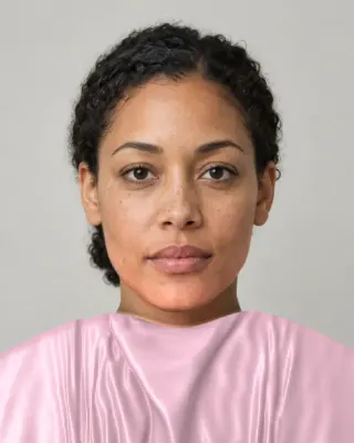
Pastel Pink is on the Deep Autumn avoid list. Here's why.
The answer is in the report.
$19one time. No subscription.
An in-person color analysis costs about $200 to $600. See a cost guide
Full Color Report
Deep Autumn
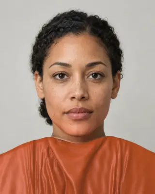
Personal palette
Metals
Yellow gold, bronze and copper
Makeup
Deep brick, chestnut and warm berry.
What's included
- Fifteen AI pictures of you: 3 best colors beside 3 worst, your lead color, 3 hair colors, day and evening makeup, 2 outfits, and glasses with jewelry
- What we measured on your face: undertone, depth, clarity and contrast, and how close your second season was
- Your full palette of about 40 named colors, with hex codes and how to use each group
- Your colors to avoid, why, and how to wear them away from your face
- Makeup from foundation to nails: lips, blush, eyeshadow, liner and brows, with a day and an evening look
- Hair colors to choose and to skip, and what to say to your colorist
- Metals, jewelry, glasses frames and leathers in your colors
- Your contrast level, your white and your black, suit and coat colors, prints, fabrics and denim
- A capsule wardrobe as outfit formulas, every piece in your colors
- A shopping guide: the color names to search for and the label words to skip
- The "Does this suit me?" checker for anything you might buy
- Your second season, and when to borrow from it
- A PDF of the whole report, a swatch card, a phone wallpaper and a share card, saved to your account
Common questions
- What is a Deep Autumn?
- A coloring described as deep first and warm second: rich dark hair and eyes with warmth in the skin. The palette has dark earth tones, spice colors and near-black browns, and it is the darkest of our twelve by mean lightness.
- Is Dark Autumn the same as Deep Autumn?
- In most 12-season charts, yes. A 16-season Deep Autumn holds a similar position to a 12-season Dark Autumn, though Agile Styling cautions that those palettes aren't necessarily identical.
- What are the best neutrals for a Deep Autumn?
- Black brown, espresso and walnut for the darks, bronze taupe and deep khaki for the middle, and aged ivory or antique cream in place of white. Each of these has warmth you can see once it sits next to a cool neutral.
- Should a Deep Autumn wear black?
- It isn't on our avoid list and it isn't on our board. Deep Autumn gets away with black more easily than other autumns. Black brown does the same job with a warmth true black lacks, so buy that when you are replacing something.
- What makes Deep Autumn different from Deep Winter?
- Temperature, almost entirely. On average our two palettes are equally deep, while one runs very warm and the other close to neutral. Warm dark browns, olives and rust belong to Deep Autumn. Jewel tones and true black belong to Deep Winter.
- What should a Deep Autumn wear for outfits in summer?
- Lighter fabrics in the same range: deep teal linen, cinnamon cotton, a clay peach blouse. Keep one dark anchor and pick airy cloth instead of pale color. Pastels look washed out on this coloring.

See which colors are yours.
See your colors on your own face, compare seasons side by side, and get your season, your undertone and a starter palette.