Compare
Deep Autumn vs Deep Winter: warm dark or cool dark?
Deep Autumn and Deep Winter are both dark: on average our palettes are almost equally deep. One is warm and one isn't, and that gap is wide. The neutrals in your closet can settle it.
Top: Deep AutumnBottom: Deep WinterW is warmth, computed from the hex
The darkest
gap 9.7
Near-black
gap 15.5
Trousers and coats
gap 32.4
The middle
gap 28.7
The pale one
gap 16.7
Which neutrals decide it
Read the row above from left to right, and notice where the gap opens up. Black Brown against Black is 9.7 points, and Espresso against Cool Espresso is 15.5. At that depth, you’d struggle to tell them apart without labels. By the time you reach the trouser and coat colors, Walnut against Charcoal, it’s 32.4.
So skip the blacks. Your test colors are the ones in the middle of the row. Hold Walnut under your chin, then Charcoal. Hold Bronze Taupe, then Steel Grey. Then try the pale pair, Aged Ivory against Ice White, which is often the clearest of all, because a stark white has nowhere to hide on warm skin. Do it by a window, no makeup, hair back. What you’re watching is your skin: whether it evens out, or whether shadows deepen under your eyes.
The hue of each neutral is doing the job. A warm neutral should vanish into a warm coloring, and a cool one into a cool coloring. Whichever makes you look more awake is the one to note.
How do I tell if I’m warm dark or cool dark?
Curate Your Style has the right frame: how dark you are isn’t the question. Being dark gets you to this pair and no further. After that, the tests that help are the ones about temperature:
- Strong color. Compare Burnt Orange with Jewel Teal, then Mustard Gold with Jewel Orchid. One of each pair should look natural and the other like a costume.
- Metal. Our boards give yellow gold, bronze, copper to Deep Autumn and silver, platinum, white gold to Deep Winter. Hold them near your face, not on your hand, in the same finish.
- A plain white shirt. Soft ivory that looks clean on you points warm, and pure white with no fuss points cool.
Dark hair won’t help. It holds little temperature, it can be dyed, and Soul of Color describes hair from black to dark brown in Deep Autumn and “jet black” or brown-black in Deep Winter, which is a difference you often can’t see. The same goes for skin depth. Curate Your Style says both seasons “span the full range of skin tones”, adding that on deeper skin the warmth “usually reads as an almost copper quality rather than a peach one.” Nothing about being darker or lighter pushes you to either side.
Which is more vivid? Sources split
Most guides answer this confidently. Soul of Color heads its sections “Dark, Warm & Muted” and “Deep, Cool & Bright”. The Concept Wardrobe calls Dark Autumn colors “similarly dark but more muted and warmer” than Dark Winter’s, while also describing them as “the most pigmented” of the Autumn family. Curate Your Style calls Deep Winter “bright and vivid”.
Our palettes complicate this. On average the two are about equally vivid, and if anything the autumn is a touch stronger. But the averages hide how differently they’re built. In Deep Winter, 32.5% of colors are vivid and 45% are muted. In Deep Autumn, 22.5% and 22.5%.
So Deep Winter has more extremes: brilliant jewel tones beside near-colorless blacks, whites and greys. Deep Autumn stays in the middle, rich and consistent. Its range from light to dark tells the same story: narrower than Deep Winter’s, which runs from crisp white to black. Where we stand: it’s fair to call Deep Winter sharper and Deep Autumn more blended, but “Deep Autumn is more muted” isn’t true of our palettes on average. This describes colors we selected by hand, not people, and other palettes may come out differently.
Does black work on a Deep Autumn?
Wear it if you like it. Soul of Color’s view is that “Winters are the only season who truly suit black”, and Curate Your Style treats black that “looks sharp on some days and heavy on others” as a sign of being stuck on this border. Our Deep Autumn board has no true black and comes closest with Black Brown, but black isn’t on its avoid list either.
In practice the difference is small. Black Brown and Black are 9.7 points apart in our numbers, and across a room few people would see it. What can change things is what you put next to it. On a warm coloring, gold jewelry and a warm lip take most of the edge off a black dress. We’d save the worry for pure white near the face, which is where Deep Autumn’s avoid list actually starts to bite: Optic White is on it, and Crisp White is at home on Deep Winter.
Olive skin and the warm assumption
A common trap on this border is assuming that anything golden or olive must be warm. Curate Your Style lists “cool olive” among the skin readings for Deep Winter, so an olive cast by itself doesn’t send you to autumn. If that sounds like you, the olive undertone page goes through it. Here seeing both palettes against your own face matters more than any description of your skin, because it doesn’t ask you to name what you see.
Red lipstick, the quick check
Red is the color where temperature shows fastest, and you probably own one. Our starting points are “Deep brick, chestnut and warm berry.” for Deep Autumn and “Deep berry, cool red and wine.” for Deep Winter. In fabric terms, it’s Copper Red against Cool Red. A brick red that looks expensive points one way, and a blue-based red that makes your teeth look white points the other. Eye makeup follows: our Deep Autumn note says “Espresso, bronze and deep olive. Dark brown or soft black liner.” and Deep Winter’s says “Black, charcoal and deep plum. Black liner suits you.”
What about contrast?
Sources mostly agree that both are strong, and that doesn’t help you choose. Curate Your Style’s table gives Deep Autumn “medium-high to high” and Deep Winter “medium-high”. PersonalColorAI simply calls Deep Winter high contrast. On our boards it does hold more range, since it goes further at both ends.
If you can’t decide
You’re in good company. Curate Your Style says this pairing gives “more mixed results from online quizzes than almost any other”, and Soul of Color allows it’s tricky. The seasons are also, in Wikipedia’s phrase, “to some degree, arbitrary”. Three ways forward:
- Run the scan. It reads your skin, eyes and hair from your camera, corrects the light with white paper, and shows your season and colors beside your photo. Treat a clear result as a lead to check with real fabric.
- Wear the crossover. Deep Teal and Jewel Teal, deep burgundies and pine greens live near the border and should sit well on either.
- Take the longer route at what season am I, which adds a calibrated reading and color rounds.
Every color with its hex code is on the Deep Autumn palette and the Deep Winter palette, and the season test runs the check on your own face.
Related guides and tools
Sources
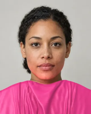
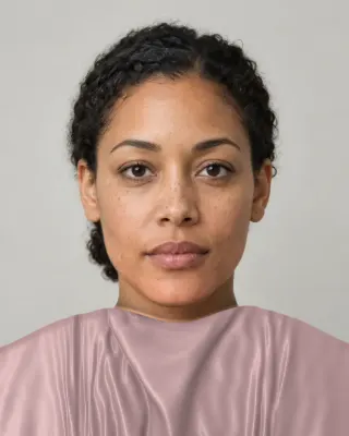
The Full Color Report: $19one time
You in your best and worst colors, about 40 colors with hex codes, makeup, hair and a capsule wardrobe plan.
See a sample reportCommon questions
- What's the difference between Deep Autumn and Deep Winter?
- Temperature. Both are dark, almost equally so in our palettes, but Deep Autumn is warm and earthy and Deep Winter is cool and sharp.
- Which neutrals show whether I'm a Deep Autumn or a Deep Winter?
- Skip the blacks, because they're too similar to help. Walnut against charcoal and ivory against bright white show the temperature far better. Whichever evens out your skin in daylight points to your side.
- Can a Deep Autumn wear black?
- Yes, especially away from the face. Our Deep Autumn palette has no true black but gets very close with black brown, and black isn't on its avoid list. Gold jewelry or a warm lip beside it helps.
- Is Deep Winter more saturated than Deep Autumn?
- Guides often say so. In our palettes they're about equally vivid on average. Deep Winter has more extremes in both directions: more vivid jewel tones and more nearly colorless blacks and whites.
- Why do quizzes keep giving me both?
- Because both seasons look obviously dark, and quizzes lean on hair and eye color. Temperature is the only real difference, and it's the hardest thing to read in dark coloring. Fabric on your skin in daylight is a better test.

See which colors are yours.
See your colors on your own face, compare seasons side by side, and get your season, your undertone and a starter palette.