Soft Summer color palette: dusty, cool colors to try on live
The most muted palette of the twelve. Grey runs through every color here, which is why it can look dull on a screen and quietly perfect on the right face.
Dusty Rose
33%of full strength
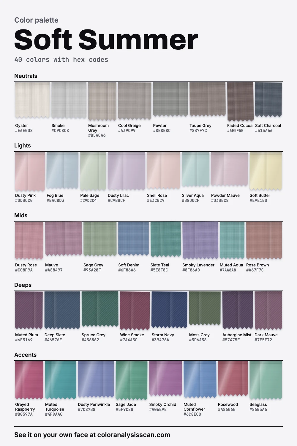
The Soft Summer palette
40 colors with hex codes. Tap any color to copy its hex code.
Neutrals
Lights
Mids
Deeps
Accents
Grey is the point
People hear “muted” and picture a washed-out version of something better. For a Soft Summer that gets it backward. The grey in these colors is the job they do. Faces in this season tend to have little contrast and no sharp color anywhere, so clothes with the same quality let the eye settle on the person. Drag the slider above and you’ll see the exact move: same hue, same lightness, the color draining toward grey until the color almost stops being one.
In Soft Summer color analysis, this is the axis that matters most. Call it strength: how far a color stands from a plain grey of the same lightness. It deserves its own axis because it changes independently of light and dark. Of our twelve palettes, this one is the most muted by a clear distance, well below Soft Autumn in second place and nowhere near Bright Winter at the top.
Two more numbers tell the same story. 75% of these 40 colors count as muted, and 0% count as vivid. The loudest thing on the board, Greyed Raspberry, would still be softer than the average color in five of the other palettes. All of that describes the palette we wrote and says nothing direct about your skin.
Why black feels so hard on you
You probably know the feeling: a black top that looks chic on the rack and severe in the mirror, with shadows under the eyes you hadn’t noticed before. Our palette explains part of that by leaving it out. The darkest color here, Storm Navy, is a deep, greyed navy, not black. The lightest, Oyster, is a pale off-white, not pure white. Black and pure white both fall outside the range.
The working replacements are Soft Charcoal and Storm Navy for black, and Oyster for white. They hold the place of a dark or a light in an outfit, and they keep the step between your clothes and your skin small. This is a place to be relaxed, though. Season rules are a styling convention, and “any woman can wear black” was already an objection to Color Me Beautiful in the 1980s. It remains a fair one. If you love black, wear it away from your face, or with a dusty scarf above the neckline.
How cool is it, really?
This surprises people. Soft Summer gets called a cool season, yet on average it sits only a hair on the cool side, close to dead neutral. 22.5% of the palette measures cool, 12.5% measures warm, and the remaining 65% is in between. Greyed colors simply don’t have much temperature left to show, which is the whole reason this season is so often confused with its neighbors.
Soft Summer or Soft Autumn
These two are almost exactly as light as each other in our palettes. What separates them is direction: yours is the side where Dusty Rose and Mauve work, and theirs is the side of salmon and camel. Our side-by-side comparison walks through the deciding colors. Hold a color from each under your chin in daylight too; seeing the two back to back usually settles it faster than reading does.
Soft Summer or Cool Summer
Cool Summer is the clearer, stronger cousin, and noticeably cooler. A useful test is whether a clean cornflower blue lights you up or sits on top of you. If Muted Cornflower is as far as you can comfortably go, stay here. True Summer vs Soft Summer covers the pair.
Soft Summer or Light Summer
Light Summer is clearly lighter on average and has more color in it. If your hair is pale and you find Faded Cocoa heavy, look there.
Signs in your own coloring
Soul of Color describes hair that isn’t much darker than the skin, sometimes at the same depth, with a muted ash quality, and eyes in hazel, grey, grey-green or soft amber. Its skin range runs from medium-dark to medium-light. Take any such list as a rough sketch. Low contrast happens at many depths: a person with deep skin and soft, smoky brown hair can sit here just as easily as someone with a mousy blonde. The test that counts is what grey-based color does on your face, which you can try with the season test.
Neutrals do most of the work
If you own only one group from this palette, make it this one. Its neutrals are the most muted of any neutral group in our twelve palettes. They look almost like pure greys until you put them beside the real thing.
Oyster
muted
Smoke
muted
Mushroom Grey
muted
Cool Greige
muted
Pewter
muted
Taupe Grey
muted
Faded Cocoa
muted
Soft Charcoal
muted
Oyster and Smoke are the shirts and knits. Cool Greige and Mushroom Grey are the summer trousers and the raincoat. Taupe Grey is a very forgiving blazer, and Faded Cocoa takes the role a brown shoe or bag has in other wardrobes. A warm camel or a true beige can look startlingly yellow beside these, so check any tan piece against Oyster before you buy it.
Color, quietly
Accents exist here, and they do real work; they just don’t announce themselves. They’re the softest accent group of the twelve, and Bright Winter’s accents are about three times as strong. Start near your face with Dusty Rose, Soft Denim or Slate Teal. For a stronger note try Greyed Raspberry or Muted Turquoise. Deep colors like Wine Smoke, Spruce Grey and Aubergine Mist are the ones to use for evening, and they look richer than their names suggest once they’re in a fabric with some texture.
Pattern matters more than people expect. A low-contrast print, such as a soft floral or a tonal stripe, feels natural here. A crisp black-and-white stripe adds both of the two things this palette leaves out.
Will this make me look boring?
It’s the fear behind most Soft Summer searches, and the risk is real if you buy one flat grey sweater after another. A quiet palette has to find its interest somewhere other than color. Three things do that well.
- Texture. A nubby knit, brushed cotton, suede and silk all catch light differently, so two garments in Mushroom Grey can look like a deliberate pair instead of an accident.
- Close tones in layers. Put Dusty Lilac under Smoky Lavender, or Pale Sage under Moss Grey. Neighboring tones read as depth and look expensive.
- One stronger note. A Greyed Raspberry lip or a Muted Turquoise earring can carry an otherwise silent outfit.
You can put numbers on how quiet this is. On the contrast ratio that web designers use, black on optic white scores 18.9 out of a possible 21. The strongest pairing in this palette, Storm Navy with Oyster, scores 7.0. A typical tonal pair like Dusty Rose with Mauve scores 1.2. A low score is the intention here, since a low-contrast outfit sits comfortably on a low-contrast face.
What to skip
The five colors on our avoid list fail in two different ways, and that’s more useful than the list itself.
- Too much edge: Black and Optic White. They sit beyond your range of light and dark, as Fig. 2 shows.
- Too much color: Hot Pink, Bright Orange and Lemon. Each one is roughly twice as strong as anything on the board, whatever its temperature. Hot pink has the right lean and still fails, which proves strength is the deciding axis here.
Metals: the finish matters more than the color
Our recommendation is pewter, silver and a muted rose gold, in a brushed finish. The finish is a matter of physics as well as taste. A polished surface throws back a mirror-like highlight, while a matte one scatters light in many directions, so brushed silver reads as a soft grey where polished silver reads as a bright flash. Pewter is an alloy that’s mostly tin, and it can be polished bright as well, so look for a satin or antiqued surface when you shop for it.
Makeup, hair and outfits
Each has its own page, so here is just the direction. Lips in muted rose, mauve and soft berry. Blush in dusty rose, blended well. Eyes in soft taupe, smoky grey and muted plum, with a smudged brown-grey liner. Soft Summer makeup has the shades. Soft Summer hair color covers ash browns and smoky blondes. Full looks are on the outfits page, and the celebrities list shows which names get typed here and where analysts disagree.
Shopping without second-guessing
Most shops are stocked for people who want color to stand out, so you will pass a lot of near misses. A few habits make it simpler. Words like heather, marl, dusty, smoke, washed and stone point the right way on a label. Hold a candidate next to something that is already working, because a color that clashes with Smoke or Soft Denim will clash with the rest of your closet. Squint at it in the fitting room: if the garment pops forward while your face fades back, it’s too strong, whatever the hanger suggested. Buying online, order the color you expect plus the one next to it, since screens and product edits can shift a muted color a long way.
A place to start
Seven pieces cover a lot of ground: a taupe grey coat, storm navy trousers, oyster knit, a dusty rose blouse, a soft denim shirt, a muted plum dress and a slate teal scarf. To go from there, the Full Color Report narrows a palette down to you, and the rest of the summer family is on the summer palette page. All twelve palettes are one click further.
Related guides and tools
Sources
Full Color Report
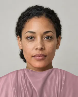
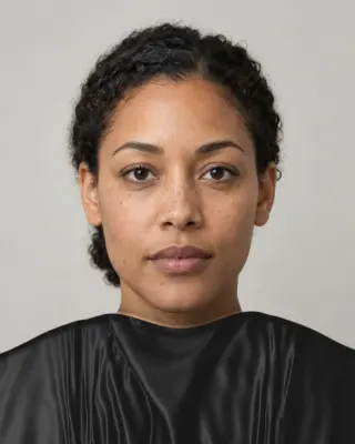
Black is on the Soft Summer avoid list. Here's why.
The answer is in the report.
$19one time. No subscription.
An in-person color analysis costs about $200 to $600. See a cost guide
Full Color Report
Soft Summer
Personal palette
Metals
Pewter, silver and rose gold
Makeup
Muted rose, mauve and soft berry.
What's included
- Fifteen AI pictures of you: 3 best colors beside 3 worst, your lead color, 3 hair colors, day and evening makeup, 2 outfits, and glasses with jewelry
- What we measured on your face: undertone, depth, clarity and contrast, and how close your second season was
- Your full palette of about 40 named colors, with hex codes and how to use each group
- Your colors to avoid, why, and how to wear them away from your face
- Makeup from foundation to nails: lips, blush, eyeshadow, liner and brows, with a day and an evening look
- Hair colors to choose and to skip, and what to say to your colorist
- Metals, jewelry, glasses frames and leathers in your colors
- Your contrast level, your white and your black, suit and coat colors, prints, fabrics and denim
- A capsule wardrobe as outfit formulas, every piece in your colors
- A shopping guide: the color names to search for and the label words to skip
- The "Does this suit me?" checker for anything you might buy
- Your second season, and when to borrow from it
- A PDF of the whole report, a swatch card, a phone wallpaper and a share card, saved to your account
Common questions
- What is a Soft Summer?
- A coloring described as muted first and cool second: greyed, low-contrast features where nothing stands out sharply. The matching palette is the most muted of the twelve we publish, built around dusty rose, soft denim, sage grey and oyster.
- Why does black look harsh on a Soft Summer?
- Black is far darker than the darkest color in the palette, a greyed storm navy, so it creates a much sharper edge against the face than anything else you'd wear. Soft charcoal and storm navy give an outfit the same weight with far less contrast.
- What neutrals replace black and white for a Soft Summer?
- Soft charcoal and storm navy for black, oyster and smoke for white. Taupe grey and cool greige fill the middle. These neutrals carry only a trace of color, so they mix with everything else on the palette.
- Is Soft Summer warm or cool?
- It's described as cool, but only just. On average our palette sits barely on the cool side of neutral, because greyed colors have little temperature left to show. That's why people get typed between Soft Summer and Soft Autumn so often.
- Can a Soft Summer wear bright colors?
- A little, away from the face. Near your face, try the strongest colors the palette holds, such as greyed raspberry or muted turquoise, before anything truly bright. A strong color works better in small amounts, like a bag or shoes.
- Is Soft Summer the same as Muted Summer?
- Sixteen-season systems often use Muted Summer for a similar position. Agile Styling notes that comparable seasons don't necessarily have identical palettes, so a Muted Summer fan and our Soft Summer board won't match shade for shade.

See which colors are yours.
See your colors on your own face, compare seasons side by side, and get your season, your undertone and a starter palette.