Soft Summer outfits: clothing colors and how to mix them
Grey-based neutrals, close tones and very little black. Six complete outfits by occasion, each measured step by step, so that low contrast reads as a decision.
With a palette this quiet, lightness is what you dress with
Most outfit advice works by color pairing: this blue with that rust. Soft Summer doesn’t have much to pair. Our palette is the most muted of the twelve, and every neutral on it is close to grey. So the thing left to design with is lightness: how far apart your pieces sit on the scale from dark to light, and whether those gaps are even.
The fashion school Academia SISA puts the same idea neatly: some people hold sharp combinations like black and white, and others gain balance from softer transitions such as mid grey, powder blue or cool beige. That’s this season. A soft outfit doesn’t have to be flat, though. It needs steps, and you can count them.
Six outfits, by occasion
Office
7.0:1
A dark base, a light top, and a blazer as the bridge between them.
Knit
Oyster #E6E0D8
step: clear
Blazer
Cool Greige #A39C99
step: clear
Shoes
Faded Cocoa #6E5F5E
step: subtle
Trousers
Storm Navy #39476A
Weekend
3.4:1
Denim and sage, close in depth, with a pale tee to lift it.
Tee
Smoke #C9C8C8
step: clear
Sweater
Sage Grey #93A28F
step: subtle
Jeans
Soft Denim #6F86A6
step: subtle
Bag
Moss Grey #5D6A58
Dinner
1.5:1
All dark and all close together. Texture does the rest.
Scarf
Dark Mauve #7E5F72
step: subtle
Coat
Soft Charcoal #515A66
step: blends
Dress
Wine Smoke #7A4A5C
step: blends
Bag
Aubergine Mist #57475F
Wedding guest
3.8:1
One pale color family from shoulder to shoe, a shawl for depth.
Dress
Dusty Lilac #C9BBCF
step: subtle
Shoes
Mushroom Grey #B5ACA6
step: clear
Shawl
Smoky Lavender #8F86AD
step: clear
Bag
Muted Plum #6E5169
Hot day
1.7:1
Light and airy, and one mid-tone so that it doesn't wash out.
Skirt
Pale Sage #C9D2C4
step: blends
Top
Silver Aqua #B8D0CF
step: subtle
Bag
Mushroom Grey #B5ACA6
step: subtle
Scarf
Muted Aqua #7AA8A8
Cold day
3.4:1
Two darks and two mids, with rose near the face.
Knit
Cool Greige #A39C99
step: blends
Scarf
Dusty Rose #C08F9A
step: bold
Trousers
Deep Slate #46576E
step: subtle
Coat
Storm Navy #39476A
Read a stack from top to bottom. Even the biggest single step anywhere in these six is moderate, and most are small. Across the whole outfit, the dinner look spans only 1.5 to 1 and the office look spans 7.0. Black on white would be about 18. The range between those two figures, about 1.5 to 7.0, is your working room. Every color is a real one from our palette, and you can match the hex against what you own. None of them is a promise about a product, since no brand makes these exact colors.
How to make low contrast look intentional
A low-contrast outfit can look considered or look like you got dressed in the dark. The difference is mostly a matter of structure, and three habits account for most of it.
Use steps, and avoid gaps
A single jump is what spoils it. Storm Navy trousers under an Oyster knit, with nothing between them, is a contrast of 7.0 to 1 in one place, right across your waist. Put a Cool Greige blazer over the knit and you have the same top and bottom with a bridge between them. That’s why the office look is built that way, and it’s worth doing with a scarf or a cardigan too.
Repeat one thing
If Muted Plum appears in a bag, let it come back at the collar or in a print. With so little color contrast to look at, the eye notices repetition more easily, and two matched notes look more deliberate than one. That’s our styling judgment, and it’s cheap to test in a mirror.
Run a mono check
L’Oréal Paris describes a black and white selfie as a way to see contrast in a face, and it works on clothes as well. Take a full-length photo, turn it black and white, and look. If you see one grey shape, the outfit needs a step. If you see one hard stripe, it needs a bridge. Then look at color again. Color tells you what you like, and the mono version shows you how it’s built.
What replaces black
Black is on our avoid list for its hard edge, not because of any rule about the color. SISA says that black is often treated as a universal fix, that its depth can be too harsh on some people, and that relying on it limits a closet more than you’d think. It isn’t a matter of owning one black substitute, either. Each job has a different answer.
| Job | Instead of black | Depth | Against Oyster |
|---|---|---|---|
| Winter coat | Soft Charcoal | deep | 5.3:1 |
| Work trousers | Storm Navy | deep | 7.0:1 |
| Evening dress | Aubergine Mist | deep | 6.5:1 |
| Shoes and bag | Faded Cocoa | deep | 4.6:1 |
| Knit under a blazer | Deep Slate | deep | 5.6:1 |
| For scale | Black | deep | 14.4:1 |
If you already have good black, keep it. Black shoes and belts are a small matter. Put something from this palette between a black top and your face, and buy from this table when you next replace a piece. The palette page has the wider reasoning.
Neutrals to buy first: greys and taupes, not camels
This is where Soft Summer and Soft Autumn outfits part ways, even though the two palettes are almost equally light.
Oyster
light, muted
Soft Cream
light, muted
Cool Greige
medium, muted
Soft Camel
medium, soft
Taupe Grey
medium, muted
Warm Taupe
medium, muted
Faded Cocoa
deep, muted
Soft Brown
deep, muted
Buy in this order. First a dark in place of black: Storm Navy or Soft Charcoal, in the trousers or coat you’ll wear most. Second, a light in place of white: Oyster or Smoke, for shirts and knits. Third, a mid to connect them: Cool Greige or Taupe Grey. Those three alone will give you the office stack above. Add Faded Cocoa for shoes and bags, because a warm tan leather reads startlingly yellow here. If your closet is all camel and you suspect you’re a Soft Summer, try a Cool Greige piece against your face first, and see the comparison. You might be a Soft Autumn after all.
Where the color goes
After neutrals, near your face is where color does the most. Dusty Rose, Soft Denim and Slate Teal are the starting points: a top, a scarf, a collar. Keep it to one colored piece at first, or two if they’re neighbors, such as Dusty Lilac with Smoky Lavender. The strongest colors on the board, Greyed Raspberry and Smoky Orchid, work best in small amounts, because at those levels they’re twice as strong as anything else you’re wearing. Denim is easy here: a mid-wash with a grey cast is close to Soft Denim, and it’s about the only everyday garment that comes this color without any searching.
For fabric, heathers, washed cotton, chambray and brushed knits soften a color further, which suits you. A hard, shiny surface in the same color can read as stronger. Prints should stay low in contrast too. Save the crisp black and white stripe for someone else.
Test a piece before you keep it
House of Colour, one of the older in-person services, does its analysis in natural daylight with precision-dyed drapes. You can borrow the daylight part. SISA suggests indirect light near a window as the most reliable, since many bulbs push skin too yellow or too cold. Hold the garment under your chin there, and look at your skin. In a photo, the colors have already been edited for you, so judge once it’s in your hands.
Hold the piece under your chin by a window before you cut the tags. If you aren’t sure Soft Summer is your season, the scan reads your own face and shows your colors beside your photo. Neither can tell you how a real dye will behave. Soft Summer makeup follows the same logic, and the Full Color Report lays out a capsule wardrobe plan in your own colors.
Related guides and tools
Sources
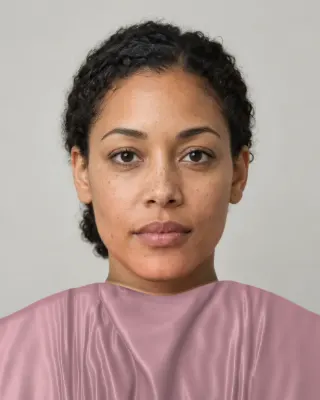
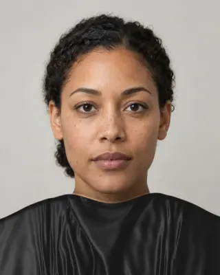
The Full Color Report: $19one time
You in your best and worst colors, about 40 colors with hex codes, makeup, hair and a capsule wardrobe plan.
See a sample reportCommon questions
- What should a Soft Summer wear?
- Grey-based neutrals such as oyster, cool greige, taupe grey and storm navy, with dusty rose, soft denim and slate teal as the colors near your face. Keep outfits in steps of lightness and avoid one hard jump.
- What replaces black for a Soft Summer?
- It depends on the job: soft charcoal for a coat, storm navy for trousers, aubergine mist for an evening dress, faded cocoa for shoes and bags. Each gives an outfit weight with less than half the contrast black has against a light top.
- How can a Soft Summer make low contrast look intentional?
- Use even steps of lightness, repeat one color or tone in two places, and check a black and white photo of the outfit. If it reads as one grey shape, add a step. If you see a hard stripe, add a piece between the two.
- Can a Soft Summer wear brown?
- Yes, in a greyed brown. Faded cocoa and rose brown are on the board. Warm chocolate and tan leather can look yellow or orange next to this palette, so compare a piece against oyster or smoke before you buy it.
- Are jeans a good choice for a Soft Summer?
- They're one of the easiest garments. Look for a mid-wash with a grey cast, close to soft denim on our board. Very dark, stiff indigo adds more contrast, and yellow-toned vintage washes bring warmth this palette avoids.
- What prints work for a Soft Summer?
- Low-contrast ones: tonal stripes, soft florals and small, blended patterns in two or three colors that sit close in lightness. A black and white graphic print adds the two things this palette leaves out.

See which colors are yours.
See your colors on your own face, compare seasons side by side, and get your season, your undertone and a starter palette.