Cool Summer color palette (True Summer): blue-based, gentle colors
Blue-based and gentle, and usually the same season people call True Summer. This is the coolest palette of our twelve, with hex codes for all forty colors.
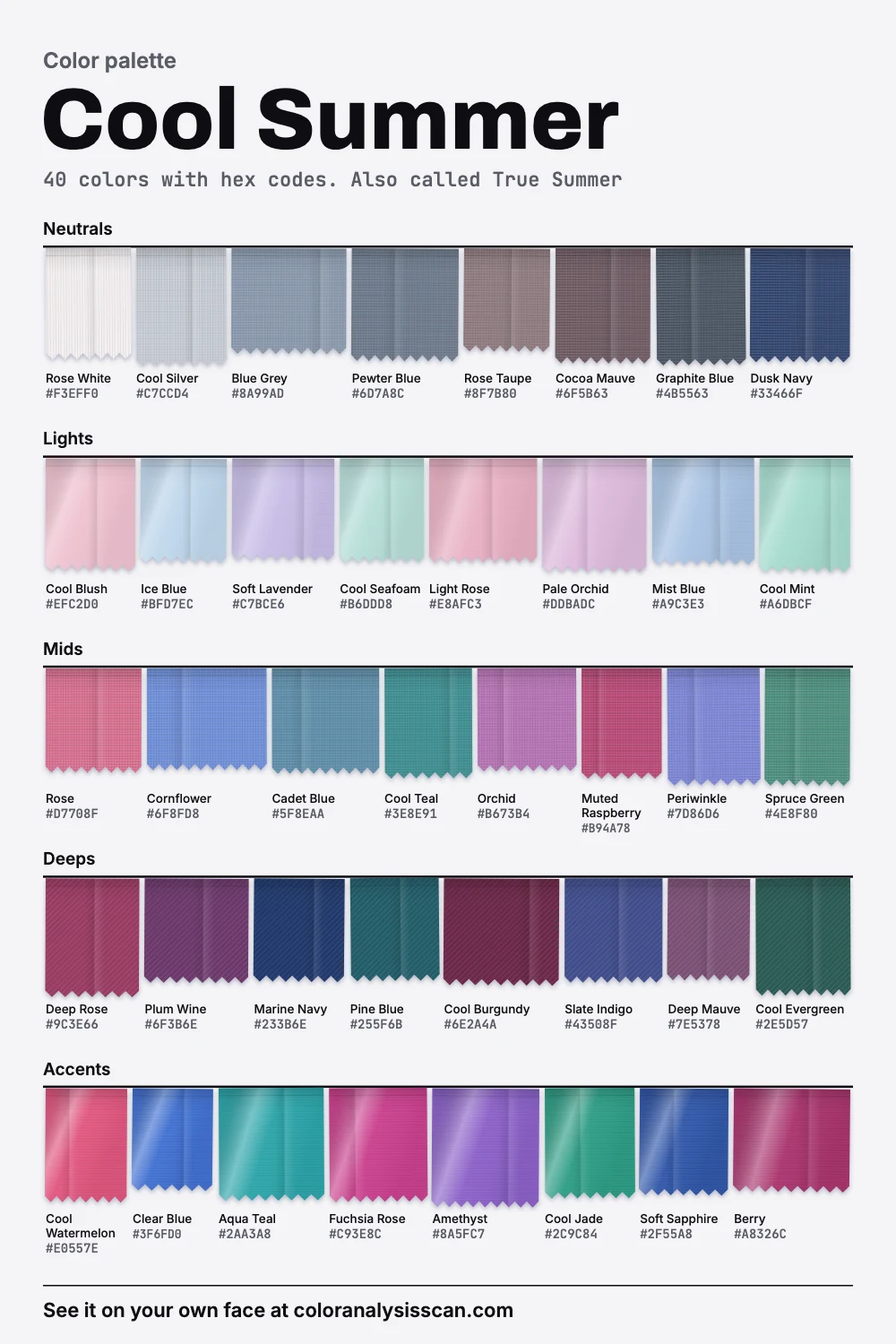
The Cool Summer palette
40 colors with hex codes. Also called True Summer. Tap any color to copy its hex code.
Neutrals
Lights
Mids
Deeps
Accents
Cool Summer or True Summer: are they the same?
Usually, yes. Most 12-season systems use one or the other for the same place on the map, cool first and softened second, so if you came looking for a True Summer color palette, this is it. We use Cool Summer because more people search for it. But naming varies between systems, and one important exception will confuse you if nobody warns you.
| System | What it calls this place | What to watch for |
|---|---|---|
| This site, and most 12-season lists | Cool Summer or True Summer | Two names, one season |
| Agile Styling’s 16 seasons | True Summer, plus a separate Cool Summer | Here Cool Summer is a flow toward True Winter, deeper and brighter than True Summer |
| The original four seasons | Summer | Everything cool and soft, in one group |
So if an analyst trained in a 16-season method told you that you’re a Cool Summer, compare your fan with this board before buying anything: you may belong a shade closer to Winter than we do. Agile Styling calls its version “True Summer on steroids”. Nothing here says one system is right. The boxes are conventions, and the names are labels on a continuous spread of color.
What the numbers say
Temperature leads here. 52.5% of the palette measures cool, the highest share of the twelve, and its average warmth is the coolest we have. The gap to the next palette isn’t large, as the plot shows, so treat the ranking as a direction and not a verdict. What makes this palette feel so consistently blue-based is how few warm notes it holds, at 20%, and most of those are pinks and berries rather than anything yellow.
Value sits in the middle, with a range running from a near-white rose down to a deep navy. Strength is moderate: nearly twice Soft Summer’s and well below Cool Winter’s. All of this was computed from the hex codes on our board, so it tells you about the palette and leaves your own face for you to judge.
Pinks first, then blues
Pink is the fastest way to see what blue-based means. The ladder at the top of this page holds lightness and strength still and only turns the hue. Move toward peach and you leave the palette entirely. Stay on the rose and orchid rungs and you’re home. So the pinks to buy are Rose, Light Rose, Cool Blush and Muted Raspberry, and the ones to leave are anything called salmon, coral or peach.
Blues come next, and this palette is generous with them. Cornflower and Cadet Blue are the daily ones. Ice Blue and Mist Blue are good for shirts. Marine Navy and Dusk Navy replace almost every dark neutral. After that, come to the less obvious colors: Cool Teal and Spruce Green are your greens, since a yellow-based green is out, and Orchid and Plum Wine add depth near the face. Amethyst and Fuchsia Rose are the strongest things on the board, and they’re a fine choice for one piece at a time.
Which of three neighbors could you be?
Cool Winter, the stronger twin
The surprising thing about this pair is how close they are in lightness: on average almost level. What differs is strength and reach. Cool Winter is clearly more vivid, and it runs all the way from pure white to true black where yours stops short at both ends.
Cornflower / True Blue
Rose / Cool Pink Punch
Cool Teal / Bright Teal
Orchid / Fuchsia
Periwinkle / Violet
Spruce Green / Clear Emerald
Hold one color from each half of a pair under your chin. On a Cool Summer the right half tends to arrive before the face does. On a Cool Winter, the left half looks a little grey and unfinished. Our page on Cool Winter has the other side of this comparison.
Soft Summer, the quieter one
Soft Summer gives up the clear blue in exchange for grey. If Clear Blue feels loud on you and only its dustier relatives work, look there first, and read True Summer vs Soft Summer to compare the deciding colors.
Light Summer, the paler one
Light Summer shares the temperature and is clearly lighter on average. If Marine Navy wears you more than you wear it, that’s the likelier home.
What this looks like in a person
Soul of Color’s description of True Summer is medium to dark brown hair with an ashy cast, eyes often blue or blue-grey, and skin with a visible cool undertone. It also notes a nice detail: blonde tends to wash these people out even when their features look light enough for it. A description like this comes from one analyst and leans toward fair examples. Cool undertones and rosy or ashy qualities also occur on medium and deep skin, so go by how the colors behave on you. The undertone test and the season test are good starting points, and you can see who gets typed here if examples help.
Can a Cool Summer wear black?
Sources disagree, so here’s exactly where we stand. Black isn’t on our five-color avoid list, and it isn’t on the board either. Our darkest color is Marine Navy, a deep navy that stays well short of black. Soul of Color lists black among the things that simply don’t suit True Summers. The Concept Wardrobe, meanwhile, places a true black at the other end of the cool family, in True Winter. Our practical advice comes from the numbers: since mean lightness is close to Cool Winter’s, you can often get away with a black garment far more easily than a Soft Summer can. It still won’t beat navy. Hold Marine Navy and Graphite Blue against black under your chin in daylight, and if you see no difference, wear whichever you like.
Silver or gold?
Silver, in our palette, or platinum. The reasoning starts with the metals themselves. Silver reflects visible light fairly evenly, which is why it reads as white. Gold absorbs some of the blue end of the spectrum, which leaves it reddish-yellow, and that yellow is exactly what Cool Summer’s palette has so little of. If your favorite pieces are gold, nobody will stop you. White gold is an easy halfway point, though its color varies with the alloy, and a pale, low-copper rose gold can look gentler than bright yellow.
Reds and greens, the two hard ones
Red is where this season most often goes wrong, because the reds in shops lean orange. You can skip the true fire-engine red and still have plenty: Cool Watermelon for a clear, bright red-pink, Berry and Muted Raspberry for something richer, Cool Burgundy when you want it dark. The way to spot the right one in a store is to look at it beside Rose. A blue-based red and a rose look related. An orange-based one fights.
Green is the opposite problem: people assume they can’t wear it at all. You can, once it has blue in it. Spruce Green, Cool Jade and Cool Evergreen are all on the board, and Cool Mint and Cool Seafoam handle the pale end. What you’re avoiding is moss, lime and anything that looks like it grew in a field. Hold a green against a sheet of white paper: if it looks slightly grey-blue in the shadows, it’s probably yours.
Denim, an everyday question
Indigo denim is close to home here, and it’s one of the easiest things in the wardrobe for this season. Aim for a mid or dark wash with no yellow in the fade. Cadet Blue is about right for a lighter wash and Marine Navy for a dark one. Whiskering and vintage bleaching often add a warm, brassy tint, which is worth avoiding near a rosy skin tone, though on your legs it hardly matters.
The five to leave on the rack
Everything on our avoid list shares one trait: yellow in the base. Orange, Golden Yellow and Rust are strong and warm. Camel is mild, but it’s the one people keep buying, since it’s sold as a classic. Swap it for Blue Grey. Olive is the green to skip, and it tends to make a rosy complexion look ruddy. It’s the same pattern each time: a warm neighbor, a pink response in your skin.
Hair and makeup, short version
Hair has a dedicated page, which covers ash blondes and cool browns and what brass does to this coloring. For makeup, the brief version is cool rose, raspberry and berry lips, a soft rose blush with a blue lean, and slate, plum and cool taupe eyes. The True Summer makeup page has each shade with its code, and shows where a rose turns warm.
Building the wardrobe
Store racks often lean warm in autumn, so buy navy and blue-grey when you see them and keep them for years. In a shop, look for blue in the shadows of a garment’s folds, because a grey that shows brown there will disappoint you at home. When something is close, hold it beside Cool Silver: a yellow lean shows up at once.
Six pieces to begin with: a dusk navy coat, pewter blue trousers, a rose white shirt, a rose knit, a cornflower top and a plum wine dress. Test them on your own face with the button at the top, and if you want the palette cut down to what suits you personally, there’s the Full Color Report. The wider family lives on the summer palette page, and the palettes hub links all twelve.
Related guides and tools
Sources
Full Color Report
Orange is on the Cool Summer avoid list. Here's why.
The answer is in the report.
$19one time. No subscription.
An in-person color analysis costs about $200 to $600. See a cost guide
Full Color Report
Cool Summer


Personal palette
Metals
Silver and platinum
Makeup
Cool rose, raspberry and berry.
What's included
- Fifteen AI pictures of you: 3 best colors beside 3 worst, your lead color, 3 hair colors, day and evening makeup, 2 outfits, and glasses with jewelry
- What we measured on your face: undertone, depth, clarity and contrast, and how close your second season was
- Your full palette of about 40 named colors, with hex codes and how to use each group
- Your colors to avoid, why, and how to wear them away from your face
- Makeup from foundation to nails: lips, blush, eyeshadow, liner and brows, with a day and an evening look
- Hair colors to choose and to skip, and what to say to your colorist
- Metals, jewelry, glasses frames and leathers in your colors
- Your contrast level, your white and your black, suit and coat colors, prints, fabrics and denim
- A capsule wardrobe as outfit formulas, every piece in your colors
- A shopping guide: the color names to search for and the label words to skip
- The "Does this suit me?" checker for anything you might buy
- Your second season, and when to borrow from it
- A PDF of the whole report, a swatch card, a phone wallpaper and a share card, saved to your account
Common questions
- Is Cool Summer the same as True Summer?
- In most 12-season systems, yes. In Agile Styling's 16-season system they are two different seasons: Cool Summer is a flow toward True Winter, with more depth and brightness than True Summer. Check which system your result came from.
- What are the best colors for a Cool Summer?
- Blue-based, medium-strength colors: rose, cornflower, cool teal, orchid, blue grey and dusk navy. Light versions like ice blue and cool blush work for shirts, and plum wine or marine navy add depth.
- Can a Cool Summer wear black?
- It's disputed. Black is neither on our board nor on our avoid list, and sources disagree. Our darkest color is Marine Navy, which does the same job with more softness. If you like black, test it against navy under your face and go by what you see.
- Should a Cool Summer wear silver or gold?
- Silver and platinum are the safe picks, since yellow gold often looks brassy against this coloring. White gold is an easy middle ground, and a pale rose gold can work. Choose by testing a piece against your skin in daylight.
- How is Cool Summer different from Cool Winter?
- They are almost level in lightness on average in our palettes, and both are blue-based. Cool Winter is much stronger: more vivid, with a wider span from white to black. If saturated colors sit on top of you, you lean Cool Summer.
- Is camel okay for a Cool Summer?
- It's on our avoid list because it's a golden neutral that can make cool skin look sallow. Blue grey or rose taupe fill the same role. A camel coat worn open over a cool top is a far smaller problem than camel at your collar.

See which colors are yours.
See your colors on your own face, compare seasons side by side, and get your season, your undertone and a starter palette.