Light Summer color palette: pale, cool colors to try on live
Pale, cool and gentle. Think of Light Spring with the temperature flipped: the same trouble with dark colors, and the opposite fix. Forty hex codes to copy and test.
97 / 97
86 / 87
71 / 71
69 / 71
84 / 88
70 / 68
90 / 89
73 / 78
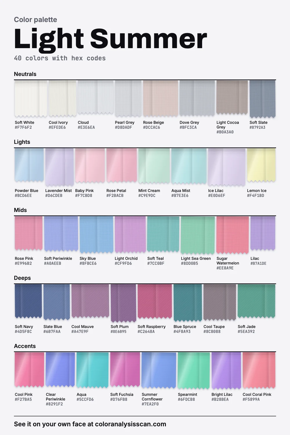
The Light Summer palette
40 colors with hex codes. Tap any color to copy its hex code.
Neutrals
Lights
Mids
Deeps
Accents
Same problem as Light Spring, opposite fix
Pale coloring has one recurring problem, and two seasons were invented to handle it. Too much darkness overwhelms a light face, so both Light Spring and Light Summer stop well short of black, and both wear mostly pale colors. They differ in what those pale colors are doing. Light Spring adds gold. Light Summer adds blue and pink. You can see the pattern in the discs above: each pair sits at about the same lightness, and one disc warms up while the other cools down.
The numbers show it plainly. This board and the Light Spring board are the two lightest of the twelve, and only a little apart. In warmth they split clearly: this one leans cool, Light Spring warm. Both palettes have a dark share of 0%. All of that was computed from our two boards, and it describes the colors, not people. Lightness is the shared problem. Temperature is the fix.
| What you need | Light Summer | Light Spring |
|---|---|---|
| A white | Soft White, Cloud | Warm Ivory, Cream |
| A mid neutral | Dove Grey, Rose Beige | Sand, Light Camel |
| A dark anchor | Soft Navy, Soft Slate | Soft Cocoa, Light Taupe |
| A pink | Rose Pink, Baby Pink | Light Coral, Shell Pink |
| A green | Soft Jade, Mint Cream | Spring Green, Pistachio |
| A metal | Silver, white gold | Yellow gold, rose gold |
Why black feels heavy
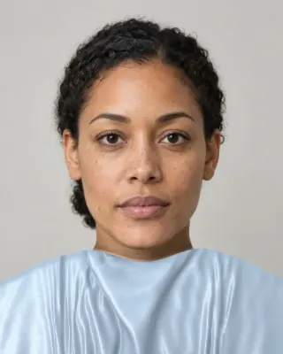
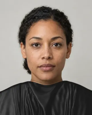
If you stopped wearing black because it made you look ill, this palette offers an explanation. Black is about the furthest thing from a pale, cool face, so it takes all the attention and it exaggerates any shadow around the eyes and mouth. Chocolate has a similar weight and adds warmth too, which is why our avoid list names both.
Soul of Color says much the same, listing black, dark brown, burgundy, deep olive and maroon as colors that overwhelm this season. Our rule of thumb is easy to remember. If it would look at home in a Deep Winter wardrobe, try it on a mannequin first. If you still want something dark near your face, Soft Navy is the one to try, and a silvery scarf can sit between a black coat and your skin.
You have more dark room than you think
It’s easy to stop at “wear pastels”, and that undersells this season. There is a difference between the twins that doesn’t involve temperature. Our Light Summer board goes down to Soft Navy, and Light Spring stops at a lighter soft cocoa, so your range from light to dark is wider too.
Light Summer
Soft Navy
deep
Soft Plum
medium
Slate Blue
medium
Blue Spruce
medium
Light Spring
Soft Cocoa
medium
Warm Rosewood
medium
Sea Teal
medium
Light Taupe
medium
In practice that gives you navy, plum and a good slate blue. Soft Navy looks close to a real navy trouser or blazer, and it’s a far better base than black. Soft Plum is lovely in a knit, and Soft Raspberry will carry a whole evening. Staying only pale can look a bit like a nightgown, and it’s an easy mistake to make here. A navy jacket over a Powder Blue shirt looks more grown up than two pastels, and it doesn’t cost you any softness.
Why so many pale colors look pink or lilac
This is a small science aside that happens to suit you. If you add white to a color, it doesn’t only get paler. It can also shift in hue, a perceptual quirk called the Abney effect. As white goes in, red drifts slightly toward magenta and blue slightly toward violet. It was measured with colored lights and is weaker on a screen, and likely in cloth, so don’t over-read it. Still, it may be one reason so many tints read as pink and lilac, and it fits with how Lavender Mist, Ice Lilac and Powder Blue feel as a family.
Pastels in the strict sense are colors with high value and low to medium saturation, and that describes a lot of this board. But not all of it. On average it’s clearly stronger than Soft Summer. So Clear Periwinkle, Cool Pink, Aqua and Soft Fuchsia are all fair game. 10% of the board counts as vivid, and a little of that keeps pale outfits from going sleepy.
Silver first, and when rose gold works
Polished silver, white gold or platinum first. That’s the short answer, and it fits how bright these metals are against a pale face. Rose gold can work if it’s pale, since less copper means less red: in the common 18-karat alloys, rose gold has slightly more copper than pink gold, and red gold has the most. So look for pink gold if a jeweler carries it. Yellow gold is where people get in trouble, because it adds exactly the warmth this palette removes. A thin yellow chain won’t hurt you, but the cooler metal will look more like it belongs.
Are you sure you’re a Light Summer?
Light Spring
The obvious alternative, and easy to mix up, particularly in photos, since warm indoor light adds gold to everything. Compare Powder Blue with Light Aqua, or Soft White with Warm Ivory, at a window. If the warmer version leaves you looking clearer, go read the Light Spring page.
Cool Summer
Cool Summer is clearly darker on average and has a real mid-range. If Soft Navy feels too pale to do much and Lilac feels babyish, you may belong there. Soul of Color adds one useful note here: its True Summers often have medium to dark brown hair, and blonde tends to wash them out.
Soft Summer
Soft Summer is greyer and quieter. If the Aqua and Cool Pink here feel loud, compare them with their dustier versions there.
Who this coloring describes
The usual picture is fair, neutral-cool skin, ash-blonde or light ash-brown hair, and light eyes in blue, grey or green. That’s what Soul of Color describes, and it’s worth noticing how specific it is. Published descriptions lean strongly toward fair people, partly because Color Me Beautiful, the book that spread the idea, focused mostly on white readers. You’ll rarely see this one shown on medium or deep skin, which may say more about who got photographed than about who it suits. Season systems are a set of conventions, and lightness is relative to the rest of your coloring. Whether you match isn’t a matter of fitting a list. Try the season test, which reads your own face and shows your colors beside your photo.
Celebrities commonly typed as Light Summer
Soul of Color’s list includes Cate Blanchett, Gwyneth Paltrow, Jodie Foster, Margot Robbie, Meryl Streep, Michelle Pfeiffer, Naomi Watts, Reese Witherspoon, Rosamund Pike and Sharon Stone, plus Daniel Craig, Jude Law and Ryan Gosling. Billie Eilish, Dakota Fanning and Yvonne Strahovski appear with a note that they’re sometimes analyzed as Light Spring. The site says none of its typings are verified.
The same page includes the best warning we’ve seen about this particular list. It says most famous Light Summer women have highlighted or dyed blonde hair over natural roots around level 6 to 8, which is dark blonde or light brown. In other words, many of these typings rest on a hair color that doesn’t grow on the person’s head. It’s a reasonable caution for anyone comparing themselves with a screen star. If your hair is mousy and you look nothing like the pictures, you can still be this season.
Cream, beige and the other traps
Plenty of people get told they suit “soft neutrals” and head straight for cream and beige. On this coloring those are often the first things to go wrong, since most of them are yellow-based. Our board’s version of beige is Rose Beige, which has a pink cast, and its version of cream is Cool Ivory. Compare them with a bought cream sweater at a window and you’ll see the difference right away. The same goes for tan raincoats and camel coats, both sold as safe, and both better replaced with Dove Grey or Soft Slate. In the cold months, a soft grey coat with a Lilac or Soft Teal scarf looks far more like you than a black one, and it photographs better too.
Makeup, briefly
Sheer cool rose, soft raspberry or blue-pink on the lips. A cool baby pink on the cheeks. Dove grey, soft plum and powder blue on the eyes, and a charcoal-brown liner where you’d otherwise use black. Sheer is the key word. Light coloring doesn’t need much pigment, and a heavy matte lip can have the same effect as a black top.
What else to skip, and how to shop
Three avoid-list colors are all about yellow. Orange can leave pink skin ruddy, Mustard turns it sallow, and Rust sits apart from you entirely. In a store, the question isn’t “is this pale?” but “is it pale and blue-based?” Many pale colors on sale, like butter, peach and ecru, are warm, and they’ll look fine on the hanger and yellow on you. Hold anything off-white against Soft White and look for a yellow cast. Spring is your best buying season, since the pale colors arrive then, and fine knits in Dove Grey and Soft Slate tend to be available all year.
A first set: soft navy trousers, a dove grey coat, a soft white shirt, a powder blue knit, a rose pink top, a soft teal dress and a lilac scarf. The rest of the summers are on the summer palette page, every season is on the hub, and a palette narrowed to you is what the Full Color Report describes.
Related guides and tools
Sources
Full Color Report
Black is on the Light Summer avoid list. Here's why.
The answer is in the report.
$19one time. No subscription.
An in-person color analysis costs about $200 to $600. See a cost guide
Full Color Report
Light Summer
Personal palette
Metals
Silver and white gold
Makeup
Sheer cool rose, soft raspberry and blue-pink.
What's included
- Fifteen AI pictures of you: 3 best colors beside 3 worst, your lead color, 3 hair colors, day and evening makeup, 2 outfits, and glasses with jewelry
- What we measured on your face: undertone, depth, clarity and contrast, and how close your second season was
- Your full palette of about 40 named colors, with hex codes and how to use each group
- Your colors to avoid, why, and how to wear them away from your face
- Makeup from foundation to nails: lips, blush, eyeshadow, liner and brows, with a day and an evening look
- Hair colors to choose and to skip, and what to say to your colorist
- Metals, jewelry, glasses frames and leathers in your colors
- Your contrast level, your white and your black, suit and coat colors, prints, fabrics and denim
- A capsule wardrobe as outfit formulas, every piece in your colors
- A shopping guide: the color names to search for and the label words to skip
- The "Does this suit me?" checker for anything you might buy
- Your second season, and when to borrow from it
- A PDF of the whole report, a swatch card, a phone wallpaper and a share card, saved to your account
Common questions
- What is a Light Summer?
- A coloring described as light first and cool second, gentle and rosy. The palette has airy blues, pinks and lilacs, with soft navy as its darkest note. It's the second-palest of the twelve we publish.
- What's the difference between Light Summer and Light Spring?
- Temperature. On average they're almost equally light in our palettes, while one leans cool and the other warm. Light Summer also goes darker, so a soft navy belongs here and not on the Spring board.
- Why does black feel heavy on a Light Summer?
- It's about the furthest thing from a pale, cool face, so it takes over and exaggerates shadows. Soft navy or soft slate gives an outfit a dark anchor without that drop. A black coat with a silvery scarf at the neck is a fair compromise.
- Should a Light Summer wear silver or gold?
- Silver, white gold or platinum first. Pale rose gold or pink gold can also work, because it has less copper than red gold. Yellow gold tends to add the warmth this palette takes out.
- Does a Light Summer have to wear only pastels?
- No. Soft navy, soft plum and soft raspberry all sit on the board. Mixing one of these with a pale color looks more grown up than a head-to-toe pastel, and it stays soft.
- Can you be a Light Summer without blonde hair?
- Yes. Natural Light Summer hair is often dark blonde or light brown with an ash cast. Soul of Color points out that many famous examples are highlighted or dyed, so don't rule yourself out by comparing with the pictures.

See which colors are yours.
See your colors on your own face, compare seasons side by side, and get your season, your undertone and a starter palette.