Summer color palette: light, cool and soft summer compared
In color analysis, summer means cool and soft. The sunny brights you're picturing are on its avoid lists. Copy the real codes and compare Light, Cool and Soft Summer.
Hold one up to your face
Summer hex codes
Six signature colors from each summer. They’re quiet on purpose. Anyone who wants them for a calm layout is welcome to them, and anyone choosing clothes should look at one column, then read on to find out which.
Airy blues, pinks and lilacs.
Light Summer
Blue-based, with real strength.
Cool Summer
Grey in every color.
Soft Summer
Why summer isn’t what you think
The name misleads almost everyone. Hear “summer palette” and you picture hot pink, orange and lemon. In color analysis those are close to the opposite of the idea. Carole Jackson’s 1980 list for summers was dusty rose, grey, cornflower blue, lavender and taupe, and Soul of Color pictures the True Summer palette as summer skies, lakes and long soft sunsets. It’s the summer of haze, with the beach umbrellas left out.
Our numbers put it plainly. Rank our twelve palettes from most vivid to most muted, and the summers come 9th, 10th and 12th. The strongest color on each board is Bright Lilac, Fuchsia Rose and Greyed Raspberry. Now look at what’s out on the right of the chart at the top of this page: Bright Orange, Hot Pink and Lemon, and all three are on Soft Summer’s avoid list.
So if you want a bright poster palette for a June campaign, nothing here will do it, and you’re better off elsewhere. Personal color and design palettes are different things, and on this one word they point in opposite directions. Everything below is personal color.
Two questions: how light, and how soft?
All three summers are cool, so temperature won’t pick one for you. The split comes from Munsell’s other two dimensions: value, which is how light, and strength, which is how far from grey.
| Light | Cool | Soft | |
|---|---|---|---|
| Depth | light | medium | medium |
| Strength | soft | soft | very muted |
| Measures cool | 42.5% | 52.5% | 22.5% |
| Muted colors | 40% | 37.5% | 75% |
| Darkest color | Soft Navy | Marine Navy | Storm Navy |
One result goes against the usual picture of “soft” as darker. Our Soft Summer board is a little lighter on average than Cool Summer, because Cool Summer holds real darks like Marine Navy and Soft Summer stays nearer the middle. The gap isn’t large, and color measurement is uneven with blues, so don’t lean on it too hard. The gap in strength is the one to trust: Soft Summer has about half of Cool Summer’s strength, and three quarters of its board counts as muted.
Meet the three
Light Summer
Light first, cool second, with Powder Blue, Rose Pink and Lilac, and nothing in our dark band. Don’t rule yourself out for not being blonde: Soul of Color calls that a common misconception and puts many natural roots around level 6 to 8, dark blonde to light brown. Its neighbor in the next family is Light Spring, a little lighter and clearly warmer. Run the scan or browse the board.
Cool Summer
Usually the same season as True Summer, and the coolest palette of our twelve: Rose, Cornflower and Cool Teal. A caution on the name: Agile Styling’s 16-season method has both, with Cool Summer as a stronger flow toward True Winter. Next door sits Cool Winter, close in lightness and far ahead on strength. Run the scan or see every color.
Soft Summer
The most muted palette we publish, with Dusty Rose, Soft Denim and Sage Grey. Soul of Color describes hair, skin and eyes at a similar depth, so that nothing stands out from the rest. It borders Soft Autumn, almost exactly as light and split by warmth. Run the scan, and see the board for the lot.
Which neutrals?
This is where a summer wardrobe really starts, because neutrals are what you wear most, and the shop defaults, black and camel, are the wrong ones here.
Light Summermuted
Soft White
#F7F6F2
Cool Ivory
#EFEDE6
Cloud
#E3E6EA
Pearl Grey
#D8DADF
Rose Beige
#DCCAC6
Dove Grey
#BFC3CA
Light Cocoa Grey
#B0A3A0
Soft Slate
#8792A3
Cool Summermuted
Rose White
#F3EFF0
Cool Silver
#C7CCD4
Blue Grey
#8A99AD
Rose Taupe
#8F7B80
Pewter Blue
#6D7A8C
Cocoa Mauve
#6F5B63
Graphite Blue
#4B5563
Dusk Navy
#33466F
Soft Summermuted
Oyster
#E6E0D8
Smoke
#C9C8C8
Mushroom Grey
#B5ACA6
Cool Greige
#A39C99
Pewter
#8E8E8C
Taupe Grey
#8B7F7C
Faded Cocoa
#6E5F5E
Soft Charcoal
#515A66
Black is on the avoid lists for Light and Soft Summer, and Cool Summer’s list leaves it out because sources disagree about that one. All three give you a dark to use in its place: Soft Navy, Dusk Navy and Soft Charcoal. For white, they each stop short of optic: Soft White, Rose White, Oyster. Camel is on Cool Summer’s list as a golden neutral that turns cool skin sallow, and Blue Grey is the swap.
Metal stays simple, because silver appears on all three lists. Light Summer adds white gold, Cool Summer adds platinum, and Soft Summer adds pewter and a muted rose gold, in a brushed finish.
Am I a summer?
- Find the temperature. Compare a cool rose and a warm salmon under your chin in window light. If the rose evens you out and the salmon makes you look ruddy, keep going. The undertone test gives a first reading.
- Check for softness. Hold a saturated cobalt next to a dusty blue. If cobalt arrives first and the dusty one lets your face come forward, you’re likelier a summer than a winter.
- Decide how light. If Marine Navy feels heavy and Powder Blue feels right, look at Light Summer. If you need that navy to look finished, Cool Summer. If neither strength feels right and only greyed colors settle, Soft Summer.
Skin depth isn’t on that list on purpose. Soul of Color’s Soft Summer runs from medium-dark to medium-light, and it says plainly that telling these seasons apart from photos alone is difficult. The season test does it with fabric instead, which is closer to how draping works. The 12-season chart and the palettes hub have the wider view, and the Full Color Report covers a personal palette.
Related guides and tools
Sources
Full Color Report
The free result shows your season. The report shows you in your colors.
$19one time. No subscription.
An in-person color analysis costs about $200 to $600. See a cost guide
Full Color Report
Bright Winter
Personal palette
Metals
Silver, platinum and white gold
Makeup
Hot pink, cherry red and clear fuchsia.
What's included
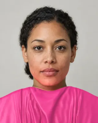
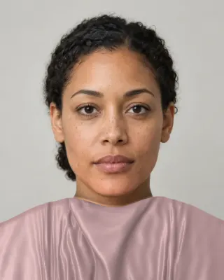
- Fifteen AI pictures of you: 3 best colors beside 3 worst, your lead color, 3 hair colors, day and evening makeup, 2 outfits, and glasses with jewelry
- What we measured on your face: undertone, depth, clarity and contrast, and how close your second season was
- Your full palette of about 40 named colors, with hex codes and how to use each group
- Your colors to avoid, why, and how to wear them away from your face
- Makeup from foundation to nails: lips, blush, eyeshadow, liner and brows, with a day and an evening look
- Hair colors to choose and to skip, and what to say to your colorist
- Metals, jewelry, glasses frames and leathers in your colors
- Your contrast level, your white and your black, suit and coat colors, prints, fabrics and denim
- A capsule wardrobe as outfit formulas, every piece in your colors
- A shopping guide: the color names to search for and the label words to skip
- The "Does this suit me?" checker for anything you might buy
- Your second season, and when to borrow from it
- A PDF of the whole report, a swatch card, a phone wallpaper and a share card, saved to your account
Common questions
- What are the three summer color types?
- Light Summer is light first and cool second. Cool Summer, usually the same as True Summer, is cool above all. Soft Summer is muted first and cool second, the most muted of our twelve palettes.
- Is a summer palette bright?
- No. In color analysis it's among the softest families, despite the name. Bright colors such as hot pink, orange and lemon are on summer avoid lists. If you want a bright design palette for the season, you're looking for something else.
- What are the best neutrals for a summer?
- Soft navy, dusk navy and soft charcoal in place of black. Soft white, rose white and oyster in place of optic white. Blue grey, dove grey and taupe grey fill the middle. Each season's board has its own eight.
- Can a summer wear black?
- Black is on our avoid lists for Light and Soft Summer. Cool Summer leaves it off because sources disagree. Away from your face it's a small matter, and a dusty scarf or a soft navy collar between black and your skin does a lot.
- Why does Soft Summer look boring on a screen?
- Because a screen puts these colors next to pure white, the brightest thing it has, and muted color looks washed out there. Against a face with the same softness, those colors stop looking dull. That's also why you can't judge them from a swatch list.
- Can I use these hex codes for a design?
- Yes, and they suit calm, editorial layouts. Copy one season's column for a set that hangs together. For text, use the darkest navy or charcoal on the palest color, since most of the mid-tones are too close together to read as words.

See which colors are yours.
See your colors on your own face, compare seasons side by side, and get your season, your undertone and a starter palette.