Soft Autumn color palette: muted, warm colors to try on live
Muted first, warm second. Forty colors that can look faded on a hanger and exactly right under your chin, with every hex code ready to copy.
The Soft Autumn palette
40 colors with hex codes. Tap any color to copy its hex code.
Neutrals
Lights
Mids
Deeps
Accents
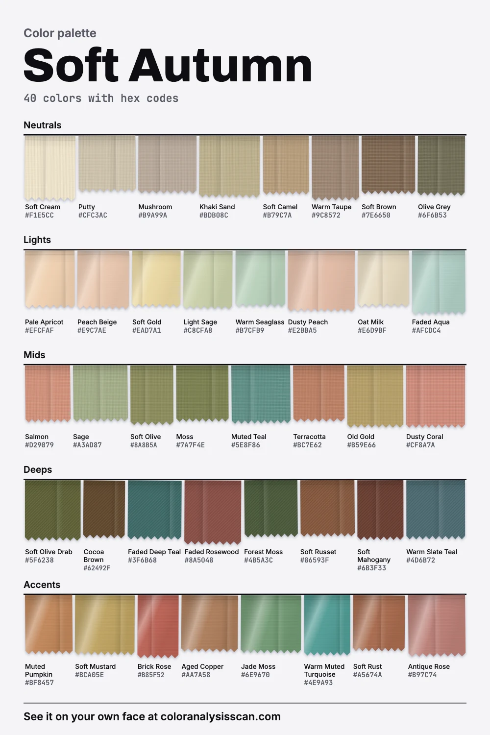
What this palette is doing
Soft Autumn is the quiet end of the autumn family. Its first trait is softness, meaning colors with a lot of grey in them, and warmth comes second. That order explains why sage, camel and terracotta belong together here: none of them is loud. In our 40 colors, 0% count as vivid and 50% count as muted. Even the strongest color on the board, Brick Rose, stays gentle, and the hero picture above shows how far it sits below what its own hue could do.
In Soft Autumn color analysis, it helps to describe all this on the three axes analysts use:
- Temperature. 82.5% of the palette measures warm and 10% measures cool, for an average that leans clearly warm. Warm, though not golden: True Autumn runs noticeably warmer.
- Value. On average the colors are medium, close to the middle of the scale. Soft Autumn can be pale or quite dark. The mix is what counts, and only 5% of it falls in our dark band.
- Strength. Low: the colors are greyed and gentle. Only Soft Summer is more muted.
Albert Munsell described color in three dimensions, and they map onto temperature, value and strength here. All of this describes the palette we built by hand, never a person, and small differences are worth little. The wider frame is a styling convention, not a science. Carole Jackson, who made seasons famous in 1980, wrote that she could have called people “Type A” and “Type B”, and that seasons were simply the more poetic label.
Soft Autumn or Soft Summer? The number that settles it
Most people landing here have been told one of these two, or both. Lists online even disagree about which of the two is lighter. In our palettes the honest answer is neither: on average they’re almost exactly as light as each other, a difference you would never see. Strength differs a little more, with Soft Summer the more muted of the two. The real split is temperature: Soft Autumn leans clearly warm and Soft Summer sits just on the cool side of neutral.
So if you’re stuck between them, stop asking how light you are. Only one question is left, and your own eyes can answer it: put Salmon under your chin, then Dusty Rose, in daylight, and look at your skin instead of the fabric, especially around the mouth and under the eyes. If the pinker color leaves you yellow there, while the salmon evens you out, that leans Soft Autumn. The full comparison page goes color by color.
The other two autumns you could be
True Autumn shares your warmth but has almost double your strength. Deep Autumn keeps the warmth and is clearly darker. If this palette looks pleasant on you but slightly sleepy, try both. We compare them directly in Soft vs True Autumn and Soft vs Deep Autumn.
What to look for in the mirror
The usual description is coloring that blends: hair, eyes and skin close to one another, nothing sharply lighter or darker than the rest. Soul of Color’s analyst notes that the eyes can change color with the light, green here and brown there, and that hair often isn’t much darker than skin. None of that depends on being fair. Soft Autumn occurs on medium and deep skin as well, where the same low contrast shows up between skin, brows and hair at a deeper level. Don’t rule yourself out because the example photos you’ve seen were all pale, and be wary of any tool that does. The season test starts from your own face.
What right looks like, since a screen can’t show you
A board of muted colors on a white web page has two things working against it. White is the brightest thing on your screen, and colors shift according to what sits beside them, which is what the chemist Michel Eugène Chevreul described as simultaneous contrast back in 1839. So Salmon looks chalky here and Sage looks a little dirty. Next to warm skin, neither does. That gap explains why so many people find this palette disappointing online and then come round to it in a fitting room.
When a color suits you, look for three things in the mirror:
- Your skin looks more even, with redness around the nose and shadows under the eyes easing off.
- You see your face first and the garment second.
- Your eyes pick up something. Hazel eyes in particular can look greener beside Sage and more golden beside Soft Mustard.
The ways it goes wrong are useful too, because each one points to a different axis:
- The garment arrives before you do. Too much strength. Go softer.
- Your skin turns yellow or grey. Wrong temperature. Try the same strength on the other side of neutral.
- You look tired, with darker shadows. Too much depth for this spot on your body. Move the color lower, or go lighter.
- Everything looks blurred and pale. Not enough depth or strength. You may sit closer to True Autumn.
Nothing in that list is a measurement. It’s judging by eye, the same way draping has always worked, and two honest people can disagree. That’s fine. The aim is a wardrobe you like looking at yourself in.
The colors, in the order you’d buy them
A palette of 40 tells you little about where to spend money. Start with the group you wear most. Soft Camel, Warm Taupe, Olive Grey and Soft Brown are coat and trouser colors, and they cover most of a working week without looking like a uniform. Next come the mid-tones that put color near your face: Salmon, Terracotta, Sage and Muted Teal. These four are the ones to test first, because they show the season at its clearest.
Darker pieces come third. Cocoa Brown, Forest Moss and Faded Deep Teal give an outfit weight, and lighter colors like Soft Gold and Peach Beige keep it from going dull in summer. Accents such as Soft Mustard, Muted Pumpkin and Brick Rose are as strong as this palette gets, so a scarf or a knit in one of them can carry a plain outfit by itself. Every hex code on the board above copies with one tap, and the PNG download gives you all 40 as swatches for shopping.
What replaces black and white
Black is the first thing people ask about, and in our palette it’s a clear no near the face. The darkest color we kept is Soft Mahogany, a deep brown that is still far lighter than black. Your own coloring rarely goes that dark, so black becomes the sharpest edge in the picture, and every soft tone around it reads as tired.
Instead of black
Black
deep
Soft Mahogany
deep
Cocoa Brown
deep
Forest Moss
deep
Faded Deep Teal
deep
Instead of white
Optic White
light
Soft Cream
light
Oat Milk
light
Pale Apricot
light
Putty
light
Pick Cocoa Brown for the jobs black usually does, such as trousers, a good bag and a winter coat. Forest Moss and Faded Deep Teal work where brown feels too obvious. For evening, Soft Mahogany is the closest thing to formal black you have. White is the same story at the other end: a bright blue-white shirt looks crisp on its own and chalky on you. Soft Cream and Oat Milk replace it almost everywhere, including T-shirts and linen. Already own a black coat you love? Keep it. A scarf in Dusty Peach or Muted Teal between the collar and your face solves most of the problem.
Soft Autumn blues and pinks
These two questions come up often because the season’s reputation is all rust and olive. It does have both. The blues just aren’t very blue, and the pinks aren’t very pink.
The blues
Faded Aqua
175°
Muted Teal
181°
Warm Muted Turquoise
188°
Faded Deep Teal
191°
Warm Slate Teal
219°
Royal Blue
295°
The pinks
Dusty Peach
57°
Salmon
45°
Dusty Coral
38°
Brick Rose
35°
Antique Rose
32°
Icy Pink
344°
For blues, reach for the green side: Muted Teal, Warm Muted Turquoise and Warm Slate Teal. Denim works when it’s washed and slightly grey. A saturated cobalt or royal blue takes over the outfit. For pinks, go through peach and rose: Dusty Peach for a soft top, Antique Rose near the face, Brick Rose when you want some strength. Cold baby pink is the one to skip, since it can leave warm skin looking yellow beside it.
Greens, the family you can barely get wrong
If you only explore one color family, explore this one. Nine of our 40 colors sit in the green range of the hue circle, between yellow-green and sea green, more than most people expect from a season with a name like autumn. Sage and Light Sage are the easy tops. Soft Olive and Moss work as trousers and jackets, and they’re close to neutrals in how they behave. Forest Moss is a dark that can pass for formal. Jade Moss is the brightest of them and a good one for a dress or a scarf. People with olive-leaning skin often get told they have nothing to wear, and this is usually where they find it. Our guide to olive skin goes deeper into that.
The worst colors, and what each one does
“Avoid” means near your face, in big amounts. Wear what you like on your legs. Our list has five, and each fails for its own reason:
- Black. Too much edge, as above.
- Optic White. Blue-leaning and sharp, so warm skin looks muddy by comparison.
- Fuchsia. Wrong on both axes. It’s far more vivid than anything in the palette, and it leans blue.
- Royal Blue. Very vivid, and very cold. A muted teal does more for your eyes.
- Icy Pink. This one is soft enough. The trouble is temperature: it’s pale and blue, which is the combination that reads as sallow.
Metals, makeup and hair
Brushed or matte gold, rose gold and bronze suit this palette better than bright polished silver. Rose gold makes sense for a physical reason as well as a styling one: it’s an alloy of gold and copper, and its pink comes straight from the copper. Keep the finish quiet. A satin surface echoes the softness of the clothes, where a mirror polish adds a hard highlight.
For makeup, our starting points are warm rose, soft terracotta and peach nude on the lips, dusty peach on the cheeks, and warm taupe, olive and soft bronze on the eyes, with brown liner smudged instead of drawn. There’s much more on the Soft Autumn makeup page, along with nail colors. Hair has its own page too: soft golden browns and muted copper hold up, and very ashy or very bright dye fights the palette from both sides. If you want examples of the coloring, see who gets typed this way, with the caveat that those typings are guesses from photos.
How to shop it without a color fan
- Save the palette image to your phone, then compare it in daylight by a window. Store lighting moves warm colors a long way.
- Don’t trust a color’s name. “Rust” on a label can be far stronger than Soft Rust. Compare the thing itself.
- Look for a slight dustiness. Heathered knits, washed linen, garment-dyed cotton and suede all make a color look softer, which is why a washed version of a color can pass here when the crisp version doesn’t.
- Online, distrust the photo. Product shots are color balanced and edited, so a garment can arrive warmer or cooler than it looked. Buy from places with easy returns until you know a brand.
A first capsule
Eight pieces, in order: a soft camel coat, cocoa brown trousers, soft cream knit, a warm taupe blazer, a salmon top, a muted teal top, soft olive chinos or a skirt, and a soft mustard scarf. Every piece goes with every other one, since nothing in that list is strong enough to clash. Soft Autumn outfits takes this further with combinations. To test a color against your own face first, use the button at the top of this page. To get a personal cut of the palette, the Full Color Report is described on the pricing page.
Other families live on the autumn palette page, and all twelve are on the palettes hub.
Related guides and tools
Sources
Full Color Report
Black is on the Soft Autumn avoid list. Here's why.
The answer is in the report.
$19one time. No subscription.
An in-person color analysis costs about $200 to $600. See a cost guide
Full Color Report
Soft Autumn
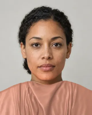
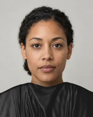
Personal palette
Metals
Rose gold, bronze and yellow gold
Makeup
Warm rose, soft terracotta and peach nude.
What's included
- Fifteen AI pictures of you: 3 best colors beside 3 worst, your lead color, 3 hair colors, day and evening makeup, 2 outfits, and glasses with jewelry
- What we measured on your face: undertone, depth, clarity and contrast, and how close your second season was
- Your full palette of about 40 named colors, with hex codes and how to use each group
- Your colors to avoid, why, and how to wear them away from your face
- Makeup from foundation to nails: lips, blush, eyeshadow, liner and brows, with a day and an evening look
- Hair colors to choose and to skip, and what to say to your colorist
- Metals, jewelry, glasses frames and leathers in your colors
- Your contrast level, your white and your black, suit and coat colors, prints, fabrics and denim
- A capsule wardrobe as outfit formulas, every piece in your colors
- A shopping guide: the color names to search for and the label words to skip
- The "Does this suit me?" checker for anything you might buy
- Your second season, and when to borrow from it
- A PDF of the whole report, a swatch card, a phone wallpaper and a share card, saved to your account
Common questions
- What is a Soft Autumn in color analysis?
- A coloring described as muted first and warm second: hair, eyes and skin that blend, with a gentle golden or olive warmth. The matching palette is earthy and muted, so colors like sage, camel, salmon and muted teal sit comfortably next to the face.
- What is the best black alternative for a Soft Autumn?
- Cocoa brown does most of the work: trousers, bags, winter coats. Forest moss and faded deep teal are good when brown feels predictable, and soft mahogany is the closest you get to formal black.
- Can a Soft Autumn wear blue?
- Yes, on the green side of blue. Muted teal, warm slate teal and washed denim all work. A saturated royal blue or cobalt is the problem, since it is far stronger and colder than anything else in the palette.
- How do I know I'm not a Soft Summer?
- Lightness won't tell you: on average our two palettes are almost exactly as light as each other. Temperature will. Compare a salmon and a dusty rose under your chin in daylight. If the rose leaves your skin yellowish and the salmon evens it out, you lean Soft Autumn.
- Is Soft Autumn the same as Muted Autumn?
- They hold a similar position, and 16-season systems often use the name Muted Autumn. Agile Styling, which uses that system, warns that the palettes aren't necessarily identical, so check a palette from the same system you were typed in.
- Should a Soft Autumn get rid of black clothes?
- No. Black matters most next to the face and in large amounts, so black shoes, trousers and belts are fine. For a black top or coat, add a scarf or necklace in a palette color between it and your skin.

See which colors are yours.
See your colors on your own face, compare seasons side by side, and get your season, your undertone and a starter palette.