Bright Winter color palette: vivid, cool colors to try on live
The widest range and the most vivid colors of the twelve. Black, white and a vivid color at once is a normal outfit here, and this page shows how to wear it.
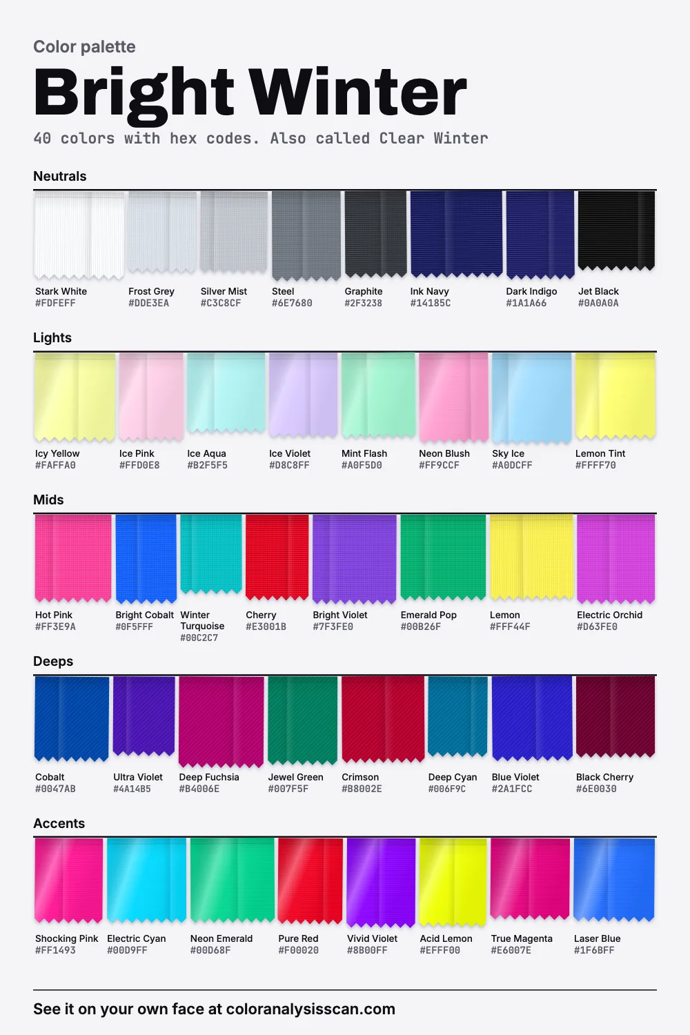
The Bright Winter palette
40 colors with hex codes. Also called Clear Winter. Tap any color to copy its hex code.
Neutrals
Lights
Mids
Deeps
Accents
Everything at once
Most palettes give up something. Soft ones drop strength. Light ones drop darkness. Bright Winter gives up almost nothing except softness, and the chart at the top shows the result: forty colors scattered from one end of the lightness scale to the other, many of them standing very tall. It runs from Stark White down to Jet Black, the widest range of the twelve. On average it’s also the most vivid, peaking at Vivid Violet. And 52.5% of the colors count as vivid, tied for first.
In a sense the palette’s logic is simple: if a face has very strong contrast of its own, softer colors look weak beside it. Analysts built this season around coloring described as clear first and cool second, with the strongest contrast of all the seasons. Everything on this page follows from that. Remember that the numbers describe our own board, nobody’s actual face. Colors this strong are also where measurement is least precise, so read “most vivid” as “very strong” rather than an exact ranking.
Bright Winter, Clear Winter: any difference?
You’ll occasionally see Clear Winter used for the same place on the chart, usually meaning no difference at all. Bright is the common English name and the one we use. In the 16-season method from Agile Styling, Bright Winter counts among the palettes considered fundamentally neutral, with a slight winter lean. That matches something we noticed in our own data, covered below.
Why does high contrast work here?
Honest answer: part of this is measured, and the bit people care most about isn’t. Facial contrast is a real thing researchers measure, defined as the luminance difference between the features and the skin around them. Studies have linked it to how faces are perceived, including perceived age: a 2013 paper in PLOS One, on a large sample of Caucasian women, found that it fell with age and that faces with more of it looked younger, and that typical makeup raises it. None of that is about seasons, clothing or any other population.
So here is the convention, stated as a convention. Color analysts hold that clothing should echo the amount of contrast in a face. The idea goes back at least to the artist Johannes Itten, who wrote in 1961 that a high-contrast brunette would choose dark colors and high contrast. A high-contrast face in low-contrast clothes looks underdressed, as if the outfit hasn’t caught up. Nobody has tested this in a controlled way, as far as we know, and we’d be suspicious of anyone who said they had. It’s still an easy thing to try on yourself. Put on a grey-beige sweater, then a crisp black and white. If the sweater makes you look tired and the contrast makes you look finished, the idea works for you. Your own level is covered in more depth in our guide to low and high contrast faces.
Black, white and vivid, all in one outfit
On most seasons this combination is a costume. Here it’s closer to a uniform.
One color, top half
Cobalt, Jet Black, Stark White
One color, bottom half
Stark White, Hot Pink, Jet Black
Two colors, on black
Jet Black, Electric Cyan, True Magenta
The rule that keeps it wearable is having one clear idea. Pick your neutrals, then pick one or two colors that are strong enough to stand next to them, and stop. Jet Black trousers, a Stark White shirt and a Cobalt jacket look deliberate. Add a printed scarf in three more colors, and you’ve lost it. If you want color on color, use sharp neighbors such as Hot Pink with True Magenta, or wide jumps such as Electric Cyan with Cherry. Bold graphic prints, color blocking and clean stripes are all on the table. This is one of the few seasons that can honestly carry a Mondrian dress.
One practical note: because the palette spans so much, its neutrals have an unusual look. Ink Navy and Dark Indigo are neutrals with far more color than you’d find in any other navy, and Steel and Graphite look nearly colorless next to them. Navies this vivid are hard to buy, so look at them next to true black in the shop. A dull navy will look tired there, and a vivid one will look alive.
On paper, neither warm nor cool
Bright Winter is filed under the cool seasons. Our numbers say something a bit different. On average it sits as close to neutral as any palette we have, with 32.5% of the colors reading warm and 40% reading cool. Some of this comes from how we measure: warmth scores any red as warm, so Cherry and Pure Red pull the average up even though analysts wouldn’t call them warm reds. But it also says something true. This season draws on the whole color wheel, with acid yellows and electric cyans on the same board. What holds them together is that none has any grey in it.
So what makes it “winter”? Its neutrals (all cold or dead neutral), its metals and its pure black and white. If you stick with cool neutrals, you can reach further around the wheel for color than the word “cool” might suggest.
What dulls it
Dulling is the main risk here, and it happens quickly. Our avoid list isn’t about warmth so much as softness. Dusty Rose, Mushroom and Dusty Olive are muted, and even Camel is only moderate. Rust is the exception. It’s strong, but earthy and warm, so it looks muddy beside crisp coloring.
Faded and washed finishes count as colors on this list, in effect. A vintage wash takes Cobalt and moves it toward something you wouldn’t pick. So does a heavy heather. It’s worth checking anything you already own that has started to fade, because a color on this palette has further to fall than one on a softer palette.
Bright Winter or Bright Spring?
Strength won’t separate these two: on average they’re equally vivid. Temperature and depth will. Bright Spring leans clearly warmer, and it’s a little lighter, with less at the dark end.
To tell, compare Stark White with a warm white, and Jet Black with a dark chocolate. These are bigger differences on a neutral than they are on a bright. If stark white and jet black look right, you’re here. Otherwise read the Bright Spring page. Soul of Color flags one name, Lily Collins, as possibly either.
The other two winters
Cool Winter is more firmly blue-based, with 50% of its colors reading cool, and has less strength. Deep Winter holds 40% dark colors against your 20%, and if your best colors are always dark jewels and never brights, it’s the better bet.
Coloring that tends to fit
Soul of Color calls Bright Winters a rare bird: people who can truly pull off bright colors. Its sketch includes jet-black or deep cool brown hair, eyes that stand out in some way, from icy blue to bright green to black, and skin from light to dark with a vibrant, glowing quality. That spread is a useful reminder that skin depth doesn’t decide this. Contrast can come from your eyes against your skin, or your hair against your skin, at any depth. The season test will tell you where to start, and the scan reads your skin, eyes and hair and shows whether colors like Cobalt and Hot Pink are in your palette.
Celebrities commonly typed as Bright Winter
Soul of Color lists Adriana Lima, Courteney Cox, Jameela Jamil, Katy Perry, Krysten Ritter, Laura Harrier, Lily Collins, Megan Fox, Nicole Scherzinger and Tina Fey, along with Adrien Brody, Donald Glover, Idris Elba, Michael B. Jordan and Will Smith. Dua Lipa appears on the site’s Deep Winter list with a note that she may be a Bright Winter. The source openly states these typings aren’t verified, and that color seasons are hard to judge from photos. Bear in mind too that studio lighting, red carpets and retouching all raise contrast, so a celebrity’s photos might show more contrast than they have in person.
At the office, or when you want less
You may have one easy advantage: black, white and grey are already the language of most workplaces. A Graphite suit with a Stark White shirt looks right on you and unremarkable on the org chart, and a single sharp note, such as Cherry on the lips or an Electric Cyan pocket square, keeps it yours. On days you want to fade into the background, Frost Grey and Ink Navy are as quiet as this board gets. Try not to go softer than that. You’ll just look under the weather.
Mirror finishes and a strong lip
High-shine silver, platinum and white gold. Mirror finishes suit this palette because a polished metal reflects light in one clear direction, rather than scattering it, so you get a crisp bright point in place of a soft glow. For makeup, this is the season for hot pink, cherry red and clear fuchsia on the lips, clean cool pink on the cheeks kept sharp, and crisp black liner with icy highlights or a flash of Cobalt or Bright Violet. A strong lip is easy here and rarely looks like too much.
How to shop for the strongest palette there is
The bright, clean colors you need tend to appear in two places: spring and summer collections, and technical or sports gear. Look for synthetic fabrics and silk, which hold saturated dyes well, and for satin finishes that add a little shine. For neutrals, stick with pure Jet Black, Stark White and Frost Grey. Check in daylight: a color that seemed clean in a shop might have a little mud in it once you’re outside. If you’re already wearing a palette color, hold the new piece against it. Clean next to clean looks crisp. Mud shows up immediately.
Six to begin: a jet black blazer, stark white shirt, graphite trousers, a cobalt knit, a hot pink top and an emerald pop accessory. Next steps: copy the hex codes from the board above, see the other winters on the winter palette page, browse the palettes hub, or read about the Full Color Report, which would cut this palette down to you.
Related guides and tools
Sources
Full Color Report
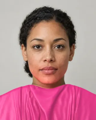
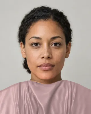
Dusty Rose is on the Bright Winter avoid list. Here's why.
The answer is in the report.
$19one time. No subscription.
An in-person color analysis costs about $200 to $600. See a cost guide
Full Color Report
Bright Winter
Personal palette
Metals
Silver, platinum and white gold
Makeup
Hot pink, cherry red and clear fuchsia.
What's included
- Fifteen AI pictures of you: 3 best colors beside 3 worst, your lead color, 3 hair colors, day and evening makeup, 2 outfits, and glasses with jewelry
- What we measured on your face: undertone, depth, clarity and contrast, and how close your second season was
- Your full palette of about 40 named colors, with hex codes and how to use each group
- Your colors to avoid, why, and how to wear them away from your face
- Makeup from foundation to nails: lips, blush, eyeshadow, liner and brows, with a day and an evening look
- Hair colors to choose and to skip, and what to say to your colorist
- Metals, jewelry, glasses frames and leathers in your colors
- Your contrast level, your white and your black, suit and coat colors, prints, fabrics and denim
- A capsule wardrobe as outfit formulas, every piece in your colors
- A shopping guide: the color names to search for and the label words to skip
- The "Does this suit me?" checker for anything you might buy
- Your second season, and when to borrow from it
- A PDF of the whole report, a swatch card, a phone wallpaper and a share card, saved to your account
Common questions
- What is a Bright Winter?
- A coloring described as clear first and cool second, with the strongest contrast of all the seasons. The palette has true black, stark white and very saturated colors from across the wheel, such as cobalt, hot pink and emerald.
- Is Clear Winter the same as Bright Winter?
- Usually. Clear Winter is a less common name for the same place on the chart. Our page uses Bright Winter throughout, and the color advice applies to either name.
- Why does high contrast work on a Bright Winter?
- Color analysts hold that clothing should echo the contrast in the face, so a high-contrast face can make soft clothing look weak. Researchers do measure facial contrast, but nobody we know of has tested that clothing idea in a controlled way. Try it on yourself in a mirror.
- What colors dull a Bright Winter?
- Greyed or earthy ones: dusty rose, dusty olive, mushroom, camel and rust. Faded and washed finishes have the same effect, even on a color that's right on paper, so choose fabrics that hold a clean dye.
- What is the difference between Bright Winter and Bright Spring?
- Strength is nearly equal in our palettes. The split is temperature and depth: Bright Spring is clearly warmer on average and has less darkness. Compare stark white and jet black with a warm white and a dark chocolate under your chin.
- Can a Bright Winter wear pastels?
- Only clear, icy ones like ice pink, ice aqua or lemon tint, and they work best with something dark or strong nearby. Dusty or chalky pastels tend to look tired on this coloring.

See which colors are yours.
See your colors on your own face, compare seasons side by side, and get your season, your undertone and a starter palette.