Best colors for dark skin, sorted by undertone
Nothing suits every dark skin tone, jewel tones and white included. The answer splits by undertone and by contrast, so here is that split, measured against four published skin tones, with a way to test each color on yourself.
Monk 7
deep
Monk 8
deep
Monk 9
deep
Monk 10
deep
The short answer, and what it leaves out
Most lists say jewel tones and white. That advice isn’t wrong, it’s incomplete, because it treats dark skin as one color. It isn’t. Deep skin runs from reddish to golden to neutral to olive, sits at several depths, and comes with hair and eyes that change how much contrast a face has before any clothing arrives. Those differences decide which of the good colors is yours.
So this page uses a working range, tones 7 to 10 of the Monk Skin Tone Scale, the ten-point scale Ellis Monk developed with Google. Other people draw the line for “dark” elsewhere, and that’s fine. We measure how much lighter or darker each color from our own twelve palettes is than those tones. It’s an imperfect ruler that isn’t even to the eye everywhere, so small differences shouldn’t be read closely. Large ones are real.
On deep skin, almost everything is lighter than you
This one fact changes the usual advice more than any other, and it’s rarely said. We hold 480 palette colors. At Monk 1, 4% of them are lighter than the skin. At Monk 8 it’s 90%, and at Monk 10 it’s 98%.
Pale skin spends its life asking which colors are dark enough to show up. Deep skin has the opposite situation and more room. Only 6% of those colors are close to Monk 10 in lightness, so you can go a long way up the scale in small or large steps, and you get to choose how large. That choice is what the rest of this page is about. It has nothing to do with looking lighter, and any advice that sells a color on those terms can be ignored.
Why “jewel tones pop” needs a footnote
Now the surprise. Jewel tones are the first thing every list recommends, on the grounds that they stand out. Measure them and many have almost no lightness gap at all.
| Color | Monk 7 | Monk 8 | Monk 9 | Monk 10 |
|---|---|---|---|---|
| Emerald | tonal | tonal | soft | soft |
| Ruby | soft | tonal | tonal | soft |
| Sapphire | soft | tonal | tonal | soft |
| Royal Purple | soft | tonal | tonal | soft |
| Jewel Teal | tonal | soft | clear | clear |
| Jewel Rose | tonal | soft | soft | clear |
Ruby, Sapphire and Royal Purple are almost exactly as light as Monk 8. Jewel Rose, Emerald and Jewel Teal do much the same at Monk 7. In a black and white photo, those garments and that skin would read as nearly the same grey.
They still look strong, for a reason worth knowing. Ruby carries about three times as much color as the Monk 8 swatch, so all the separation comes from hue and strength. That gives a particular look: rich, close, with the color and the skin at one level. If that’s what you want, jewel tones are for you. If your eye wants a crisper edge on the same skin, the same hue one or two steps lighter will do what the jewel version can’t. Deepen the skin to Monk 10 and ruby opens up to a soft step in lightness on its own, which is why the same dress can read so differently on two people who’d both be told it “pops”.
Warm or cool on deep skin: the harder half
Undertone exists at every depth, though it’s a smaller signal at the deep end. In our illustrative skin recipes, warm and cool versions of the same tone sit less than half as far apart at Monk 9 as they do at Monk 6. On the published Monk swatches, the amount of color falls steeply from tone 6 to tone 10. Less color to read means more room for the light and the camera to mislead you, which is one reason a chart or a vein check is worth less here than a cloth test.
So test it. Image consultant Carol Brailey, speaking to CBC Radio, traces the old warm and cool test back to the artist Robert Dorr, who compared skin against magenta for cool and orange for warm. It’s still a good first pair, because each is far from neutral. Hold a magenta and an orange under your chin and watch your skin. If it looks even and alive beside one and flat or muddy beside the other, you have a lean. Plenty of people get no clear winner, and that points toward neutral or muted colors. Olive-leaning deep skin often behaves that way, and our olive skin guide has more on why.
If you lean cool
Look for colors with blue in them at any lightness: jewel rose, deep cobalt, cerulean and wine. Icy lights such as icy lavender give a very large step in lightness with almost no warmth, and white behaves the same way.
If you lean warm
The golden side has a reputation for being earthy. Earth tones do work, and a warm emerald and deep camel are reliable, yet they aren’t the whole of it. Marigold, poppy and warm turquoise come from a Spring palette, and they’re bright, clear and warm. A stylist in the CBC story, told by her instructors that she was a Winter, tried paint on her own skin and concluded she was a Spring. Those colors are worth trying before you settle on rust.
If you lean neutral or muted
Colors with some grey in them can look quietly right where the clear ones feel loud: jade moss, rosewood, brick rose. This is the group lists tend to skip, as if deep skin could only carry strong colors. Soft palettes aren’t reserved for anyone, and we’ll come back to that.
Contrast is the second split
Two people at Monk 9 can want very different things. One has black hair and dark eyes, so her skin, hair and irises sit close together. Another has grey or bleached hair, or light eyes, so her face already holds a big step. L’Oréal Paris gives deep skin with black hair as an example of a low contrast face, which surprises people who assume contrast belongs to pale skin with dark hair. The whites of the eyes and the teeth do carry a sharp step on any deep face, so “low” here describes hair and skin only. Our face contrast guide measures this properly.
What it changes in practice is a matter of taste more than rules, and this is our reading of it:
- Close features: tonal and soft steps feel continuous with your face. Think chocolate, wine and pine worn head to toe, with one light piece near the neck if you want an edge.
- Features far apart: your face can carry a strong step without it looking separate from you. White against black, cream against navy, and color-blocked outfits have somewhere to echo.
Do pastels work on dark skin?
Yes, and they’re the strongest lightness contrast in the wardrobe. Butter sits far above Monk 9 in lightness, more than any jewel tone in the table above reaches at any depth we measured. Nothing about that reads as washed out, since washing out happens when a pale color lands close to pale skin.
What to look for instead is temperature and chalkiness. A pastel with almost no color, close to grey-white, is the one to test carefully on warm skin, since it can leave your skin looking a little grey by comparison. Apricot and butter tend to feel easy on the golden side, icy pink and frost aqua on the cool side. That’s a starting guess based on temperature, and what you see in your own mirror outranks it.
The neutrals that hold up
Most of a wardrobe is neutrals, so these deserve real numbers. Each square sits on the actual ground it’s being compared with.
Black is the interesting one. Black is usually sold as the high contrast choice, and on Monk 1 it is, with a gap of 90. On Monk 10 the gap is 11. There it behaves as a soft, close neutral, about the step soft brown makes on Monk 6. That’s why black often looks gentle and elegant on very deep skin, where the same garment can look severe on someone paler.
Navy and espresso go further still: on Monk 10 they’re almost exactly as dark as the skin. Wearing them is about as close as dressing gets to one continuous tone. At Monk 8 the same continuous look comes from charcoal and walnut. And deep camel has become a go-to for good reason: it’s well above Monk 10 in lightness and only a little above Monk 7, so it reads as a clear neutral at one end and a soft one at the other.
White or cream? Pure white gets you the largest step we can measure on Monk 10. Antique cream gives up a little of that and brings warmth with it. Cool skin tends to take white easily, and warm skin often likes cream better up close. Try both, since a shirt collar is a cheap experiment. For metals, the same split applies: our cool boards favor silver, platinum, white gold and our warm boards yellow gold, bronze, copper, and the gold or silver test is built for that one question.
Why none of this says you’re a Winter
Season systems have a history here, and you should know it before you take a result from anyone. Critics of Carole Jackson’s 1980 book say it focused mostly on white people and put all people of color in Winter. Micah Lumsden, now a stylist, told CBC what that looked like at her fashion school: “The instructor typed me as a Winter because all Black people were either a Winter or a Dark Autumn, like, there was no in between.” She adds that nobody draped her. Having colors picked for you by skin depth alone is exactly the mistake to watch for, from a person or from software.
A palette doesn’t know how deep you are. Here is every one of our twelve on the same ground.
You may well land on Deep Winter or Deep Autumn. They are the two palettes most often given to dark skin, partly because of those old habits and partly because many people do have dark hair and eyes, which is what those seasons describe. Just don’t accept them as a default. And remember that seasons are a styling convention. Nobody has shown they’re a fact about anyone’s skin.
What our camera tools can and can’t do here
Cameras have their own history with dark skin. For years, photo labs calibrated color prints against all-white Shirley cards, and the researcher Lorna Roth told NPR that film’s range was biased toward white skin. Phones are far better now, yet a picture can still shift with auto exposure and room light.
So, plainly, about ours:
- Nothing on this site has been tested on real people yet, and none of the portraits in our test set is deeper than about Monk 6. Deep skin is our weakest evidence.
- Our checks at the deep end used made-up complexions. With black hair and dark eyes at Monk 9, the scan plus its color rounds could land on eleven of our twelve seasons. Light Summer wasn’t reached in that setup, even when the picks favored it. That’s a real limit.
- On deep skin the scan deliberately trusts its own clarity reading less, because that reading leans on a few bright pixels in the whites of the eyes. The color rounds, where your own eyes decide, carry more of the result.
That makes the scan a better fit for this page than any verdict. It reads your skin, eyes and hair from your camera, corrects the light with white paper, and shows your season, palette and colors beside your photo, with nothing drawn on your face. One of its fictional example people has deep skin if you want to see how it works before you use your own face. The skin tone test estimates your depth, and what colors look good on me runs the whole comparison. Treat a real scarf in a real window as the final word.
How to test a color on yourself
- Sit facing a window with indirect daylight, with a plain top or a neutral towel over your shoulders. Warm bulbs push everything toward orange.
- Start with magenta against orange, under your chin. Look at your skin around the mouth and under the eyes, not at the fabric.
- Then compare one difference at a time: same lightness at two temperatures, a clear color against a muted version of it, a light against a deep.
- Keep the one that leaves your skin more even and your features easier to see. If you can’t tell them apart, both are fine, so choose the one you like.
When you have a direction, the foundation shade finder and lipstick shade finder use the same reading for makeup, and hair color for brown skin covers dye. The Full Color Report is the paid version, with about 40 colors built around your own result.
Related guides and tools
Sources
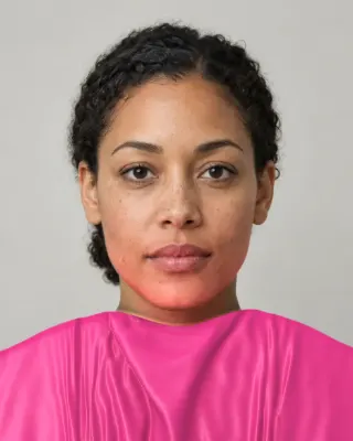
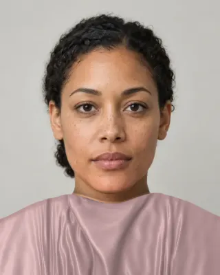
The Full Color Report: $19one time
You in your best and worst colors, about 40 colors with hex codes, makeup, hair and a capsule wardrobe plan.
See a sample reportCommon questions
- What color looks best on dark skin?
- There's no single one. Cool-leaning deep skin often does well with blue-based colors such as fuchsia, cobalt and wine, warm-leaning skin with marigold, poppy and warm emerald, and neutral or olive-leaning skin with slightly greyed colors such as jade moss or rosewood. Test each under your chin in daylight.
- Does white look good on dark skin?
- It can look wonderful, because it's the biggest lightness step available, far above the darkest Monk tone. That says nothing about looking lighter, which isn't the goal. Warm skin often prefers cream or ivory right next to the face, so compare them.
- Is black a good color on dark skin?
- Yes. On very deep skin, black is only a little darker than Monk 10, so it reads as soft and tonal and not stark. If you want more separation near your face, add a light collar, a necklace or a lifted lip.
- What colors should dark skin avoid?
- None as a rule. What fails is usually the wrong temperature or a very chalky version of a color worn right at the face. Our palettes do list colors to avoid per season, and those lists depend on undertone and contrast, not on how deep your skin is.
- Can dark skin be a Summer or a Spring?
- Yes. Season systems define these by temperature and softness, and those traits occur at every depth. Stylist Micah Lumsden told CBC Radio she was typed as a Winter without being draped, and later found she was a Spring. Older books mostly showed these seasons on light skin, which is a gap in the books.
- Do yellow and orange work on dark skin?
- Often very well, especially on warm-leaning skin, where marigold and burnt orange sit a clear step above most deep tones. If your skin leans cool or olive, a yellow can look heavy against it. A mustard or a softer gold may work where a lemon doesn't, so try a few before you decide.
- How do I find my undertone if my skin is very dark?
- Use fabric, not veins. Veins are hard to see on deep skin, and charts lose detail at the deep end. Hold magenta against orange under your chin in daylight, then repeat with other warm and cool pairs. The undertone test on this site runs five such pairs beside your photo.

See which colors are yours.
See your colors on your own face, compare seasons side by side, and get your season, your undertone and a starter palette.