
What this lipstick shade finder does
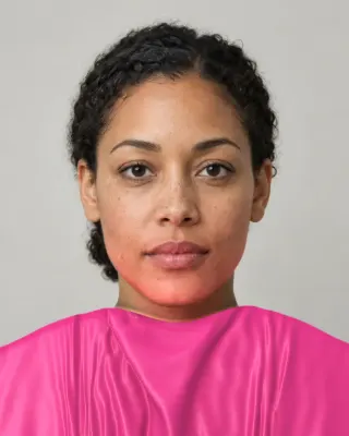
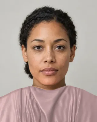
It puts color on your actual lips and lets you flip through shades. A face landmark model finds your mouth among 478 points on your face, and the shade is painted inside that outline. We multiply the color by your lips’ own light, so the shading stays and the highlights still read as highlights, and a very bright glint passes through. It runs from your camera, from one photo, or on a fictional example person. The camera is the most useful of the three, since you can talk, turn your head and see the color move with you.
Here are the limits. You get nine fixed shades, shown as dots with the name of the one you pick on the Lips tab, and the figure below names them in the same family order. The tool doesn’t filter them for you: the undertone advice is on this page, and the decision is yours. It has no brand catalog, so it can’t say which bottle matches a dot. It draws a single opaque finish, with no matte, gloss or sheer setting. On your own camera or photo, the finder’s clip and which-is-better picture use these shades while you’re on this tab, and a screenshot works too.
The nine shades, sorted the way they matter
Lipstick advice mostly comes down to whether a color has blue or orange in it. We can measure that from where each color sits on the color wheel. Here are the nine going around from the blue side to the orange side, with a hex code you can use as a reference when you shop.
Plum
#572041
Berry
#7C1C42
Mauve
#935567
Rose pink
#C9547A
True red
#AD1729
Nude rose
#B4706A
Coral
#D65A48
Brick
#853122
Terracotta
#A94E38
By that measure, plum, berry, mauve and rose pink sit on the blue side, true red and nude rose sit in the middle, and coral, brick and terracotta sit on the orange side. True red is the interesting one. It lands right between, which fits why people argue about whether a given red is “warm”. In hue order the full list runs plum, berry, mauve, rose pink, true red, nude rose, coral, brick, terracotta.
What lipstick shade suits my undertone?
The usual rule is to match the lean, and it’s a styling convention with no research behind it that we could find. That said, it’s a useful place to start.
- Cool undertones tend to start well on the blue side: plum, berry, mauve and rose pink. If your skin picks up pink easily, these often look settled.
- Warm undertones tend to start on the orange side: coral, brick and terracotta. Blue-based pinks can look chalky or separate from golden skin.
- Neutral undertones can usually go either way, so start in the middle with true red and nude rose and try one step to each side.
- Olive undertones are the awkward case. In IPSY’s interview, analyst Brooke Ann says warm reds like chili or coral can look “too orange, harsh, or light” on olive skin. Try berry and mauve first, and see the olive undertone page.
Don’t know your lean? What undertone means explains it, and the undertone test gives you a reading. Or run the check directly: rose pink against coral, which are about the same lightness and differ mainly in hue. Watch your skin as you flip between them.
Do berry and plum suit cool undertones?
Usually, and they’re the classic pick. The catch is depth. Plum is far darker than the lightest Monk tone and almost level with Monk 9. So on very fair skin it’s a dramatic evening lip, and on very deep skin it’s closer to an everyday one. Cool undertone tells you the side of the ring, and depth tells you how far you can go on it. Warm skin isn’t shut out of plum either, though a browner version may feel easier.
What’s a safe everyday nude?
There’s no such thing as one nude, and this is the most useful thing the numbers show. “Nude” means close to your own coloring, so it moves with your skin. Here is every chip on all ten tones of a published scale.
The chip named Nude rose is almost level with Monk 6, so it’s a real nude there. On Monk 1 it’s far darker than the skin and on Monk 10 far lighter, so on either end it reads as a statement. For Monk 7 the nearest chip is mauve, for Monk 8 brick and for Monks 9 and 10 plum. Those colors are nobody’s idea of beige, which is why a beige lipstick so often looks chalky on deep skin.
One gap you should know about. On Monk tones 1 to 4 even the closest chip is clearly darker than the skin. Our nine shades don’t include a pale nude, so fair skin won’t find one here, and will have to read nude rose as a stronger color than its name suggests.
You don’t want an exact skin match, in any case. A lip that disappears removes one of the things a face is organized around. In the faces Porcheron and colleagues measured, the lips were always darker than the skin around them. So our rule of thumb, and it is only ours, is to look for your own lips’ color or a touch deeper, on the side of the ring that suits you.
Contrast: how strong should it be?
Makeup advice ties lipstick to your facial contrast. L’Oréal Paris suggests soft, natural looks for low contrast faces and rich colors such as plums and crimsons for high contrast ones. That’s a popular theory and not a finding, and our face contrast guide goes through it, with what research did measure.
There is some research on lips themselves. Stephen and McKeegan had participants adjust lip color on calibrated photos of Caucasian faces. They increased redness to make women’s faces look more feminine and attractive, and greater lightness contrast helped attractiveness for both sexes. And Porcheron’s cross-cultural work notes that lip contrast changes with age differently across groups, and suggests that shades may work differently across races and cultures. Neither tested what shade suits whom. We’d take from them only that lip color is a strong signal in a face, so a small change is easy to see.
Do blue-based lipsticks make teeth look whiter?
You’ll read this everywhere, and we couldn’t find a study behind it. Basic color science doesn’t obviously back it either. Chevreul’s simultaneous contrast says a color seems to shift toward the complement of its neighbor. On that logic, an orange lip should push nearby teeth toward blue, and a blue-red should push them toward yellow, the reverse of the usual claim. Lightness probably matters more: any deep lip makes what’s beside it look lighter by comparison, and blue-reds are often sold in deep versions. Check this one on your own face. It takes one flip between true red and coral.
Should lipstick match your foundation’s undertone?
It doesn’t have to. Lips are a separate color on the face, so a contrast in temperature can look deliberate, and a blue-red on warm skin is a long-standing classic. Where a mismatch shows is in the nudes. A nude has to sit close to your skin to work, so a pink-beige nude on golden skin, or a peach one on rosy skin, tends to look like a mistake where a stronger color would look like a choice. So match your foundation with care, and let your lipstick off the hook unless it’s meant to be invisible. If your base is still uncertain, the foundation shade finder and its jaw test will settle it.
How do I test a lipstick without buying it?
- Use this tool for direction. Sit facing a window. Compare a blue-side and an orange-side chip of similar depth, then go lighter and deeper on the side you liked.
- Look at the whole face. Skin clearer or sallower? Shadows softer or stronger? Is the lip the first thing you see, and do you want it to be?
- Keep a screenshot. Bring it with the hex code to a counter. Names won’t translate between brands, and a picture will.
- Check the real one on your lips. Swatching on your hand can’t tell you how the color sits on your lip’s own pigment, particularly with a sheer formula. Use a disposable applicator, and walk to daylight.
What the preview can’t tell you: how sheer or opaque a real product is, whether it shifts through the day, or how it behaves over naturally darker or two-toned lips. Ours covers evenly. It also needs to see your mouth, so a hand in the way or a sharp head turn can throw it off.
Season guides go further for specific palettes: Soft Autumn makeup, Soft Summer makeup, Deep Autumn makeup, Deep Winter makeup and True Summer makeup. A lip always reads against the skin around it, so it pays to look at both together. The Full Color Report names makeup shades for your full palette.
Related guides and tools
Sources
- Face landmark detection guide
- Lip colour affects perceived sex typicality and attractiveness of human faces. Stephen ID, McKeegan AM
- Aspects of facial contrast decrease with age and are cues for age perception. Porcheron A, Mauger E, Russell R
- Facial contrast is a cross-cultural cue for perceiving age. Porcheron A et al.
- What Is the Contrast Makeup Theory?
- How to tell if you have olive skin, according to expert makeup artists
- Michel Eugène Chevreul
- Monk Skin Tone Scale